Project Management
Topics related to project management
Colored Network Diagrams (Part 2)
Executive Summary
This blog post is the continuation of the blog post Colored Network Diagrams (Part 1). In this blog post, I describe some improvements and enhanced capabilities of the scripts that have been presented in Part 1 already. The new set of scripts can now additionally color network graphs (PERT charts) according to:
- … remaining durations
- … remaining work
- … criticality based on remaining duration
Before reading this blog post, you need to read the blog post Colored Network Diagrams (Part 1) first to fully understand the context.
Preconditions
In order to use the approach described here, you should:
- … have access to a Linux machine or account
- … have a MySQL or MariaDB database server set up, running, and have access to it
- … have the package graphviz [2] installed
- … have some basic knowledge of how to operate in a Linux environment and some basic understanding of shell scripts
Description and Usage
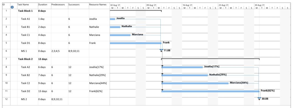
In the previous blog post Colored Network Diagrams (Part 1) we looked at a method on how to create colored network graphs (PERT charts) based on the duration, the work, the slack, and the criticality of the individual tasks. We also looked at how a network graph looks like when some of the tasks have already been completed (tasks in green color). We will now enhance the script sets in order to process remaining duration and remaining work. In addition, this information shall also be displayed for each task. For this, the scripts create_project_db.sql, msp2mysql.sh, and mysql2dot.sh require modifications so that they can process the additional information. I decided to name the new scripts with a “-v2” suffix so that they can be distinguished from the ones in the previous blog post.
Let us first look at the script create_project_db-v2.sql which sets up the database [1]. Compared to the previous version, it now sets up some new fields which have been highlighted in red color below. For the sake of readability, only parts of the script have been displayed here.
...
task_duration INT UNSIGNED DEFAULT 0,\
task_work INT UNSIGNED DEFAULT 0,\
free_slack INT DEFAULT 0,\
total_slack INT DEFAULT 0,\
finish_slack INT DEFAULT 0,\
rem_duration INT UNSIGNED DEFAULT 0,\
rem_work INT UNSIGNED DEFAULT 0,\
`%_complete`
In addition to the fields rem_duration and rem_work, we also prepare the database for 3 out of the 4 slack types that tasks have (free_slack, total_slack, finish_slack), in order to be able to execute some experiments in future releases. Furthermore, we can now capture the link_lag between two linked tasks; this information will not be used now, but in a future version of the script set.
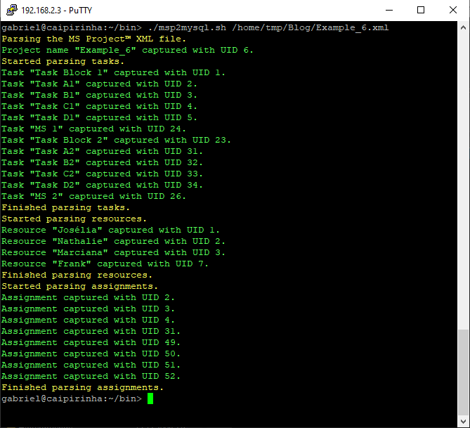
Step 1: Parsing the Project Plan
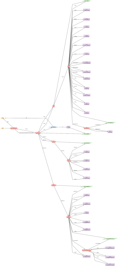
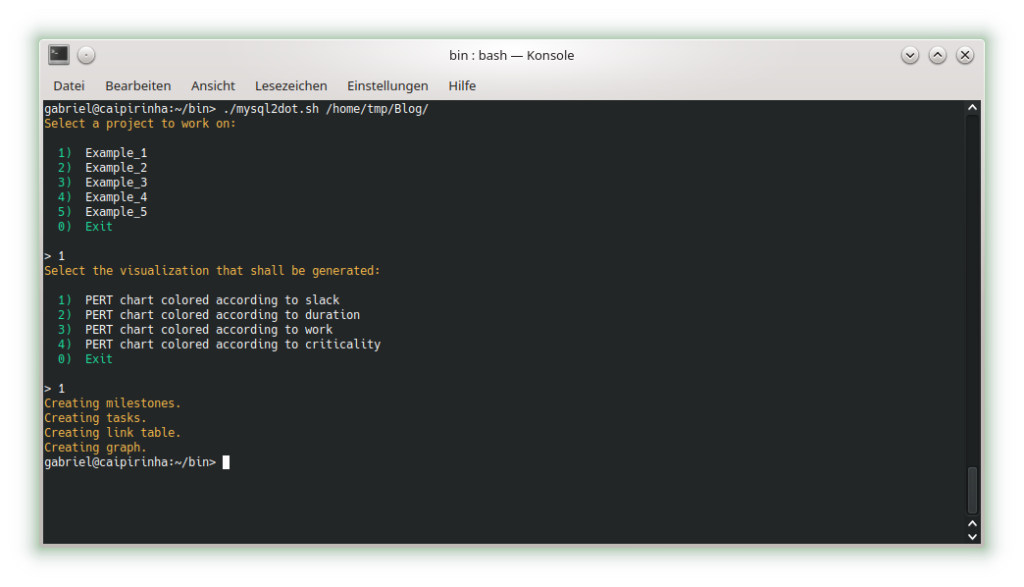
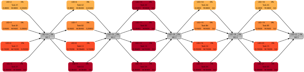
The script msp2mysql-v2.sh parses the Microsoft® Project plan in XML format. It contains a finite-state machine (see graph below), and the transitions between the states are XML tags (opening ones and closing ones).
Step 2: Generating a Graph
Now we can extract meaningful data from the database and transform this into a colored network graph; this is done with the bash script mysql2dot-v2.sh. mysql2dot-v2.sh can create colored network graphs according to:
- … the task duration
- … the work allocated to a task
- … the total slack of a task
- … the criticality of a task
- … the remaining task duration
- … the remaining work allocated to a task
- … the remaining criticality of a task
mysql2dot-v2.sh relies on a working installation of the graphviz package, and in fact, it is graphviz and its collection of tools that create the graph, while mysql2dot-v2.sh creates a script for graphviz in the dot language. Let us look close to some examples:
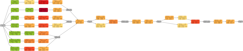
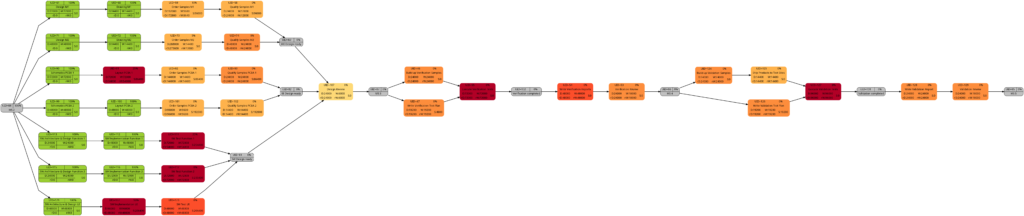
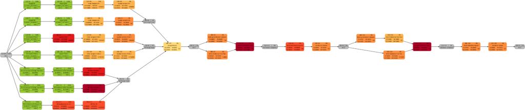
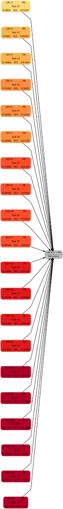
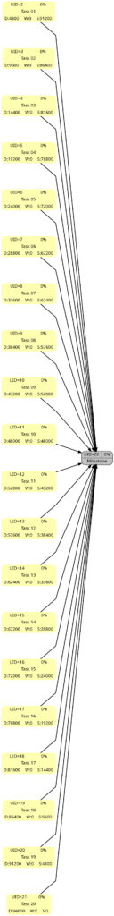
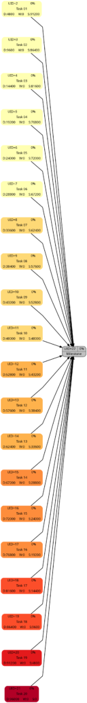
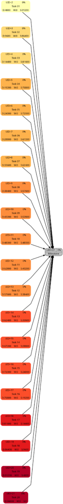
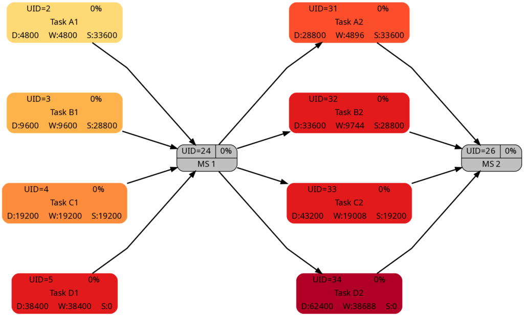
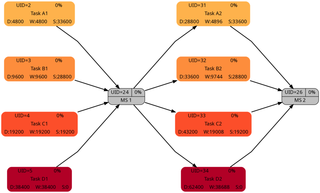
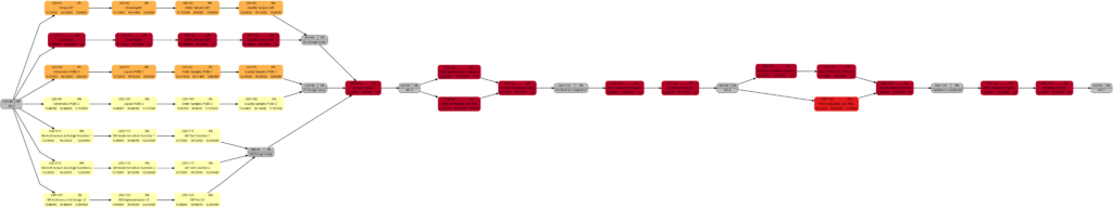
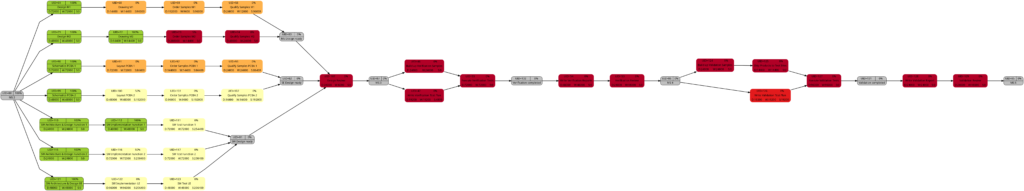
Example 8: A real-world example
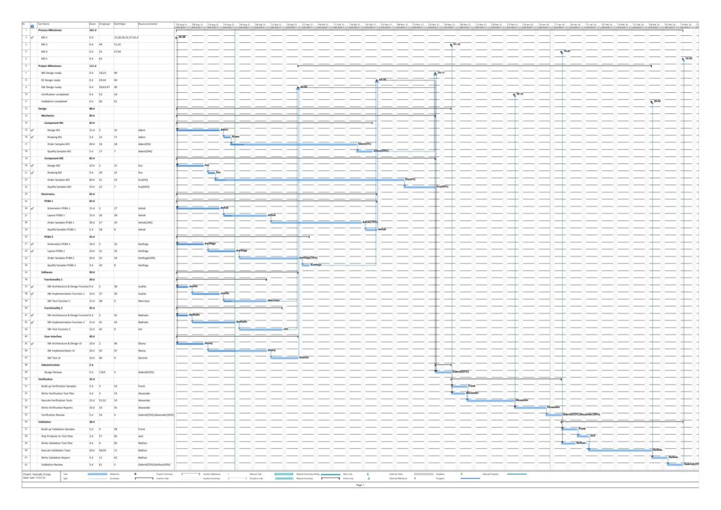
Example 8 was already mentioned in the blog post Colored Network Diagrams (Part 1). It is a fictious simplified project plan with development, verification, and validation activities where some tasks have already been completed. The green vertical line in the plan shows the status date.

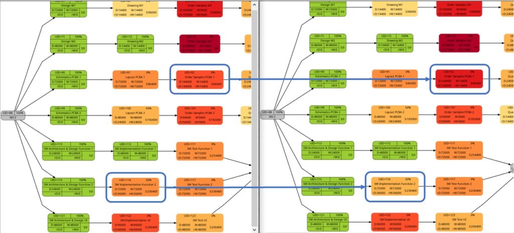
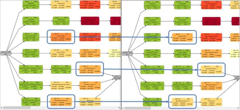
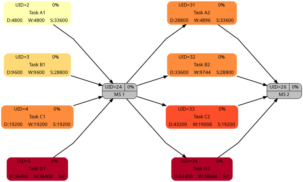
Tasks that have been completed 100% are colored in green color across all network graphs indicating that these tasks do not require any more attention in the remaining project. While the network graphs had already been shown in the blog post Colored Network Diagrams (Part 1), they shall nevertheless ben shown again as the new script mysql2dot-v2.sh shows additional information (remaining duration, remaining work) for each task. For completed tasks, those values as well as total task slack are 0, of course.

The new script mysql2dot-v2.sh offers 3 additional graphs (menu choices 5…7):
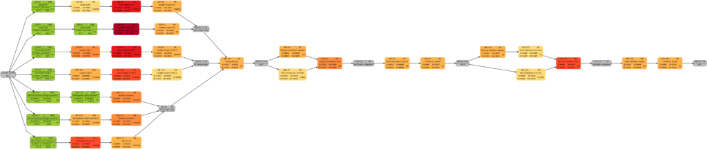
Let us have a closer look at these graphs and compare some of them:
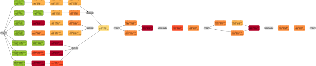
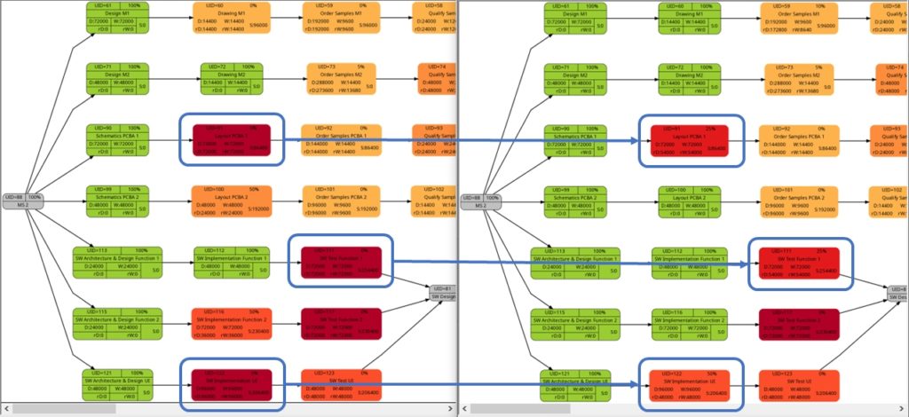
The comparison of the graphs above show two tasks whose colors have changed in different directions of color shades:
- The task with UID=116 changes to a lighter color shade. This is because the left graph takes the duration into account (D=72000), and the right graph takes the remaining duration into account (rD=36000). As the remaining duration is less than the duration, we can expect that change in the color shade.
- The task with UID=92 changes to a darker color shade although the values for the duration (D=14400) and the remaining duration (rD=14400) are equal. Why is that?
The explanation is that the spread between the color shades (the variable ${color_step} in the script mysql2dot-v2.sh) is computed based on the maximum remaining duration in the graph on the right side, different from the maximum duration in the graph on the left side. Consequently, if there is a task with a very long duration in the left graph and this task has a significantly lower remaining duration, this might occur in a smaller spread (a smaller value of ${color_step}) when the network graph for the remaining duration is computed.
I am personally open to the discussion of whether a different spread as seen in example (2) makes sense or not. For the moment, I decided to proceed like that. But there are valid arguments for both approaches:
- Leaving the spread equal between both graphs makes them directly comparable 1:1. This might be important for users who regularly compare the network graph colored according to task duration with the one colored according to remaining task duration.
- Computing the spread from scratch for each graph sets a clear focus on the tasks which should be observed now because they have a long remaining duration, irrespective of whether the tasks once in the past had a longer or shorter duration.
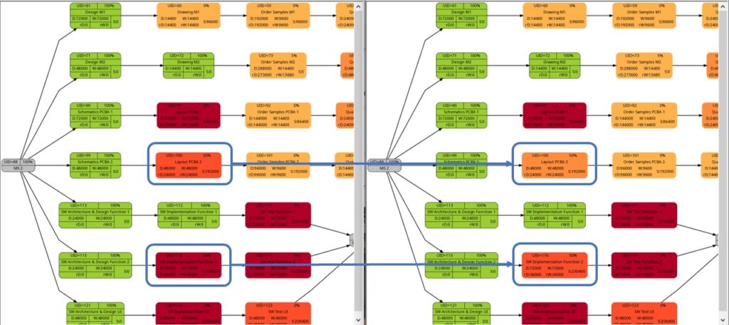
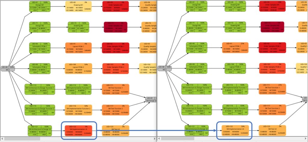
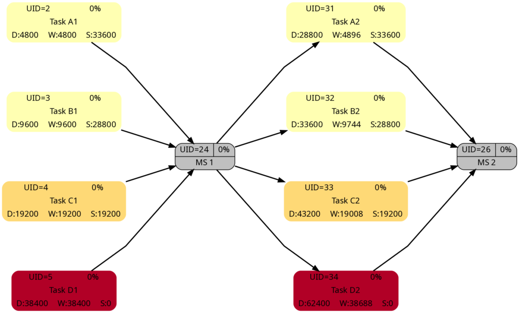
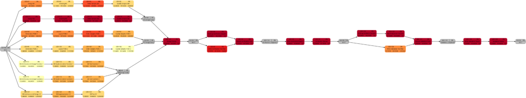
The shift of color shades in the graph above seems logical and corresponds to the case (1) of the previous example. For both the tasks with UID=100 and UID=116, the value of the remaining task work is half the value of the task work, and therefore, in the network graph for the remaining task work, both tasks feature lighter color shades as they are “less problematic”.
As already explained in the blog post Colored Network Diagrams (Part 1), criticality is computed based on the information of task slack and task duration. Whereas the script mysql2dot.sh used the task finish slack for this calculations, I decided to change to task total slack in the newer script mysql2dot-v2.sh; that seemed to be more adequate although in my examples, both values have been the same for all involved tasks.
In both versions of the scripts, logarithmic calculations are undertaken, and their outcome is different from the calculations based on the square root for the network graphs according to (remaining) task durations. As a result, we only observe a color shift in the task with UID=116. As the remaining task duration is half of the task duration, this task is less critical (hence, a lighter color shade) on the right side of the image above.
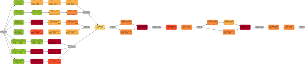
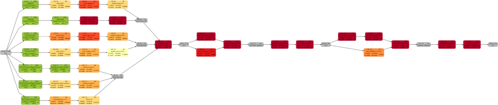
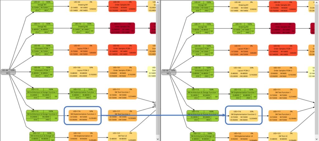
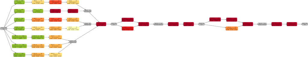
Example 9: Same project plan (more in the future)
Jumping to the future, more tasks of the same project plan have been completed either entirely or partially. Again, the green vertical line in the plan shows the status date.
The resulting graphs are:
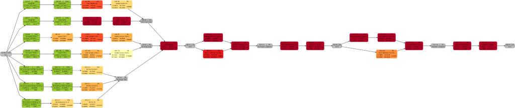
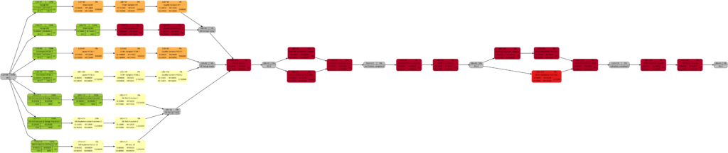
We will now look at some of the graphs and compare them with the equivalent graphs in Example 8. Apart from tasks being colored in green color once they have been completed, there are only differences in color shades of tasks belonging to the network graphs of:
- remaining task duration
- remaining task work
- remaining task criticality
as completed tasks have their remaining values set to 0 and therefore diminish the set of tasks that are considered for the calculation. In contrast to this, there are no changes in the network graphs of:
- task duration
- task work
as the respective values do not change for completed tasks. We could, however, in theory experience changes in the network graphs of:
- task slack
- task criticality
as complete tasks have their slack values set to 0 and therefore diminish the set of tasks that are considered for the calculation. This was not the case in our examples, though. It should also be mentioned that there might be changes in the color shade for a task where the duration or work is increased due to a revised assessment of the project manager from one status date to the other.
As mentioned above, the changes in the color shade of the highlighted tasks in the comparisons above are due to the fact that either the remaining duration or the remaining work of the respective tasks change between the earlier and the later status date.
Conclusion
The scripts create_project_db-v2.sql, msp2mysql-v2.sh and mysql2dot-v2.sh and the examples provided above show how, using the powerful graphviz package, traditional project plans created with Microsoft® Project can be visualized in a set of graphs that can help a project manager to focus on the right tasks. Compared to the set of scripts in the blog post Colored Network Diagrams (Part 1), the improved set of scripts additionally allow the examination of the task duration, task value, and task criticality based on remaining values of the tasks, and so can answer the question “How does the project look now?” more adequately.
Outlook
In the near future, I plan to rewrite the script mysql2dot-v2.sh into PHP because I want to incorporate an algorithm which I developed back in 2010 that can show the first x critical paths of the project using a recursive PHP function and several large multi-dimensional arrays.
Sources
Files
- create_project_db-v2.sql sets up the database in MySQL or MariaDB. The script works with the user gabriel who assumes to have access to the database server without password; you might have to adapt the script to your environment and needs.
- msp2mysql-v2.sh reads a Microsoft® Project plan in XML, parses it and writes the data into the MariaDB database.
- mysql2dot-v2.sh reads from the MariaDB database and creates a script for dot, a tool of the graphviz suite.
- Example_8-v2.zip contains all files with respect to Example 8 (created with the current set of scripts).
- Example_9-v2.zip contains all files with respect to Example 9.
Disclaimer
- The program code and the examples are for demonstration purposes only.
- The program code shall not be used in production environments without further modifications.
- The program code has not been optimized for speed (It’s a bash script anyway, so do not expect miracles.).
- The program code has not been written with cybersecurity aspects in mind.
- While the program code has been tested, it might still contain errors.
- Only a subset of all possibilities in [1] has been used, and the code does not claim to adhere completely to [1].
Colored Network Diagrams (Part 1)
Executive Summary
This blog post offers a method to create colored network graphs (PERT charts) from project plans that are created with Microsoft® Project. Color schemes similar to the ones used in physical maps visualize those tasks which:
- … have long durations
- … have a high amount work
- … have little slack
- … have a high criticality
The blog post shall also encourage readers to think outside of the possibilities that established project management software offers and to define for yourself which tasks are critical or relevant for you and how this information shall be determined.
Preconditions
In order to use the approach described here, you should:
- … have access to a Linux machine or account
- … have a MySQL or MariaDB database server set up, running, and have access to it
- … have the package graphviz installed
- … have some basic knowledge of how to operate in a Linux environment and some basic understanding of shell scripts
Description and Usage
The base for the colored network graphs is a plan in Microsoft® Project which needs to be stored as XML file. The XML file is readable with a text editor (e.g., UltraEdit) and follows the syntax in [1]. The XML file is then parsed, the relevant information is captured and is stored in a database (Step 1). Then, selected information is retrieved from the database and written to a script in dot language which subsequently is transformed into a graph using the package graphviz (Step 2). Storing the data in a database rather than in variables allows us to use all the computational methods which the database server offers in order to select, aggregate, and combine data from the project plan. It also allows us to implement Step 2 in PHP so that graphs can be generated and displayed within a web site; this could be beneficial for a web-based project information system.
Step 0: Setting up the Database
At the beginning, a database needs to be set up in the database server. For this, you will probably need administrative access to the database server. The following SQL script sets up the database and grants access rights to the user gabriel. Of course, you need to adapt this to your needs on the system you work on.
# Delete existing databases
REVOKE ALL ON projects.* FROM 'gabriel';
DROP DATABASE projects;

# Create a new database
CREATE DATABASE projects;
GRANT ALL ON projects.* TO 'gabriel';
USE projects;

CREATE TABLE projects         (proj_uid               SMALLINT UNSIGNED NOT NULL AUTO_INCREMENT PRIMARY KEY,\
                               proj_name              VARCHAR(80)) ENGINE=MyISAM DEFAULT CHARSET=utf8;
CREATE TABLE tasks            (proj_uid               SMALLINT UNSIGNED NOT NULL,\
                               task_uid               SMALLINT UNSIGNED NOT NULL,\
                               task_name              VARCHAR(150),\
                               is_summary_task        BOOLEAN           DEFAULT FALSE NOT NULL,\
                               is_milestone           BOOLEAN           DEFAULT FALSE NOT NULL,\
                               is_critical            BOOLEAN           DEFAULT FALSE NOT NULL,\
                               task_start             DATETIME          NOT NULL,\
                               task_finish            DATETIME          NOT NULL,\
                               task_duration          INT UNSIGNED      DEFAULT 0,\
                               task_work              INT UNSIGNED      DEFAULT 0,\
                               task_slack             INT               DEFAULT 0,\
                               rem_duration           INT UNSIGNED      DEFAULT 0,\
                               rem_work               INT UNSIGNED      DEFAULT 0,\
                               `%_complete`           SMALLINT UNSIGNED DEFAULT 0,\
                                                      PRIMARY KEY (proj_uid, task_uid)) ENGINE=MyISAM DEFAULT CHARSET=utf8;
CREATE TABLE task_links       (proj_uid               SMALLINT UNSIGNED NOT NULL,\
                               predecessor            SMALLINT UNSIGNED NOT NULL,\
                               successor              SMALLINT UNSIGNED NOT NULL) ENGINE=MyISAM DEFAULT CHARSET=utf8;
CREATE TABLE resources        (proj_uid               SMALLINT UNSIGNED NOT NULL,\
                               resource_uid           SMALLINT UNSIGNED NOT NULL,\
                               calendar_uid           SMALLINT UNSIGNED NOT NULL,\
                               resource_units         DECIMAL(3,2)      DEFAULT 1.00,\
                               resource_name          VARCHAR(100),\
                                                      PRIMARY KEY (proj_uid, resource_uid)) ENGINE=MyISAM DEFAULT CHARSET=utf8;
CREATE TABLE assignments      (proj_uid               SMALLINT UNSIGNED NOT NULL,\
                               task_uid               SMALLINT UNSIGNED NOT NULL,\
                               resource_uid           SMALLINT UNSIGNED NOT NULL,\
                               assignment_uid         SMALLINT UNSIGNED NOT NULL,\
                               assignment_start       DATETIME          NOT NULL,\
                               assignment_finish      DATETIME          NOT NULL,\
                               assignment_work        INT UNSIGNED      DEFAULT 0,\
                                                      PRIMARY KEY (proj_uid, task_uid, resource_uid)) ENGINE=MyISAM DEFAULT CHARSET=utf8;
CREATE TABLE assignment_data  (proj_uid               SMALLINT UNSIGNED NOT NULL,\
                               assignment_uid         SMALLINT UNSIGNED NOT NULL,\
                               assignment_start       DATETIME          NOT NULL,\
                               assignment_finish      DATETIME          NOT NULL,\
                               assignment_work        INT UNSIGNED      DEFAULT 0) ENGINE=MyISAM DEFAULT CHARSET=utf8;
This SQL script sets up a database with several tables. The database can hold several project plans, but they all must have distinctive names. This SQL script only catches a subset of all information which is part of a Microsoft® Project plan in XML format; it does not capture calendar data, for example, nor do the data types in the SQL script necessarily match the ones from the specification in [1]. But it is good enough to start with colored network graphs.
This only needs to be executed one time. Once the database has been set up properly, we only have to execute Step 1 and Step 2.
Step 1: Parsing the Project Plan
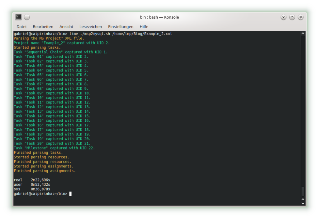
The first real step is to parse the Microsoft® Project plan in XML format; this is done with the bash script msp2mysql.sh. This program contains a finite-state machine (see graph below), and the transitions between the states are XML tags (opening ones and closing ones). This approach helps to keep the code base small and easily maintainable. Furthermore, the code base can be enlarged if more XML tags or additional details of the project plan shall be considered.
I concede there are more elegant and faster ways to parse XML data, but I believe that msp2mysql.sh can be understood well and helps to foster an understanding of what needs to be done in Step 1.
There is one important limitation in the program that needs to be mentioned: The function iso2msp () transforms a duration in ISO 8601 format to a duration described by multiples of 6 s (6 s are an old Microsoft® Project “unit” of a time duration, Microsoft® Project would traditionally only calculate with 0.1 min of resolution). However, as you can see in [2], durations cannot only be measured in seconds, minutes, and hours, but also in days, months, etc. A duration of 1 month is a different amount of days, depending on the month we are looking at. This is something that has not been considered in this program; in fact, it can only transform durations given in hours, minutes and seconds to multiples of 6 s. Fortunately, this captures most durations used by Microsoft® Project, even durations that span over multiple days (which are mostly still given in hours in the Microsoft® Project XML file).
While msp2mysql.sh parses the Microsoft® Project plan in XML format, it typically runs through these steps:
- It extracts the name of the project plan and checks if there is already a project plan with this name in the database. If that is the case, the program terminates. If that is not the case, the project name is stored in the table projects, and a new proj_uid is allocated.
- It extracts details of the tasks and stored them in the tables tasks and task_links.
- It extracts the resource names and stores their details in the table resources.
- It extracts assignments (of resources to tasks) and stores them in the tables assignments and assignment_data.
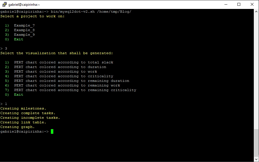
msp2mysql.sh is called with the Microsoft® Project plan in XML format as argument, like this:
./msp2mysql.sh /home/tmp/Example_1.xmlStep 2: Generating a Graph
The second step is to extract meaningful data from the database and transform this into a colored network graph; this is done with the bash script mysql2dot.sh. mysql2dot.sh can create colored network graphs according to:
- … the task duration
- … the work allocated to a task
- … the task slack
- … the criticality of a task
mysql2dot.sh relies on a working installation of the graphviz package, and in fact, it is graphviz and its collection of tools that create the graph, while mysql2dot.sh creates a script for graphviz in the dot language. Let us look close to some aspects:
mysql2dot.sh uses an uneven scale of colors, and the smallest scale should be three or more colors. The constant NUM_COLSTEPS sets the number of colors, in our case 7 colors. The constant COLSCHEME defines the graphviz color scheme that shall be used, in our case this is “ylorrd7”. [3] shows some really beautiful color schemes. The ColorBrewer schemes are well suited for our kind of purpose (or for physical maps); however, the license conditions ([4]) must be observed.
mysql2dot.sh is invoked with the name of a directory as argument. The generated script(s) in dot language as well as the generated graph(s) will be stored in that directory. A typical call looks like this:
./mysql2dot.sh /home/tmp/When started, mysql2dot.sh retrieves a list of all projects from the database and displays them to the user who then has to select a project or choose the option Exit. When a project plan has been selected, the user has to choose the graph that shall be generated. Subsequently, the program starts to generate a script in dot language and invokes the program dot (a tool of the graphviz suite) in order to compute the network graph.
Different project plans typically have different ranges of durations, work or slack for all of their tasks. mysql2dot.sh therefore takes into account the maximum duration, the maximum work, or the maximum slack it can find in the whole project. Initially, I used a linear scale to distribute the colors over the whole range from [0; max_value], but after looking at some real project plans, I personally found that too many tasks would then be colored in darker colors and I thought that this would rather distract a project manager from focusing on the few tasks that really need to be monitored closely. Trying out linear, square and square root approaches, I finally decided for the square root approach which uses the darker colors only when the slack is very small, the workload is very high, or the duration is very long. Consequently, the focus of the project manager is guided to the few tasks that really deserve special attention. However, this does not mean that this approach is the only and correct way to do it. Feel free to experience with different scaling methods to tune the outcome to your preferences.
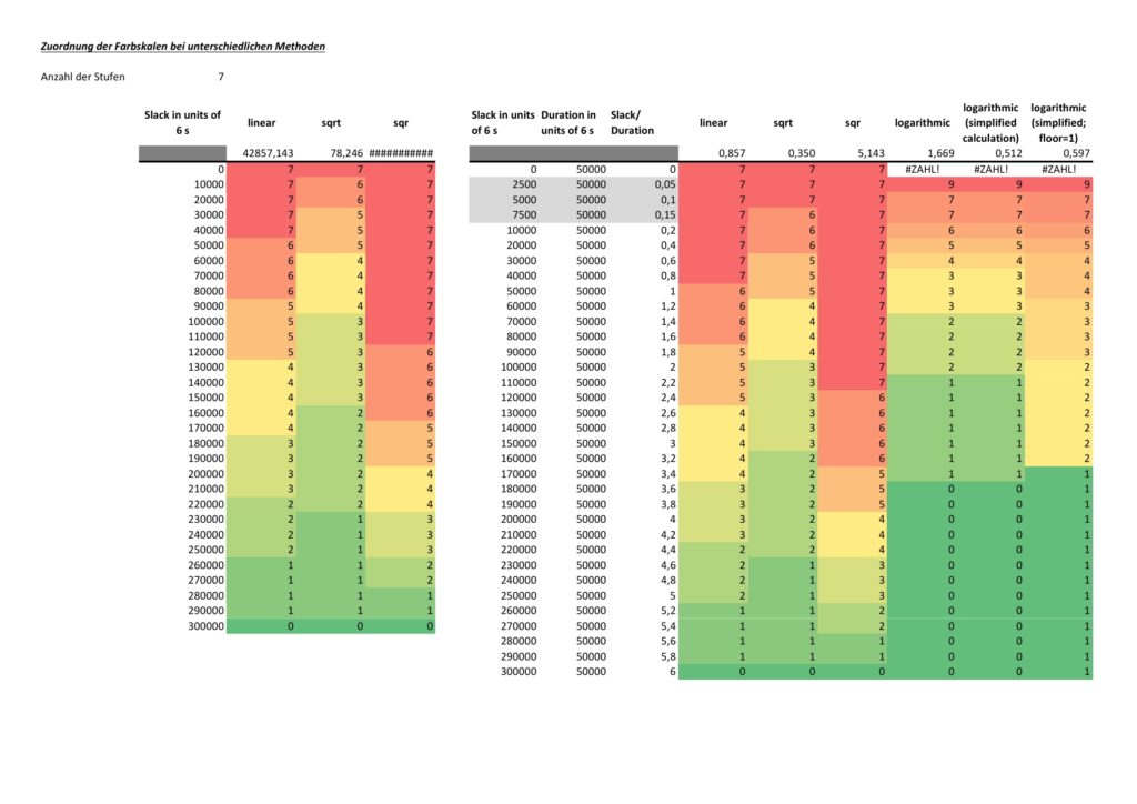
The network graph colored according to task criticality follows a different approach. Task criticality is derived from the ration of task slack and task duration. Tasks which have a low ratio of task slack / task duration are defined as more critical than tasks where this ratio is higher. I also experienced with the square root approach mentioned above, but that seemed to result in different criticalities depending on the maximum ratio of task slack / task duration which seemed unsatisfactory to me. Finally, I opted for a logarithmic approach which puts the ration task slack / task duration = 1,0 to the middle value of NUM_COLSTEPS. So in the current case, a ratio of task slack / task duration = 1,0 (means: task slack = task_duration) would result in a value of 4.0. If NUM_COLSTEPS was 9 rather than 7, the result would be 5.0. This can be reached by the formula:
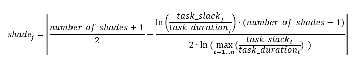
where:
- n is the number of tasks that are neither a milestone nor a summary task and that have a non-zero duration
- j is the task for which we determine the level of shade
- number_of_shades is the number of different shades you want to have in the graph; this should be an impair number and it should be 3 at least
- shadej is the numerical value of the shade for task j
- task_slackj is the task slack of task j
- task_durationj is the duration of task j
Examples
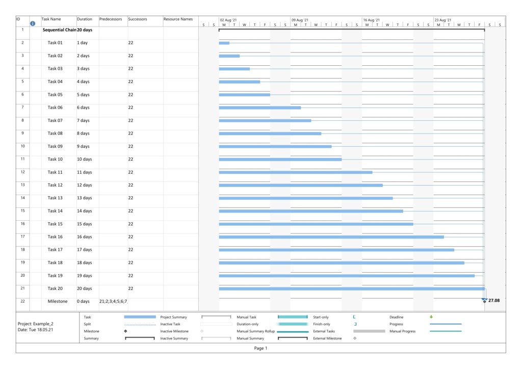
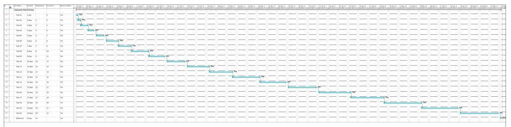
Example 1: Sequential Task Chain
This example is a sequential task chain with 20 tasks; each task is +1d longer than the previous task.
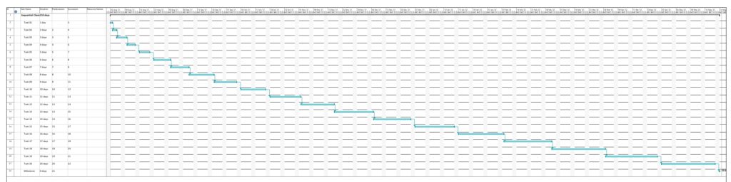
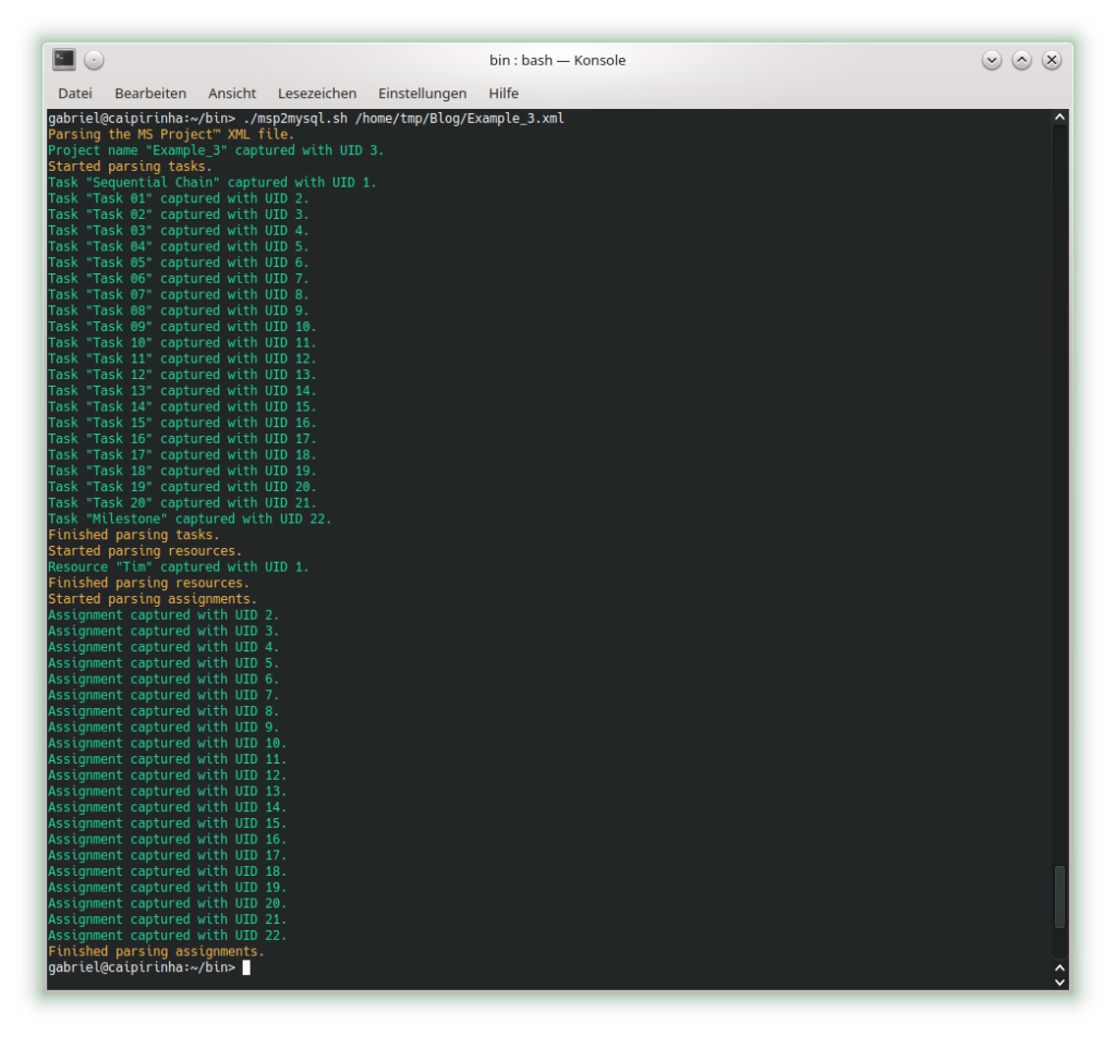
In this example, no resources have been assigned yet. As all tasks are in sequence, there is obviously no slack in any task, and all tasks are in the critical path. Parsing this project plan with msp2mysql.sh leads to:

We can already see that the shall script takes a long time for this easy project plan. For a productive environment, one would have to use C code rather than a shell script, but for educational purposes, the shell script is easier to change, understand and also to debug. Subsequently, we start creating the graphs with mysql2dot.sh, here is an example on how this looks like:
Let us look at the 4 graphs which can be generated:

The result is what could be expected. Tasks with a shorter duration are colored in a lighter color, tasks with a longer duration consequently in a darker color. While the task duration increases in a linear fashion from left to right, the graph colors tasks with a longer duration more in the “dangerous” area, that is, in a darker color.

As no resource has been attributed, no work has been registered for any of the tasks. Therefore, all tasks are equally shown in a light color.

As none of the tasks has any slack, obviously all tasks are in the critical path. Hence all of them are colored in dark color.

Similar to the graph above, all tasks are critical, and progress must be carefully monitored; hence, all tasks are colored in dark color.
Example 2: Parallel Task Chain
This example has the same tasks as Example 1, but all of them in parallel. The longest task therefore determines the overall project runtime.
In this example, too, no resources have been assigned yet. Parsing this project plan with msp2mysql.sh leads to:
The 4 graphs from this example look very different from Example 1:
The color of the tasks is the same as in Example 1; however, all tasks are in parallel.
The color of the tasks is the same as in Example 1 as we still have no work assigned to any of the tasks; however, all tasks are in parallel.
As to slack, the picture is different. Only one task (task #20) does not have any slack, all other tasks have more or less slack, and task #01 has the most slack.
Here, we can see that both tasks #19 and tasks #20 are considered to be critical. More tasks receive a darker color as compared to the graph considering slack alone.
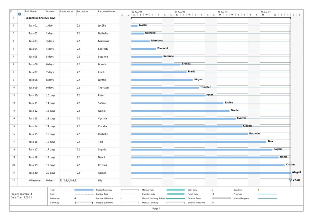
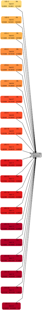
Example 3: Sequential Task Chain with Resource
This example has the same tasks as Example 1, but we assign a resource to each task (the same in this example, but this OK as all tasks are sequential, hence no overload of the resource). Consequently, work is assigned to each task, and we can expect changes in the network graph referring to task work.
Parsing this project plan with msp2mysql.sh leads to:
We can see that now (different from Example 1), resources and assignments are captured, too. Let us look at the 4 graphs from this example:

Nothing has changed compared to Example 1 as the durations are the same.

This graph now experiences the same coloring as the network graph according to task duration. That is understandable given the fact that we have a full-time resource working 100% of the time for the full task duration, hence work and duration have the same numeric values for each respective task.

Nothing has changed compared to Example 1 as still none of the tasks has any slack.

Nothing has changed compared to Example 1 as still none of the tasks has any slack. Consequently, all of them are critical.
Example 4: Parallel Task Chain with Resources
This example has the same tasks as Example 2, but we assign a resource to each task. As all tasks are parallel, we assign a new resource to each task so that there is no resource overload.
Parsing this project plan with msp2mysql.sh leads to:
We can see that now (different from Examples 2), resources and assignments are captured, too. Let us look at the 4 graphs from this example:

Nothing has changed compared to Example 2 as the durations are the same.
This graph now experiences the same coloring as the network graph according to task duration. That is understandable given the fact that we have a full-time resource working 100% of the time for the full task duration, hence work and duration have the same numeric values for each respective task.
Nothing has changed compared to Example 3; the slack of each task has remained the same.
Nothing has changed compared to Example 3; the criticality of the tasks remains the same.
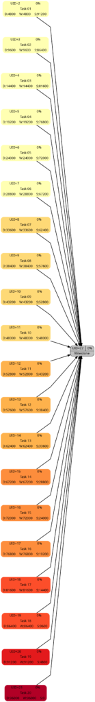
Example 5: Sequential Blocks with Parallel Tasks and with Resources
This example is the most interesting one as it combines different aspects within one project plan. We have 5 milestones, and 4 parallel tasks before each milestone. All tasks have resources assigned.
Task Block 1 contains 4 tasks of different durations, and as each task has a 100% resource allocated, also of different work. Due to the different durations, the 4 tasks also have different slack, with the longest task having zero slack.
Task Block 2 is like Task Block 1, but the work is the same for each task; this has been achieved by an over-allocation of the respective resources for 3 out of the 4 tasks.
Task Block 3 consists of 4 parallel tasks with the same duration, however with a work allocation similar to Task Block 1. None of the tasks therefore has slack, but the work for each task is different.
Task Block 4 is like Task Block 1 in terms of task duration and task work. However, the tasks have been arranged in a way so that none of the tasks has slack.
Task Block 5 is like Task Block 4, but each task has (the same amount of) lag time between the task end and the subsequent milestone. None of the tasks has any slack.
Parsing this project plan with msp2mysql.sh leads to:
Let us look at the 4 graphs from this example:
The colors in Task Block 1, 2, 4 and 5 are the same. Only in Task Block 3 where all tasks have the same (long) duration, all tasks have a dark color.
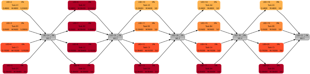
The colors in Task Block 1, 3, 4, and 5 are the same. Only in Task Block 2 where all tasks have the same amount of work (which is also the highest work a task has in this project plan), all tasks have a dark color.
The colors in Task Block 1 and 2 are the same. The tasks in Task Blocks 3, 4, and 5 are all dark as none of these tasks has any slack.
The network graph according to task criticality is similar to the one according to slack, but we can see that in Task Blocks 1 and 2 tasks get a darker color “earlier” as in the network graph according to criticality.
Example 6: Distinguishing Slack and Criticality
So far, we have not seen much difference between the network graphs according to slack and the one according to criticality. In this example, we have two task blocks with 4 tasks each where the slack is the same in the corresponding tasks in each task block. However, the duration is different between both task blocks. Work per task is almost the same, I tried to match the work despite the longer duration of the tasks in Task Block 2 as good as possible.
Parsing this project plan with msp2mysql.sh leads to:
Let us look at the 4 graphs from this example:
The duration of the tasks in Task Block 2 is +5d higher as in Task Block 1. Therefore, it is not surprising that the tasks in Task Block 2 are colored in darker colors.
As mentioned above, I tried to keep the amount of the work the same for corresponding tasks in Task Block 1 and 2 (which can also be seen in the numeric values for the work), and consequently, the colors of corresponding tasks match.
The slack of corresponding tasks in Task Block 1 and 2 is the same as the numeric values how. And so are the colors.
Despite the same slack of corresponding tasks in Task Block 1 and 2, the algorithm rates the criticality of the tasks in Task Block 2 higher as in Task Block 1. This is because the computation of “criticality” is based on the ratio of slack and duration. Out of two tasks with the same slack, the one with a longer duration is rated more critical as relative deviations in the duration have a higher probability to consume the free slack.
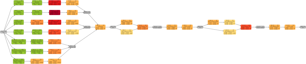
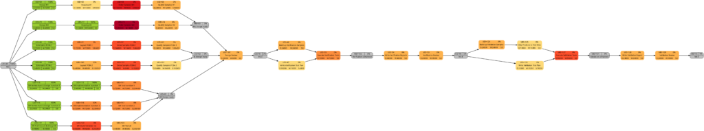
Example 7: A real-world example
Let us now look at a real-world example, a simplified project plan of a development project consisting of mechanical parts, PCBAs and software, including some intermediate milestones. As it is the case in reality, some tasks have only a partial allocation of resources, that means, that the numerical values for the allocated work are less than for the allocated duration. This will be reflected in different shadings of colors in the network graphs task duration and task duration.
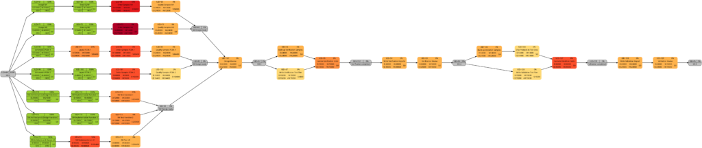
The resulting graphs are:
As mentioned above already, we can see the differences in the shading of the graphs according to task duration and task work, the reason being an allocation of resources different to 100%. However, in contrast to an initial expectation, the different shadings occur in large parts of the graph rather than only on a few tasks. This is because the shadings depend on the maximum and the minimum values of task duration or task work, and these values are unique to each type of graph. Well visible is also the critical path in dark red color in the network graph colored according to task criticality.
Example 8: A real-world example with complete tasks
Once a project has been started, sooner or later, the first tasks will be completed, and in this example, we assume that we have run three weeks into the project (green vertical line), and all tasks have been executed according to schedule (this is an example from an ideal world 😀). Consequently, our plan looks like this:
Tasks that have been completed 100% are colored in green color across all network graphs indicating that these tasks do not require any more attention in the remaining project:
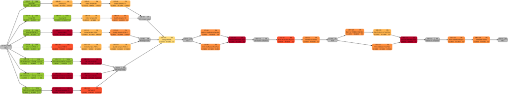
The color shadings of the incomplete tasks remain as they were in Example 7. This is because the script mysql2dot.sh determines the step size of the shadings (and thus the resulting shadings) of the individual tasks based on the maximum and minimum value of task duration, task work, task slack, or task criticality for the whole project, independent whether some tasks have been completed or not.
Conclusion
The scripts create_project_db.sql, msp2mysql.sh and mysql2dot.sh and the examples provided above show how, using the powerful graphviz package, traditional project plans created with Microsoft® Project can be visualized in a set pf graphs that can help a project manager to focus on the right tasks. For the ease of understanding, the scripts run in bash so that everyone can easily modify, enlarge, or change the scripts according to the own demands. Users who want to deploy the scripts on productive systems should take speed of execution and cybersecurity (or the lack of both in the provided example scripts) into account.
Outlook
The provided scripts can be enlarged in their scope or improved in numerous ways, and I encourage everyone to tailor them to your own needs. Some examples for improvement are:
- Improve the parsing of Microsoft® Project XML files by:
- …using a real XML parser rather than bash commands
- …enlarging the scope of the parser
- Create additional graphs.
- Consider tasks that have been completed partially.
- Experiment with different definitions of criticality.
- Explore resource usage and how to display it graphically (load, usage, key resource, etc.).
- Improve the function iso2msp () which so far is only a very simplistic implementation and is not yet able to process values like “days”, “weeks”, “months”.
Sources
- [1] = Introduction to Project XML Data
- [2] = ISO 8601 duration format
- [3] = Graphviz Color Names
- [4] = ColorBrewer License
Files
- create_project_db.sql sets up a database in MySQL or MariaDB. The script works with the user gabriel who assumes to have access to the database server without password; you might have to adapt the script to your environment and needs.
- msp2mysql.sh reads a Microsoft® Project plan in XML, parses it and writes the data into the MariaDB database.
- mysql2dot.sh reads from the MariaDB database and creates a script for dot, a tool of the graphviz suite.
- PERT-Farbskalen.xlsx is a work sheet where different approaches for color distributions are tested and where you can play around to find the “right” algorithm for yourself.
- Example_1.zip contains all files with respect to Example 1.
- Example_2.zip contains all files with respect to Example 2.
- Example_3.zip contains all files with respect to Example 3.
- Example_4.zip contains all files with respect to Example 4.
- Example_5.zip contains all files with respect to Example 5.
- Example_6.zip contains all files with respect to Example 6.
- Example_7.zip contains all files with respect to Example 7.
- Example_8.zip contains all files with respect to Example 8.
Disclaimer
- The program code and the examples are for demonstration purposes only.
- The program shall not be used in production environments.
- While the program code has been tested, it might still contain errors.
- The program code has not been optimized for speed (It’s a bash script anyway, so do not expect miracles.).
- The program code has not been written with cybersecurity aspects in mind.
- Only a subset of all possibilities in [1] has been used, and the code does not claim to adhere completely to [1].
Financial Risk and Opportunity Calculation
Executive Summary
This blog post offers a method to evaluate n-ary project risks and opportunities from a probabilistic viewpoint. The result of the algorithm that will be discussed, allows to answer questions like:
- What is the probability that the overall damage resulting from incurred risks and opportunities exceeds the value x?
- What is the probability that the overall damage resulting from incurred risks and opportunities exceeds the expected value (computed as ∑(pi * vi) for all risks and opportunities)?
- How much management reserve should I assume if the management reserve shall be sufficient with a probability of y%?
The blog post shall also encourage all affected staff to consider more realistic n-ary risks and opportunities rather than the typically used binary risks and opportunities in the corporate world.
This blog post builds on the previous blog post Financial Risk Calculation and improves the algorithm by:
- removing some constraints and errors of the C code
- enabling the code to process risks and opportunities together
Introduction
In the last decades, it has become increasingly popular to not only consider project risks, but also opportunities that may come along with projects. [1] and [2] show aspects of the underlying theory, for example.
In order to accommodate that trend (and also in order to use the algorithm I developed earlier in my professional work), it became necessary to overhaul the algorithm so that it can be used with larger input vectors of risks as well as with opportunities. The current version of the algorithm (faltung4.c) does that.
Examples
Example 1: Typical Risks and Opportunities
In the first example, we will consider some typical risks and opportunities that might occur in a project. The source data for this example is available for download in the file Risks_Opportunities.xlsx.
We can see a ternary, a quaternary, and a quinary risk and two ternary opportunities. This is already different from the typical corporate environment in which risks and opportunities are still mostly perceived as binary options (“will not happen” / “will happen”), probably because of a lack of methods to process any other form. At that point I would like to encourage everyone in a corporate environment to take a moment and think whether binary risks only are really still contemporary in the complex business world of today. I believe that they are not.
As already described in the previous blog post Financial Risk Calculation, these values have to copied to a structured format in order to be processed with the convolution algorithm. For the risks and the opportunities shown in the table above, that would turn out to be:
# Distribution of the Monetary Risks and Opportunities
# Risks have positive values indicating the damage values.
# Opportunities have negative values indicating the benefit values.

# START
     0    0.60
 10000    0.20
 50000    0.10
 90000    0.10
# STOP

# START
       0  0.40
 1000000  0.40
 2000000  0.20
# STOP

# START
      0   0.50
 200000   0.10
 300000   0.10
 400000   0.20
 800000   0.10
# STOP

# START
       0   0.80
  -20000   0.15
  -50000   0.05
# STOP

# START
       0   0.70
-1000000   0.20
-1500000   0.10
# STOP
Note that risks do have positive (damage) values whereas opportunities have negative (benefit) values. That is inherently programmed into the algorithm, but of course, could be changed in the C code (for those who like it the opposite way).
After processing the input with:
cat risks_opportunities_input.dat | ./faltung4.exe > risks_opportunities_output.datthe result is stored in the file risks_opportunities_output.dat which is lengthy and therefore not shown in full here on this page. However, let’s discuss about some important result values at the edge of the spectrum:
# Convolution Batch Processing Utility (only for demonstration purposes)
# The resulting probability density vector is of size: 292
# START
  -1550000   0.0006000000506639
...
   2890000   0.0011200000476837
# STOP

# The probability values are:
  -1550000   0.0006000000506639
  -1540000   0.0008000000625849
...
         0   0.2721000205919151
...
   2870000   0.9988800632822523
   2890000   1.0000000633299360
The most negative outcome corresponds to the possibility that no risk occurs, but that all opportunities realize with their best value. In our case this value is 1,550,000 €, and from the corresponding line in the density vector we see that the probability of this occurring is only 0.06%.
The most positive outcome corresponds to the possibility that no opportunity occurs and that all risks realize with their worst value. On our case, this is 2,890,000 €, and the probability of this to occur is 0.11%. In between those extreme values, there are 290 more possible outcomes (292 in total) for a benefit or damage.
Note that the probability density vector is enclosed in the tags #START and #STOP so that it can directly be used as input for another run of the algorithm.
The second part of the output contains the probability vector which (of course) also has 292 in this example. The probability vector is the integration of the probability density vector and sums up all probabilities. The first possible outcome (most negative value) therefore starts with the same probability value, but the last possible outcome (most positive value) has the probability 1. In our case, the probability is slightly higher as 1, and this is due to the fact that float or double variables in C do not have infinite resolution. In fact, already when converting a number with decimals to a float or double value, you most probably encounter imprecisions (unless the value is a multiple or fraction of 2).
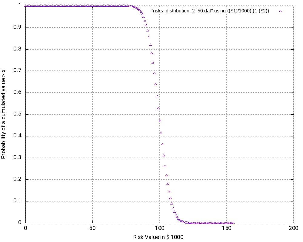
The file Risks_Opportunities.xlsx contains the input vector and the output of the convolution as well as some graphic visualizations in Excel. However, for large output values, I do not recommend to process or visualize them in Excel, but instead, I recommend to use gnuplot for the visualization. The images below show the probability density distribution as well as (1 – probability distribution) as graphs generated with gnuplot.
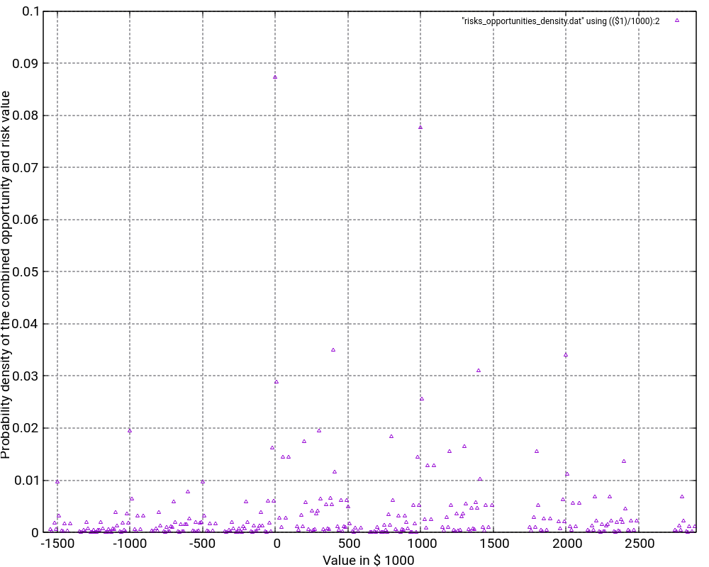
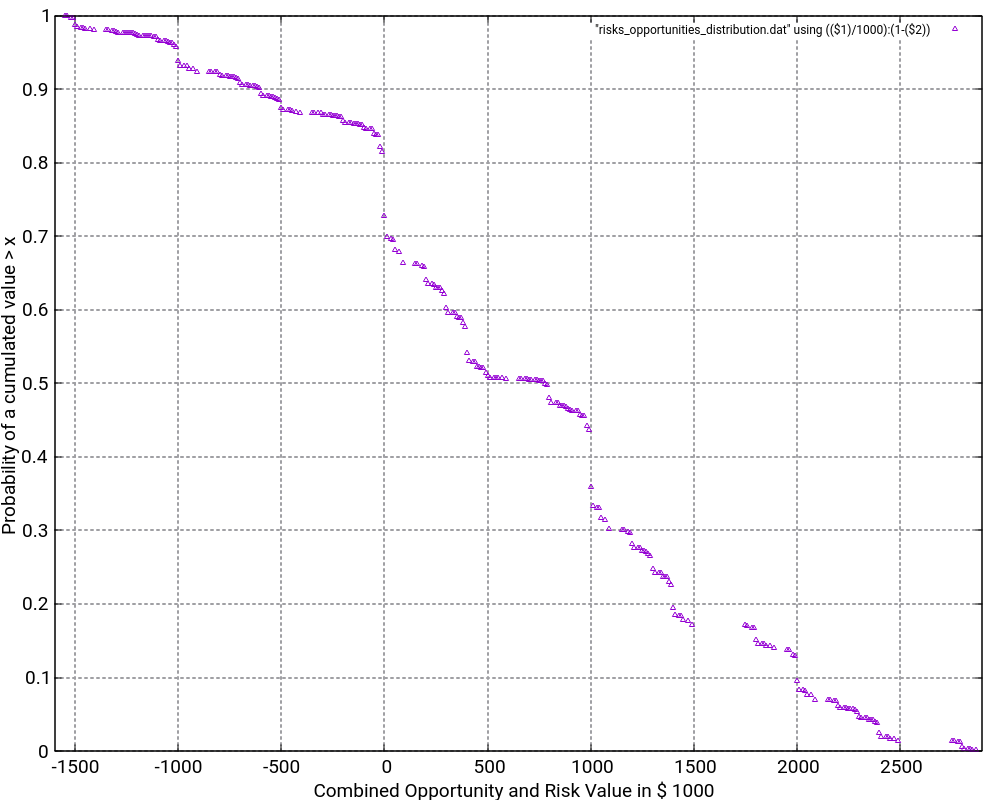
What is the purpose of the (1 – Probability distribution) graph? The purpose is to answer the question: “What is the probability that the damage value is higher as x?”
Let’s look what the probability of a damage value of more than 1,000,000 € is? In order to do so, we locate “1000” on the x-axis and go vertically up until we reach the graph. Then, we branch to the left and read the corresponding value on the y-axis. In our case, that would be something like 36%. This means that there is a probability of 36% that thus project experiences a damage of more than 1,000,000 €. This is quite a notable risk, something which one would probably not guess by just looking at the expected damage value of 1,026,000 € listed in the Excel table.
And even damage values of more than 2,000,000 € can still occur with some 10% of probability.
The graph would always start relatively on the top left and finish on the bottom right. Note that the graph does not start at 1.0 because there is a small chance that the most negative value (no risks, but the maximum of the opportunities realized) happens. However, the graph reaches the x-axis at the most positive value. Therefore, it is important asking the question “What is the probability that the damage value is higher than x?” rather than asking the question “What is the probability that the damage value is than x or higher?” The second question is incorrect although the difference might be minimal when many risks and opportunities are used as input.
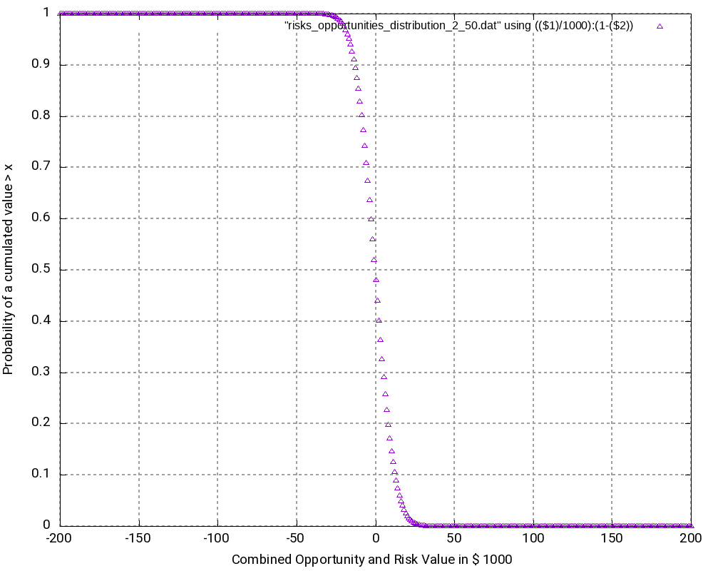
Example 2: Many binary risks and opportunities of the same value
This example is not a real one, but it shall help us to understand the theory behind the algorithm. In this example, we have 200 binary risks and 200 binary opportunities with a damage or benefit value of 1,000 € and a probability of occurrence of 50%.
# Risks have positive values indicating the damage values.
# Opportunities have negative values indicating the benefit values.

# START
    0   0.50
 1000   0.50
# STOP

# START
    0   0.50
-1000   0.50
# STOP
...
From this, we can already conclude that the outcomes are in the range [-200,000 €; +200,000 €] corresponding to the rare events “no risk materializes, but all opportunities materialize” respectively “no opportunity materializes, but all risks materialize”. As the example is simple in nature, we can also conclude immediately that the possibility of such an extreme outcome is
p = 0.5(200+200) = 3.87259*10-121
and that is really a very low probability. We might also guess that the outcome value zero would have a relatively high probability as we can expect this value to be reached by many different combinations of risks and opportunities.
When we look at the resulting probability density curve and the resulting probability distribution, we can see a bell-shaped curve in the probability density and the resulting S curve as the integration of the bell-shaped curve. While the curve resembles a Gaussian distribution, this is not the case in reality as our possible outcomes are bound by a lower negative value and an upper positive value whereas a strict Gaussian distribution has a probability (and be it minimal only) for any value on the x-axis.
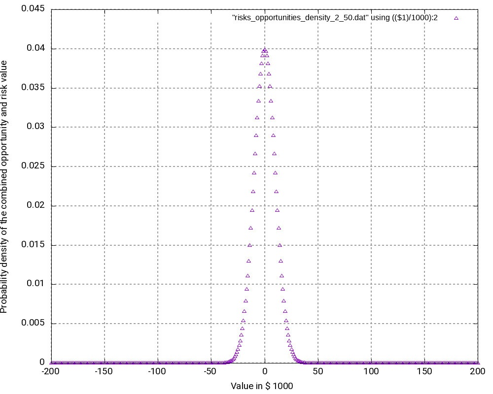
Let us have a closer look at some values in the output tables:
# Convolution Batch Processing Utility (only for demonstration purposes)
# The resulting probability density vector is of size: 401
# START
   -200000   0.0000000000000000
   -199000   0.0000000000000000
...
     -2000   0.0390817747440756
     -1000   0.0396709472276547
         0   0.0398693019637929
      1000   0.0396709472276547
      2000   0.0390817747440756
...
    199000   0.0000000000000000
    200000   0.0000000000000000
# STOP

# The probability values are:
   -200000   0.0000000000000000
   -199000   0.0000000000000000
...
     -2000   0.4403944017904490
     -1000   0.4800653490181037
         0   0.5199346509818966
      1000   0.5596055982095512
      2000   0.5986873729536268
...
    199000   0.9999999999999996
    200000   0.9999999999999996
The following observations can be made:
- The most negative outcome (-200,000 €) and the most positive outcome (+200,000 €) can only be reached in one constellation and have, as calculated above, minimal probability of occurrence. Therefore, the probability density vector shows all zero in the probability.
- The outcome 0 has the highest probability of all possible outcomes (3.99%), and outcomes close to 0 have a similarly high probability. Hence, it is very probable that the overall outcome of a project with this (artificially constructed) risk and opportunity pattern is around 0.
- It may astonish at first that in the probability distribution (not the probability density), the value 0 is attributed to a probability of 51.99% rather than to 50.00%. However, we must keep in mind that the values in the probability distribution answer the question: “What is the probability that the outcome is > x?” and not “… ≥ x?” That makes the difference.
- At the upper end of the probability distribution (+200,000 €), we would expect the probability to be 1.0 rather than a value below that. However, here, the limited resolution of even double variables in C result in the fact that errors in the precision of arithmetic results add up. This might be improved by using long double as probability variable.
Example 3
The third example is similar to the second one, but it only contains risks, that is, we leave away all opportunities from the second example. Consequently, outcomes (damages) lie in the interval [0; +200,000 €]. The outcomes at the edges of the interval have the lowest probability of occurrence, in this case:
p = 0.5200 = 6.22302*10-61
While this probability of occurrence is much higher than the one for the edge values in Example 2, it is still very low.
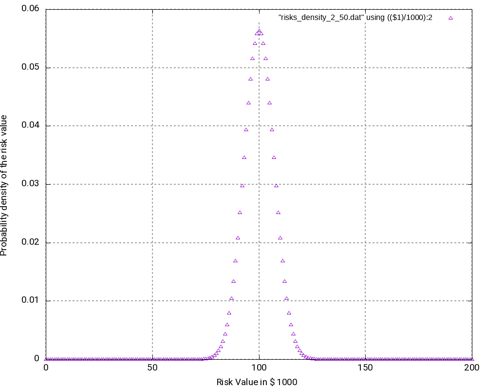
As we can see (and this could be expected somewhat), the most probably outcome now is a damage of +100,000 €, again the value in the middle of the interval which now has a probability of occurrence of 5.63% (higher than in the second example). While the curves in the second and in the third example look very similar, the curves are “steeper” in the third example.
# Convolution Batch Processing Utility (only for demonstration purposes)
# The resulting probability density vector is of size: 201
# START
         0   0.0000000000000000
      1000   0.0000000000000000
...
     99000   0.0557905732764915
    100000   0.0563484790092564
    101000   0.0557905732764915
...
    199000   0.0000000000000000
    200000   0.0000000000000000
# STOP

# The probability values are:
         0   0.0000000000000000
      1000   0.0000000000000000
...
     99000   0.4718257604953718
    100000   0.5281742395046283
    101000   0.5839648127811198
...
    199000   1.0000000000000002
    200000   1.0000000000000002
Conclusion
This blog post shows that with the help of the algorithm faltung4.c, it has become possible to computer probability densities and probability distributions of combined risks and opportunities and answer valid and important questions with respect to the project risk and the monetary reserves (aka “management reserve”) that should be attributed to a project with a certain portfolio of risks and opportunities.
Outlook
The algorithm may be enlarged so that it can accommodate start and finish dates of risks and opportunities. In this case, probability densities and probability distributions can be computed for any point in time that changes the portfolio of risks and opportunities due to the start or finish of a risk or opportunity. In this case, the graphs will become 3-dimensional and look somewhat like a “mountain area”. This would have relevance in the sense that some projects might start heavily on the risky side and opportunities might only become available later. For such projects, there is a real chance that materialized risks result in a large cash outflow which later is then partially compensated by materialized opportunities.
Sources
- [1] = Balancing project risks and opportunities
- [2] = Project opportunity – risk sink or risk source?
Files
- Risks_Opportunities.xlsx contains the example table as well as the result tables of the analysis, graphs and some scripting commands.
- faltung4.c contains the C program code that was used for the analysis.
- Example 1:
- risks_opportunities_input.dat is the input table.
- risks_opportunities_output.dat is the output table which contains the probability density and the probability distribution.
- risks_opportunities_density.dat is the output table containing the probability density only.
- risks_opportunities_density.png is a graphic visualization of the probability density with gnuplot.
- risks_opportunities_distribution.dat is the output table containing the probability distribution only.
- risks_opportunities_distribution.png is a graphic visualization of (1 – probability distribution) with gnuplot.
- Example 2:
- risks_opportunities_input_2_50.dat is the input table.
- risks_opportunities_output_2_50.dat is the output table which contains the probability density and the probability distribution.
- risks_opportunities_density_2_50.dat is the output table containing the probability density only.
- risks_opportunities_density_2_50.png is a graphic visualization of the probability density with gnuplot.
- risks_opportunities_distribution_2_50.dat is the output table containing the probability distribution only.
- risks_opportunities_distribution_2_50.png is a graphic visualization of (1 – probability distribution) with gnuplot.
- Example 3:
- risks_input_2_50.dat is the input table.
- risks_output_2_50.dat is the output table which contains the probability density and the probability distribution.
- risks_density_2_50.dat is the output table containing the probability density only.
- risks_density_2_50.png is a graphic visualization of the probability density with gnuplot.
- risks_distribution_2_50.dat is the output table containing the probability distribution only.
- risks_distribution_2_50.png is a graphic visualization of (1 – probability distribution) with gnuplot.
Usage
Scripts and sequences indicating how to use the algorithm faltung4.c can be found in the table Risks_Opportunities.xlsx on the tab Commands and Scripts. Please follow these important points:
- The input file which represents n-ary risks and n-ary opportunities as well as their probabilities of occurrence, has to follow a certain structure which is hard-coded in the algorithm faltung4.c. A risk or opportunity is always enclosed in the tags # START and # STOP.
- Lines starting with “#” are ignored as are empty lines.
- The probabilities of occurrence of an n-ary risk or an n-ary opportunity must sum up to 1.0.
- The C code can be compiled with a standard C compiler, e.g., gcc, with the sequence:
gcc -o faltung4.exe faltung4.c- The input file is computed and transformed into an output file with the sequence:
cat input_file.dat | ./faltung4.exe > output_file.dat- The output file consists of two parts:
- a resulting probability density which has the same structure as the input file (with the tags # START and # STOP)
- a resulting probability distribution
- In order to post-process the output, e.g., with gnuplot, you can help yourself with standard Unix tools like head, tail, wc, cat, etc.
- The output file is structured in a way so that it can be easily used for visualizations with gnuplot.
Disclaimer
- The program code and the examples are for demonstration purposes only.
- The program shall not be used in production environments.
- While the program code has been tested, it might still contain errors.
- Due to rounding errors with float variables, you might experience errors depending on your input probability values when reading the input vector.
- The program code has not been optimized for speed.
- The program code has not been written with cybersecurity aspects in mind.
- This method of risk and opportunity assessment does not consider that risks and opportunities in projects might have different life times during the project, but assumes a view “over the whole project”. In the extreme case, for example, that risks are centered at the beginning and opportunities are centered versus the end of a project, it might well be possible that the expected damage/benefit of the overall project is significantly exceeded or significantly subceeded.
Financial Risk Calculation
Problem Statement
We now build up on our knowledge from the blog entry Delay Propagation in a Sequential Task Chain and use the knowledge as well as the C code that was developed in that blog post in order to tackle a problem from project risk management. We want to examine which outcomes are possible based on a set of risks and their possible monetary impact on our project. The assumption in our example is though that all risks are independent from each other.
The questions we are going to ask are of the type:
- What is the probability that our overall damage is less than x €?
- What is the probability that our overall damage is higher than x €?
- …
Source Data
We use the following risks below. Different from traditional risk tables, we do not have only 2 outcomes per risk (“Risk does not materialize.” and “Risk materializes.”), but we have an n-ary discrete outcome for each risk (“Risk does not materialize.”, “Risk materializes with damage A and probability a%”, “Risk materializes with damage B and probability b%”, …). This allows a finer grained monetary allocation of each risk.
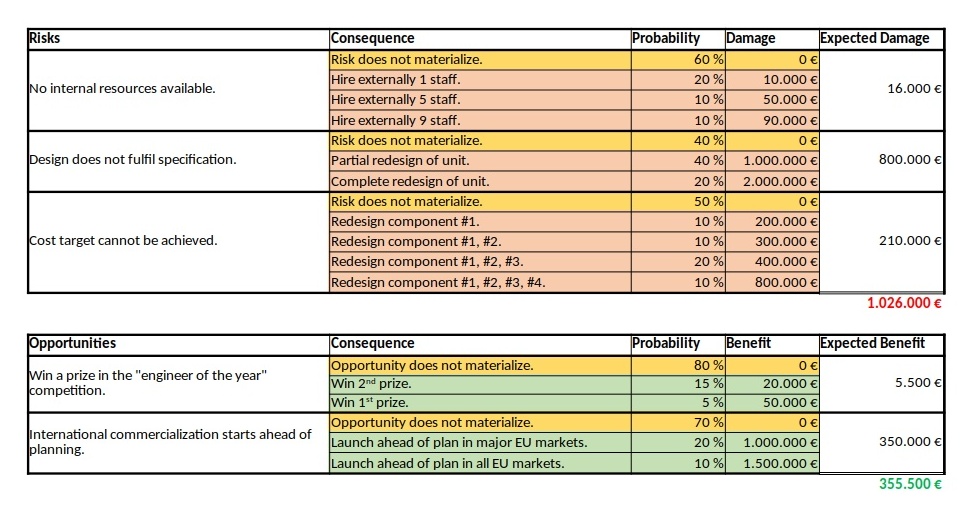
| Risk | Consequence | Probability | Damage | Expected Damage |
| No internal resources available. | Risk does not materialize. | 60% | 0 € | 16.000 € |
| Hire external 1 staff. | 20% | 10.000 € | ||
| Hire external 5 staff. | 10% | 50.000 € | ||
| Hire external 9 staff. | 10% | 90.000 € | ||
| Design does not fulfil specification. | Risk does not materialize. | 40% | 0 € | 800.000 € |
| Partial redesign of unit. | 40% | 1.000.000 € | ||
| Complete redesign of unit. | 20% | 2.000.000 € | ||
| Cost target cannot be achieved. | Risk does not materialize. | 60% | 0 € | 210.000 € |
| Redesign component #1. | 10% | 200.000 € | ||
| Redesign component #1, #2. | 10% | 300.000 € | ||
| Redesign component #1, #2, #3. | 20% | 400.000 € | ||
| Redesign component #1, #2, #3, #4. | 10% | 800.000 € |
We can calulate that the expected value of the damage is 1,026,000 € by adding up the expected damages of the individual, independent risks.
Solution
Our approach will use the discrete convolution and take leverage of the C file faltung.c. However, in contrast to the example in the blog entry Delay Propagation in a Sequential Task Chain, we face the problem that our possible outcomes (the individual damage values) are a few discrete values spread over a large interval. Hence, the program faltung.c. must be modified unless we want to eat up the whole system memory with unnecessarily large arrays of float numbers. Therefore, the upgraded version (faltung2.c) uses a struct to capture our input and output vectors, and the modified sub-routine convolution() iterates through all possible combinations of input vectors and stores the resulting struct elements in the output vector. We also need a helper funtion that checks if a struct with a certain damage value already exists (function exists()). We do not sort our output vector until before printing it out where we use qsort() in connection with compare_damage() to get an output with increasing damage values. In addition to the probability distribution, we now generate values for a probability curve (accumulated probabilities) which will help us to answer the questions of the problem statement.
Our input values now are reflected in 3 input vectors in the file input_monetary.dat and looks like this:
# START
0 0.6
10000 0.20
50000 0.10
90000 0.10
# STOP
# START
0 0.4
1000000 0.40
2000000 0.20
# STOP
# START
0 0.5
200000 0.1
300000 0.1
400000 0.2
800000 0.1
# STOP
When we evaluate this input with our C program, we get the following output:
# The resulting propability density vector is of size: 60
# START
0 0.1200
10000 0.0400
50000 0.0200
90000 0.0200
200000 0.0240
210000 0.0080
250000 0.0040
290000 0.0040
300000 0.0240
310000 0.0080
350000 0.0040
390000 0.0040
400000 0.0480
410000 0.0160
450000 0.0080
490000 0.0080
800000 0.0240
810000 0.0080
850000 0.0040
890000 0.0040
1000000 0.1200
1010000 0.0400
1050000 0.0200
1090000 0.0200
1200000 0.0240
1210000 0.0080
1250000 0.0040
1290000 0.0040
1300000 0.0240
1310000 0.0080
1350000 0.0040
1390000 0.0040
1400000 0.0480
1410000 0.0160
1450000 0.0080
1490000 0.0080
1800000 0.0240
1810000 0.0080
1850000 0.0040
1890000 0.0040
2000000 0.0600
2010000 0.0200
2050000 0.0100
2090000 0.0100
2200000 0.0120
2210000 0.0040
2250000 0.0020
2290000 0.0020
2300000 0.0120
2310000 0.0040
2350000 0.0020
2390000 0.0020
2400000 0.0240
2410000 0.0080
2450000 0.0040
2490000 0.0040
2800000 0.0120
2810000 0.0040
2850000 0.0020
2890000 0.0020
# STOP
0 0.1200
10000 0.1600
50000 0.1800
90000 0.2000
200000 0.2240
210000 0.2320
250000 0.2360
290000 0.2400
300000 0.2640
310000 0.2720
350000 0.2760
390000 0.2800
400000 0.3280
410000 0.3440
450000 0.3520
490000 0.3600
800000 0.3840
810000 0.3920
850000 0.3960
890000 0.4000
1000000 0.5200
1010000 0.5600
1050000 0.5800
1090000 0.6000
1200000 0.6240
1210000 0.6320
1250000 0.6360
1290000 0.6400
1300000 0.6640
1310000 0.6720
1350000 0.6760
1390000 0.6800
1400000 0.7280
1410000 0.7440
1450000 0.7520
1490000 0.7600
1800000 0.7840
1810000 0.7920
1850000 0.7960
1890000 0.8000
2000000 0.8600
2010000 0.8800
2050000 0.8900
2090000 0.9000
2200000 0.9120
2210000 0.9160
2250000 0.9180
2290000 0.9200
2300000 0.9320
2310000 0.9360
2350000 0.9380
2390000 0.9400
2400000 0.9640
2410000 0.9720
2450000 0.9760
2490000 0.9800
2800000 0.9920
2810000 0.9960
2850000 0.9980
2890000 1.0000
The second problem statement (“What is the probability that our overall damage is higher than x €?”) is determined with the same approach. However, rather than directly using the value on the axis Accumulated Probability, we have to subtract that one from 1.00. The result is then the probability that the resulting damage is higher than x.

Downloads and Hints
- You can download the source code of faltung2.c from https://caipirinha.spdns.org/~gabriel/Blog/faltung2.c. The source code is in Unix format, hence no CR/LF, but only LF. It can be compiled with gcc -o {target_name} faltung2.c. The C program is a demonstration only; no responsibility is assumed for damages resulting from its usage.
- The sample input file input_monetary.dat is available at https://caipirinha.spdns.org/~gabriel/Blog/input_monetary.dat and can be read with a standard text editor. If is also in Unix format (only LF).
- The Excel tables and visualizations are available at https://caipirinha.spdns.org/~gabriel/Blog/PM%20Blog%20Tables.xlsx.
Delay Propagation in a Parallel Task Chain
Problem Statement
Similar to the last blog, we now want to examine how delays in parallel tasks propagate if we have a discrete and non-binary probabilistic pattern of delay for each involved task. We will assume to have reached our milestone if each task has been completed. We take the same example tasks as yesterday, but now, they are in parallel:
Source Data
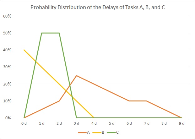
In our example, we have 3 tasks, named “A”, “B” and “C”, and their respective durations is distributed according to the table and the graph below:
| Duration | 0 d | 1 d | 2 d | 3 d | 4 d | 5 d | 6 d | 7 d | 8 d | 9 d | 10 d | 11 d | 12 d | 13 d | 14 d | 15 d | 16 d | 17 d | 18 d | 19 d | 20 d | |
| A | 0% | 0% | 0% | 0% | 0% | 0% | 0% | 0% | 0% | 0% | 0% | 5% | 10% | 25% | 20% | 15% | 10% | 10% | 5% | 0% | 0% | 100% |
| B | 0% | 0% | 0% | 0% | 0% | 0% | 0% | 0% | 0% | 0% | 40% | 30% | 20% | 10% | 0% | 0% | 0% | 0% | 0% | 0% | 0% | 100% |
| C | 0% | 0% | 0% | 0% | 0% | 0% | 50% | 50% | 0% | 0% | 0% | 0% | 0% | 0% | 0% | 0% | 0% | 0% | 0% | 0% | 0% | 100% |
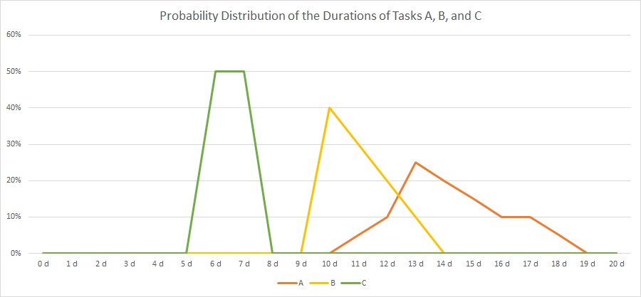 As you can see, there is not a fixed duration for each task as we have that in traditional project management. Rather than that, there are several possible outcomes for each task with respect to the real duration, and the probability of the outcome is distributed as in the graph above. The area below each graph will sum up to 1 (100%) for each task.
If we assume these distributions, how does the probability distribution of our milestone outcome look like?
Solution
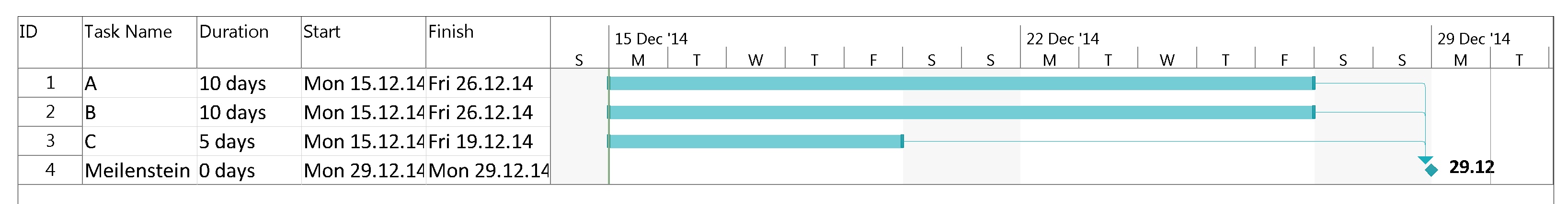
If we consider our milestone to be reached when all tasks have been completed, that is, when A, B, and C have been completed, then it becomes obvious that the distribition of task C has no influence at all. Even after 8 days when C has been completed with 100% certainty, there is no chance that either A or B will have started ever. The earliest day when our milestone could happen is on day 11 because this is the first day when there is a slight chance that A could be completed.
On the other side, on day 19, all tasks have been completed with 100% certainty, and hence by then, the milestone will have been reached for sure.
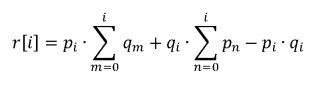
The correct mathematical approach in order to compute the resulting distribution is, for 2 tasks:
In order to facilitate our work and enable us to compute many parallel tasks, we use a C program named parallel.c which processes an input file of probability distributions in a certain format:
- Each description of a probability distribution of a task begins with a statement named # START
- Each description of a probability distribution of a task ends with a statement named # STOP
- Lines with comments must start with a #
- Empty lines are ignored.
- Data lines have an integer value, at least one white space and then a probability. This format can also be used for visualizations with gnuplot.
- The sum of probabilities for each task must add up to 1.00 (= 100%).
- Probability distributions for several tasks can be combined in one input file.
- The output file which the C file parallel.c will generate has the same syntax and can therefore be used as input file for further calculations.
The program parallel.c will compute 2 input vectors at a time and then use the result cor computation with the third, fourth, etc. input vector.
In the example, we use the input:
# START
11 0.05
12 0.10
13 0.25
14 0.20
15 0.15
16 0.10
17 0.10
18 0.05
# STOP
10 0.40
11 0.30
12 0.20
13 0.10
# STOP
6 0.50
7 0.50
# STOP
# The resulting vector is of size: 19
# START
0 0.0000
1 0.0000
2 0.0000
3 0.0000
4 0.0000
5 0.0000
6 0.0000
7 0.0000
8 0.0000
9 0.0000
10 0.0000
11 0.0350
12 0.1000
13 0.2650
14 0.2000
15 0.1500
16 0.1000
17 0.1000
18 0.0500
# STOP
which is shown in the table and the graph below:
| Duration | 10 d | 11 d | 12 d | 13 d | 14 d | 15 d | 16 d | 17 d | 18 d | 19 d | 20 d | |
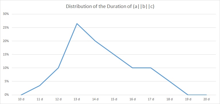
| (a||b||c) | 0,00% | 3,50% | 10,00% | 26,50% | 20,00% | 15,00% | 10,00% | 10,00% | 5,00% | 0,00% | 0,00% | 100% |
Downloads and Hints
- You can download the source code of parallel.c from https://caipirinha.spdns.org/~gabriel/Blog/parallel.c. The source code is in Unix format, hence no CR/LF, but only LF. It can be compiled with gcc -o {target_name} parallel.c. The C program is a demonstration only; no responsibility is assumed for damages resulting from its usage. It contains, however, already an optimization for the computational effort.
- The sample input file is available at https://caipirinha.spdns.org/~gabriel/Blog/input_parallel.dat and can be read with a standard text editor. If is also in Unix format (only LF).
- The maximum length of the output vector is of size 100.
Delay Propagation in Sequential Task Chains
Problem Statement
Today, we want to examine how delays in sequential tasks propagate if we have a discrete and non-binary probabilistic pattern of delay for each involved task. That sounds quite complicated, but such problem statements do exist in real life. Let’s look into the source data…
Source Data
In our example, we have 3 tasks, named “A”, “B” and “C”, and their respective durations is distributed according to the table and the graph below:
| Duration | 0 d | 1 d | 2 d | 3 d | 4 d | 5 d | 6 d | 7 d | 8 d | 9 d | 10 d | 11 d | 12 d | 13 d | 14 d | 15 d | 16 d | 17 d | 18 d | 19 d | 20 d | |
| A | 0% | 0% | 0% | 0% | 0% | 0% | 0% | 0% | 0% | 0% | 0% | 5% | 10% | 25% | 20% | 15% | 10% | 10% | 5% | 0% | 0% | 100% |
| B | 0% | 0% | 0% | 0% | 0% | 0% | 0% | 0% | 0% | 0% | 40% | 30% | 20% | 10% | 0% | 0% | 0% | 0% | 0% | 0% | 0% | 100% |
| C | 0% | 0% | 0% | 0% | 0% | 0% | 50% | 50% | 0% | 0% | 0% | 0% | 0% | 0% | 0% | 0% | 0% | 0% | 0% | 0% | 0% | 100% |
As you can see, there is not a fixed duration for each task as we have that in traditional project management. Rather than that, there are several possible outcomes for each task with respect to the real duration, and the probability of the outcome is distributed as in the graph above. The area below each graph will sum up to 1 (100%) for each task.
If we assume these distributions, how does the probability distribution of sequence of tasks A, B, C look like?
Solution
Level the durations
In a first approach, we define a minimum duration for each tasks. This is not mandatory, but it helps us to reduce the memory demand in our algorithm that we will use in a later stage. While we can define any minimum duration from zero to the first non-zero value of the probability distribution, we set them in our example to:
- A: tmin = 10 days
- B: tmin = 10 days
- C: tmin = 5 days (Keep in mind that here, we could also have selected 6 days, for example.)
That approach simply serves to level out tasks with large differences in their minimum duration, it is not necessary for the solution that is described below.
If we do so, then our overall minimum duration is 25 days then which we shall keep in mind right now. We now subtract the minimum duration from each task and get the values in the table and the graph below:
| Delay | 0 d | 1 d | 2 d | 3 d | 4 d | 5 d | 6 d | 7 d | 8 d | 9 d | |
| A | 0% | 5% | 10% | 25% | 20% | 15% | 10% | 10% | 5% | 0% | 100% |
| B | 40% | 30% | 20% | 10% | 0% | 0% | 0% | 0% | 0% | 0% | 100% |
| C | 0% | 50% | 50% | 0% | 0% | 0% | 0% | 0% | 0% | 0% | 100% |
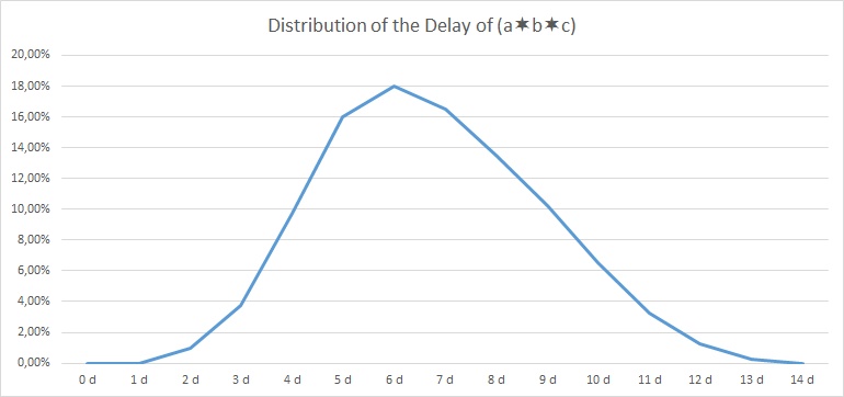
Discrete Convolution
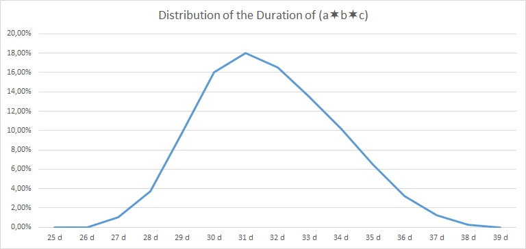
In order to compute the resulting probability distribution, we use the discrete convolution of the probability distributions of tasks A, B, and C, that is: (a∗b∗c). As the discrete convolution is computed as a sum of multiplications, we actually first compute (a∗b) and then convolute the result with c, that is we do ((a∗b)∗c). In order to facilitate our work and enable us to compute sequences of many tasks, we use a C program named faltung.c which processes an input file of probability distributions in a certain format:
- Each description of a probability distribution of a task begins with a statement named # START
- Each description of a probability distribution of a task ends with a statement named # STOP
- Lines with comments must start with a #
- Empty lines are ignored.
- Data lines have an integer value, at least one white space and then a probability. This format can also be used for visualizations with gnuplot.
- The sum of probabilities for each task must add up to 1.00 (= 100%).
- Probability distributions for several tasks can be combined in one input file.
- The output file which the C file faltung.c will generate has the same syntax and can therefore be used as input file for further calculations.
In the example, we use the input:
# START
0 0.00
1 0.05
2 0.10
3 0.25
4 0.20
5 0.15
6 0.10
7 0.10
8 0.05
# STOP
0 0.40
1 0.30
2 0.20
3 0.10
# STOP
0 0.00
1 0.50
2 0.50
# STOP
and get the following result:
# The resulting vector is of size: 14
# START
0 0.0000
1 0.0000
2 0.0100
3 0.0375
4 0.0975
5 0.1600
6 0.1800
7 0.1650
8 0.1350
9 0.1025
10 0.0650
11 0.0325
12 0.0125
13 0.0025
# STOP
| Delay | 0 d | 1 d | 2 d | 3 d | 4 d | 5 d | 6 d | 7 d | 8 d | 9 d | 10 d | 11 d | 12 d | 13 d | 14 d | |
| (a∗b∗c) | 0,00% | 0,00% | 1,00% | 3,75% | 9,75% | 16,00% | 18,00% | 16,50% | 13,50% | 10,25% | 6,50% | 3,25% | 1,25% | 0,25% | 0,00% | 100% |
Downloads and Hints
- You can download the source code of faltung.c from https://caipirinha.spdns.org/~gabriel/Blog/faltung.c. The source code is in Unix format, hence no CR/LF, but only LF. It can be compiled with gcc -o {target_name} faltung.c. The C program is a demonstration only; no responsibility is assumed for damages resulting from its usage.
- The sample input file is available at https://caipirinha.spdns.org/~gabriel/Blog/input_faltung.dat and can be read with a standard text editor. If is also in Unix format (only LF).
- The maximum delay of the output vector is 99.
Sensitivity Analysis for Business Cases
Sensitivity Analysis
-
sales price
-
sales numbers
-
material cost
-
development cost
1-Dimensional Sensitivity Analysis

From the graph shown above, we can already get some important insights with respect to our example business case:
- The sales price has the largest influence on the resulting NPV. If sales prices drop by 5% only, our project does not add any more value to the business. Therefore, we must make sure that:
- our estimation of the sales price is as good as possible and not “inflated”
- we develop suitable countermeasures in case the sales price drops in the market
- The sales numbers and the development cost have less influence on the NPV; hence they are not our first concern.
2-Dimensional Sensitivity Analysis
Now, we will change two input variables at a time and leave the others constant (ceteris paribus). The tables for these investigations are listed on the sheet Scenario Analysis (2D). In additional to the overall monetary values of the NPV, the relative increments and decrements in % have been listed in tables on the right side of the respective scenario. I tried to visualize the result in Excel, but I found the related Excel graphics not very adequate. With the open-source tool gnuplot, it is however possible to create meaningful graphs. I am a novice with this tool and certainly, more elaborate visualizations are possible. Nevertheless, for a first interpretation, heat maps and contour lines serve the purpose. In order to create them, I had to transpose the tables into formats as shown on the sheet Scenario Analysis (2D), gnuplot. Furthermore, I had to use the setup commands listed on the sheet Init gnuplot in order to make gnuplot output the graphs below.

The graphs show heat maps with contour lines, and I believe that this is a good visualization for a 2-D sensitivity analysis although initially, it might take a while to familiarize yourself with this kind of visualization. The areas with green colour represent areas in which the NPV is better than in our base estimation, the areas with red colour represent areas in which the NPV is worse than in our initial base estimation. Each graph also has a contour lines which is labeled “0” in the legend, and this contour line represents combinations of the input variables where the NPV is the same than in our base estimation.
From the tables on the sheet Scenario Analysis (2D) and the graphs, we can get additional insight which is not accessible in the 1-D sensitivity analysis. We can draw the following conclusions, for example:
- If an increase in the sales price leads to a drop of the sales numbers of less than 15%, we still get a higher NPV than in our base estimation. If the price elasticity of our product warrants that move, then we should definitively go for it!
- If the development of additional features can yield a 10% increase of the sales price, we can easily spend 30% more development budget on those features.
- We can easily spend 25% more development budget if that additional development effort results in a 10% lower material cost.
3-Dimensional Sensitivity Analysis
I expect that with virtual reality gear like Oculus Rift, we might very soon be able to move ahead and create a visualization like a room that is filled with a coloured gas. By moving through that room and moving you head in the vertical, you might be able to explore that room in three dimensions. Similarly to the added insight that we gained while moving from a 1-D sensitivity analysis to a 2-D sensitivity analysis, we might find yet more additional insight.
Outlook
Clearly, heat maps with contour lines offer valuable insight in business cases, especially if we limit the heat maps to visualizations of those input variables that have proven to have the largest impact in the 1-D sensitivity analysis. In our business case example, the underlying formula for the NPV is simple which is reflected in the slightly curved or straight contour lines of the graphs. In more complicated business cases or in different applications, we might expect different and non-linear behaviours that then would result in more complicated heat maps and contour lines. We might find, for example that there can be a local minimum (a red-coloured spot) in our heat map which would then mean that we have a found a combination of our input variables that we must avoid under all circumstances, similar to a cliff in the ocean where we have to ship around. This would be visible immediately in the heat map. However, mathematically, we can even find such “cliffs” in an n-dimensional sensitivity analysis using multi-variable calculus although we are not able to “visualize” that in our mind. Such approaches might delivers us insight into dangerous or unfortunate combinations of input variables that other methods might not offer.