Grafana Visualizations (Part 1)
Executive Summary
In this article, we do first steps into visualizations in Grafana of data stored in a MariaDB database and draw conclusions from the visualizations. In this case, we look at meaningful data from solar power generation.
Preconditions
In order to use the approach described here, you should:
- … have access to a Linux machine or account
- … have a MySQL or MariaDB database server installed, configured, up and running
- … have a populated MySQL or MariaDB database like in our example to which you have access
- … have the package Grafana [2] installed, configured, up and running
- … have some basic knowledge of how to operate in a Linux environment and some basic understanding of shell scripts
Description and Usage
The base for the following visualizations is a fully populated database of the following structure:
# Datenbank für Analysen der Solaranlage
# V1.1; 2023-12-10, Gabriel Rüeck <gabriel@rueeck.de>, <gabriel@caipirinha.spdns.org>
# Delete existing databases
REVOKE ALL ON solaranlage.* FROM 'gabriel';
DROP DATABASE solaranlage;

# Create a new database
CREATE DATABASE solaranlage DEFAULT CHARSET utf8mb4 COLLATE utf8mb4_general_ci;
GRANT ALL ON solaranlage.* TO 'gabriel';
USE solaranlage;
SET default_storage_engine=Aria;

CREATE TABLE anlage          (uid            INT UNSIGNED NOT NULL PRIMARY KEY AUTO_INCREMENT,\
                              zeitstempel    TIMESTAMP NOT NULL DEFAULT CURRENT_TIMESTAMP,\
                              leistung       INT UNSIGNED DEFAULT NULL,\
energie INT UNSIGNED DEFAULT NULL);[1] explains how such a database can be filled with real-world data using smart home devices whose data is then stored in the database. For now, we assume that the database already is fully populated and contains large amount of data of the type:
MariaDB [solaranlage]> SELECT * FROM anlage LIMIT 20;
+-----+---------------------+----------+---------+
| uid | zeitstempel         | leistung | energie |
+-----+---------------------+----------+---------+
|   1 | 2023-05-02 05:00:08 |        0 | 5086300 |
|   2 | 2023-05-02 05:15:07 |        0 | 5086300 |
|   3 | 2023-05-02 05:30:07 |        0 | 5086300 |
|   4 | 2023-05-02 05:45:07 |        0 | 5086300 |
|   5 | 2023-05-02 06:00:07 |        0 | 5086300 |
|   6 | 2023-05-02 06:15:07 |    12660 | 5086301 |
|   7 | 2023-05-02 06:30:07 |    39830 | 5086307 |
|   8 | 2023-05-02 06:45:08 |    44270 | 5086318 |
|   9 | 2023-05-02 07:00:07 |    78170 | 5086333 |
|  10 | 2023-05-02 07:15:07 |   187030 | 5086367 |
|  11 | 2023-05-02 07:30:07 |   312630 | 5086424 |
|  12 | 2023-05-02 07:45:08 |   665900 | 5086556 |
|  13 | 2023-05-02 08:00:07 |   729560 | 5086733 |
|  14 | 2023-05-02 08:15:08 |   573700 | 5086889 |
|  15 | 2023-05-02 08:30:07 |   288030 | 5086985 |
|  16 | 2023-05-02 08:45:07 |   444170 | 5087065 |
|  17 | 2023-05-02 09:00:08 |   655880 | 5087217 |
|  18 | 2023-05-02 09:15:07 |   974600 | 5087476 |
|  19 | 2023-05-02 09:30:08 |  1219150 | 5087839 |
|  20 | 2023-05-02 09:45:07 |   772690 | 5088024 |
+-----+---------------------+----------+---------+
20 rows in set (0,000 sec)
whereby the values in column leistung represent the current power generation in mW and the values in energy represent the accumulated energy in Wh.
Now we shall visualize the data of the solar power generation in Grafana. Grafana is powerful and mighty visualization tool with which you can create state-of-the-art dashboards and professional visualizations. I must really laude the team behind Grafana for making such a powerful tool free for personal and other usage (for details to their licenses und usage models, see Licensing | Grafana Labs).
Before you can use data from a MySQL database in Grafana, you have to set up MySQL as a data source in Connections. Remember that MySQL is one of many possible data sources for Grafana and so, you have to walk through the jungle of offered data sources and find the MySQL connection and set up your data source accordingly. On my server, both Grafana and MariaDB run on the same machine, so there is no need for encryption, etc. My setup simply looks like this:
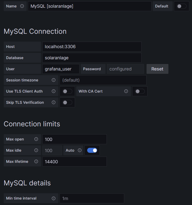
One step where I always stumble again is that in the entry mask for the connection setup, localhost:3306 is proposed in grey color as Host, but unless you type that in, too, Grafana will actually not use localhost:3306. So be sure to physically type that in.
Average Power per Month and Hour of the Day (I)
For this, we use the built-in Grafana visualization Table. We select the according database, and our MySQL query is:
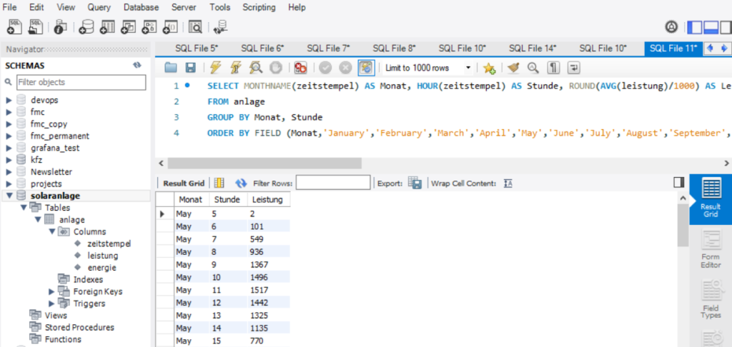
SELECT MONTHNAME(zeitstempel) AS Monat, HOUR(zeitstempel) AS Stunde, ROUND(AVG(leistung)/1000) AS Leistung
FROM anlage
GROUP BY Monat, Stunde
ORDER BY FIELD (Monat,'January','February','March','April','May','June','July','August','September','October','November','December'), Stunde ASC;
This query delivers us an ordered list of power values grouped and ordered by (the correct sequence of) month, and subsequently by the hour of the day as shown below:
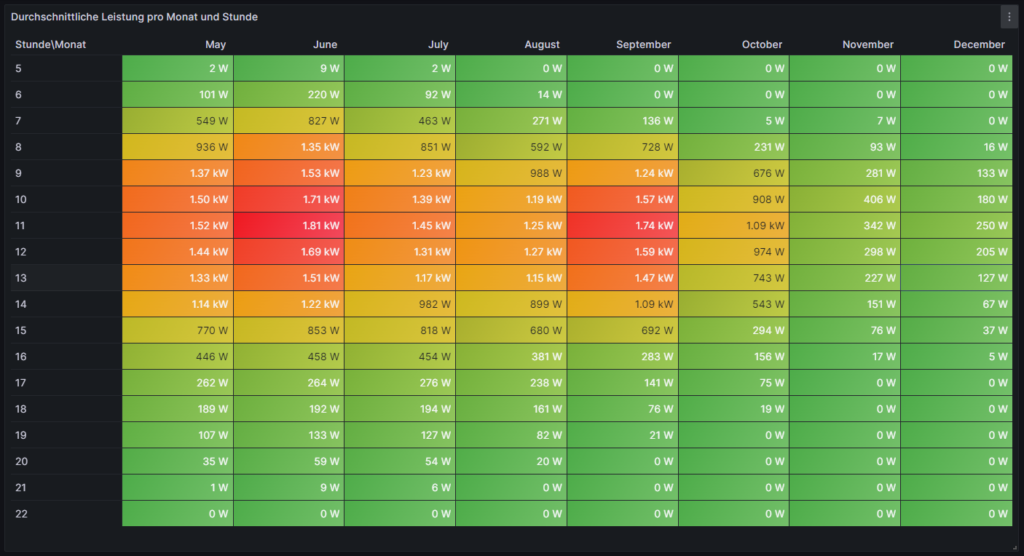
However, this is not enough to get the table view we want in Grafana as the power values are still one-dimensional (only one value per line). We need to transpose the table with respect to the months, and therefore, we must select the built-in transformation Grouping to Matrix for this visualization and enter our column names according to the image below:

Now, in order to get a beautiful visualization, we need to adjust some of the panel options, and those are:
- Cell options → Cell type: Set to Colored background
- Standard options → Color scheme: Set to Green-Yellow-Red (by value)
and we need to define some Overrides:
- Override 1 → Fields with name: Select Stunde\Monat
- Override 1 → Cell options → Cell type: Set to Auto
- Override 2 → Fields with type: Select Number
- Override 2 → Standard options → Unit: Select Watt (W)
Then, ideally, you should see something like this:
Average Power per Month and Hour of the Day (II)
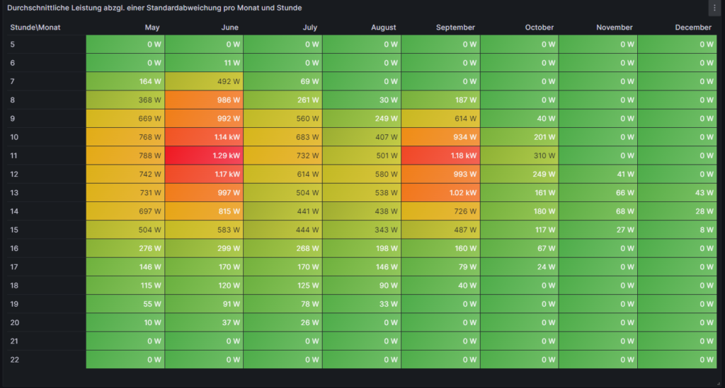
This visualization is similar to the one of the previous chapter. However, we slightly modify the MySQL query to:
SELECT MONTHNAME(zeitstempel) AS Monat, HOUR(zeitstempel) AS Stunde, ROUND(GREATEST((AVG(leistung)-STDDEV(leistung))/1000,0.0)) AS 'Ø-1σ'
FROM anlage
GROUP BY Monat, Stunde
ORDER BY FIELD (Monat,'January','February','March','April','May','June','July','August','September','October','November','December'), Stunde ASC;
Doing so, we assume that there is some reasonable normal distribution in the timeframe of one month among the values in the same hourly time interval which, strictly speaking, is not true. Further below, we will look into this assumption. Using this unproven assumption, if we subtract 1σ from the average power value and use the resulting value or zero (whichever is higher), then we come to a value where we can say: “Probably (84%), in this month and in this hour, we generate at least x watts of power.” So if someone was looking, for example, for an answer to the question on “When would be the best hour to start the washing machine and ideally use my solar energy for it?”, then, in June, this would be somewhen between 10:00…12:00, but in September, it might be 11:00…13:00, a detail which we might not have uncovered in the visualization of the previous chapter. Of course, you might argue that common sense (“Look out of the window and turn on the washing machine when the sun is shining.”) makes most sense, and that is true in our example. However, for automated systems that must run daily, such information might be valuable.
Heatmap of the Hourly and Daily Power Generation
For this, we use the plug-in Grafana visualization Hourly heatmap. We select the according database, and our MySQL query is very simple:
SELECT UNIX_TIMESTAMP(zeitstempel) AS time, ROUND(leistung/1000) AS power FROM anlage;This time, there is also no need for any transformation, but again, we should adjust some panel options in order to beautify our graph, and these are:
- Hourly heatmap → From: Set to 05:00
- Hourly heatmap → To: Set to 23:00
- Hourly heatmap → Group by: Select 60 minutes
- Hourly heatmap → Calculation: Select Mean
- Hourly heatmap → Color palette: Select Spectral
- Hourly heatmap → Invert color palette: (enabled)
- Legend → Gradient quality: Select Low (it already computes long enough in Low mode)
- Standard options → Unit: Select Watt (W)
Then, ideally, after some seconds, you should see something like this:

This visualization is time-consuming. Keep in mind that if you have large amounts of data, it might take several seconds until the graph build up. The Hourly Heatmap is also more detailed than the previous visualizations, and we can point with the mouse pointer on a certain rectangle and get to know the average power on this day and in this hour (if the database has at least one power value per hour). It even shows fluctuations occurring in one day only which might go unnoticed in the previous visualizations. We can realize, for example, that the lower average power which was generated in July this year was not because the sky is greyer in July than in other months, but that there were a few 2…3 days periods with clouded sky where the electricity generation dropped while other days were just perfectly sunny as in June or August. We can also see how the daylight hours dramatically decrease when we reach November.
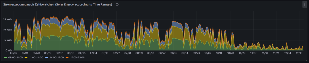
Daily Energy Generation, split into Time Ranges
The next graph shall visualize the daily energy generation of the solar system over the time, and we split the day into 4 time ranges (morning, lunch, afternoon, evening). The 4 time ranges are not equally large, so you have to pay close attention to the description of the time range. Of course, you can easily change the MySQL query and adapt the time ranges to your own needs. We use the built-in Grafana visualization Time Series. We select the according database, and our MySQL query uses the timestamp and the energy values of the dataset. We also use the uid as we calculate the differences in the (ever increasing) energy value between two consecutive value sets in the dataset.
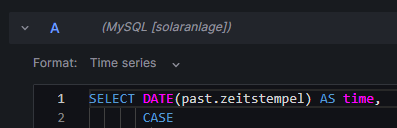
SELECT DATE(past.zeitstempel) AS time,
       CASE
         WHEN (HOUR(past.zeitstempel)<11) THEN '05:00-11:00'
         WHEN (HOUR(past.zeitstempel)>=11) AND (HOUR(past.zeitstempel)<14) THEN '11:00-14:00'
         WHEN (HOUR(past.zeitstempel)>=14) AND (HOUR(past.zeitstempel)<17) THEN '14:00-17:00'
         WHEN (HOUR(past.zeitstempel)>=17) THEN '17:00-22:00'
       END AS metric,
       SUM(IF(present.energie>=past.energie,IF((present.energie-past.energie<4000),(present.energie-past.energie),NULL),NULL)) AS value
FROM anlage AS present INNER JOIN anlage AS past ON present.uid=past.uid+1
GROUP BY time,metric;
In order to better understand the MySQL query, here are some explanations:
- We determine the time ranges in the form of a CASE statement in which we determine our time ranges and what shall be the textual output for a certain time range.
- We sum up the differences between consecutive energy values in the database over the respective time ranges. This is the task of the SUM operator.
- There might be missing energy values in the dataset, maybe because of network outages or (temporary) issues in the MySQL socket. The IF clauses inside the SUM operator help us to determine if the result of (present.energie-past.energie) would be negative (in case that present.energie is NULL) or if we have an unrealistic value (≥4000) because past.energie is NULL. Such values will be skipped in the calculation.
- We consult the same tables (anlage) two times, one time named as present and one time named as past whereby past the dataset immediately before present is.
- Keep in mind that as time we use the value of past.zeitstempel so that we include the last value that still fits into the time range (although for the calculation of the energy difference, present.zeitstempel would already be the next hour value, e.g.: (past.zeitstempel=16:45 and present.zeitstempel=17:00).
We furthermore should adjust some panel options in order to beautify our graph, and these are:
- Graph styles → Fill opacity: Set to 45%
- Graph styles → Stack Series: Select Normal
- Standard options → Unit: Select Watt-hour (Wh)
- Standard options → Min: Set to 0
- Standard options → Decimals: Set to 0
- Standard options → Color scheme: Select to Classic palette
On the left side, just above the code window, we have to switch from Table to Time Series:
The graph should now look like this:
There is one interesting characteristic of the built-in Grafana visualization Time Series which we make use of. If we edit the graph and select the Table view, we will see that Grafana automatically has created a matrix from the results of our MySQL query.
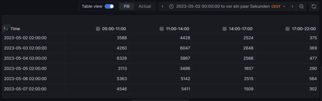
This is astonishing because the MySQL query does not create the matrix itself, but rather delivers an output like:
MariaDB [solaranlage]> SELECT DATE(past.zeitstempel) AS time,
    ->        CASE
    ->          WHEN (HOUR(past.zeitstempel)<11) THEN '05:00-11:00'
    ->          WHEN (HOUR(past.zeitstempel)>=11) AND (HOUR(past.zeitstempel)<14) THEN '11:00-14:00'
    ->          WHEN (HOUR(past.zeitstempel)>=14) AND (HOUR(past.zeitstempel)<17) THEN '14:00-17:00'
    ->          WHEN (HOUR(past.zeitstempel)>=17) THEN '17:00-22:00'
    ->        END AS metric,
    ->        SUM(IF(present.energie>=past.energie,IF((present.energie-past.energie<4000),(present.energie-past.energie),NULL),NULL)) AS value
    -> FROM anlage AS present INNER JOIN anlage AS past ON present.uid=past.uid+1
    -> GROUP BY time,metric
    -> LIMIT 15;
+------------+-------------+-------+
| time       | metric      | value |
+------------+-------------+-------+
| 2023-05-02 | 05:00-11:00 |  3588 |
| 2023-05-02 | 11:00-14:00 |  4428 |
| 2023-05-02 | 14:00-17:00 |  2524 |
| 2023-05-02 | 17:00-22:00 |   375 |
| 2023-05-03 | 05:00-11:00 |  4260 |
| 2023-05-03 | 11:00-14:00 |  6047 |
| 2023-05-03 | 14:00-17:00 |  2648 |
| 2023-05-03 | 17:00-22:00 |   369 |
| 2023-05-04 | 05:00-11:00 |  6326 |
| 2023-05-04 | 11:00-14:00 |  5867 |
| 2023-05-04 | 14:00-17:00 |  2568 |
| 2023-05-04 | 17:00-22:00 |   477 |
| 2023-05-05 | 05:00-11:00 |  3113 |
| 2023-05-05 | 11:00-14:00 |  3496 |
| 2023-05-05 | 14:00-17:00 |  1657 |
+------------+-------------+-------+
15 rows in set (0,197 sec)
I found out that this only works if metric is not a numerical value. For numerical values, the matrix would not be auto generated, the graph would not work like this. Maybe, an additional transformation in Grafana might then be necessary.
Detailed Examinations of the Dataset
Let us look closer to subsets of the dataset and visualize them, in order to get a better understanding of how the solar power generation behaves in reality at selected times.
Power Distribution between 12:00 and 13:00 (4 values per day)
For this, we use the built-in Grafana visualization Heatmap. We select the according database, and our MySQL query is:
SELECT zeitstempel AS time, ROUND(leistung/1000) AS 'Power' FROM anlage
WHERE (HOUR(zeitstempel)=12);
Keep in mind that in my dataset, I register 4 samples per hour in the database. This is defined by the frequency of how often the script described in [1] is executed, and this itself is defined in crontab. You can also have the script be executed every minute, and hence you will register 60 samples per hour in the database which will be more precise but put higher load on your server and on the evaluation of the data in MySQL queries. So, in my case, in the time frame [12:00-13:00], we consider 4 power values, and we filter for these power values simply by looking at timestamps with the value “12” as the hour part. The Heatmap will give the distribution of these 4 power values per day. We must furthermore adjust some panel options, and these are:
- Heatmap → X Bucket: Select Size and set to 24h
- Heatmap → Y Bucket: Select Size and set to Auto
- Heatmap → Y Bucket Scale: Select Linear
- Y Axis → Unit: Select Watt (W)
- Y Axis → Decimals: Set to 1
- Y Axis → Min value: Set to 0
- Colors → Mode: Select Scheme
- Colors → Scheme: Select Oranges
- Colors → Steps: Set to 64

With this Heatmap, we can immediately understand an important detail, and that is: If someone had the assumption that between [12:00-13:00], we generate a lot of power every day in summer, this would clearly be very wrong. In fact, we can recognize that the power generation varies from low to high values on many days. The reason is that even in summer, there are many cloudy days in the location where this solar power generator is located. This might not be true for a different location, and if we had data from Southern Europe (Portugal, Spain, Italy), this might look very different.
Average Power [12:00-13:00]
Now, we shall look at the average power generation between [12:00-13:00] over the year, using the 4 power values that we have register in this time interval every day. For this, we use the built-in Grafana visualization Time Series. We select the according database, and we use two MySQL queries (A and B). Both curves will then be visualized in the diagram with different colors. Our query A calculates the average value per day in the time interval [12:00-13:00] and is displayed in green color:
SELECT zeitstempel AS time, ROUND(AVG(leistung)/1000) AS 'Power [12:00-13:00]' FROM anlage
WHERE (HOUR(zeitstempel)=12)
GROUP BY DATE(zeitstempel);
Our query B takes a 7d average of the average values per day, it therefore is kind of a trend line of the curve we have generated with query A and is displayed in yellow color:
SELECT zeitstempel AS time, (SELECT ROUND(AVG(leistung)/1000) FROM anlage WHERE (HOUR(zeitstempel)=12) AND zeitstempel<=time AND zeitstempel>DATE_ADD(time,INTERVAL-7 DAY)) AS 'Power [12:00-13:00; 7d average]' FROM anlage
WHERE (DATE(zeitstempel)>='2023-05-09')
GROUP BY DATE(zeitstempel);
This graph visualizes the same finding as the previous heatmap. In my opinion, it even shows in a more dramatic way that the average power between [12:00-13:00] even during summer can vary dramatically, and that we simply cannot assume that there is a certain minimum power “guaranteed” in a certain time frame during summer. We also see that in winter, the power generation is minimal, and there is no chance that the solar power generator can contribute to the electricity demand of the home in any meaningful way.
Average Power [12:00-13:00] (calculated as difference of energy values)
One might argue that 4 sampling values per hour are not enough, maybe we were just unlucky and there were clouds in the sky exactly when we were sampling the data. Let us therefore repeat the graph from above, not by using the average of the 4 samples per hour but let us divide the increase of the overall generated energy in the time frame [12:00-13:00] as the base for the power calculation. Again, we will do two queries (A and B) whereby query A is the value on the daily basis:
SELECT present.zeitstempel AS time, (present.energie-past.energie) AS 'Power [12:00-13:00]'
FROM anlage AS present INNER JOIN anlage AS past ON present.uid=past.uid+4
WHERE (TIME_FORMAT(present.zeitstempel,'%H:%i')='13:00');
and where query B shows the 7d average of the daily values:
SELECT zeitstempel AS time, (SELECT AVG(present.energie-past.energie) FROM anlage AS present INNER JOIN anlage AS past ON present.uid=past.uid+4 WHERE (TIME_FORMAT(present.zeitstempel,'%H:%i')='13:00') AND present.zeitstempel<=time AND present.zeitstempel>DATE_ADD(time,INTERVAL-7 DAY)) AS 'Power [12:00-13:00; 7d average]' FROM anlage
WHERE (DATE(zeitstempel)>='2023-05-09')
GROUP BY DATE(zeitstempel);
While we can identify some differences in the green curve between this graph and the previous one, the yellow curve is almost identical. In general, the calculation via the energy values is the more precise one; 4 sample values simply do not seem to suffice as we can see in the differences of the green curves.
The overall conclusion of this curve is the same as in the previous one, however: There are many days where the average power generation between [12:00-13:00] stays well below the expected (larger) values.
Average Hourly Power Generation [June]
The following visualization, again using the built-in Grafana visualization Time Series, shows how the average value of power generated per hour in the month of June varies if we look at the first half and the second half of June. This visualization uses three queries. Query A shows the average power generation of the whole month of June:
SELECT zeitstempel AS time, ROUND(AVG(leistung)/1000) AS 'Power [June 2023]' FROM anlage
WHERE (zeitstempel>'2023-06-01') AND (zeitstempel<'2023-07-01')
GROUP BY HOUR(zeitstempel);
Query B looks at the average power generation of the first half of June:
SELECT zeitstempel AS time, ROUND(AVG(leistung)/1000) AS 'Power [June 2023; first half]' FROM anlage
WHERE (zeitstempel>'2023-06-01') AND (zeitstempel<'2023-06-16')
GROUP BY HOUR(zeitstempel);
Query C looks at the average power generation of the second half of June
SELECT DATE_ADD(zeitstempel, INTERVAL -15 DAY) AS time, ROUND(AVG(leistung)/1000) AS 'Power [June 2023; second half]' FROM anlage
WHERE (zeitstempel>'2023-06-16') AND (zeitstempel<'2023-07-01')
GROUP BY HOUR(zeitstempel);
As time period for the visualization, we select 2023-06-01 00:00:00 to 2023-06-01 23:59:59. You might wonder why we only select one day for the visualization when we examine a whole month. But as we calculate the average value over the full month (indicated in the WHERE clause of the MySQL query), we will receive only data for one day:
MariaDB [solaranlage]> SELECT zeitstempel AS time, ROUND(AVG(leistung)/1000) AS 'Power [June 2023]' FROM anlage
    -> WHERE (zeitstempel>'2023-06-01') AND (zeitstempel<'2023-07-01')
    -> GROUP BY HOUR(zeitstempel);
+---------------------+-------------------+
| time                | Power [June 2023] |
+---------------------+-------------------+
| 2023-06-01 05:00:07 |                 9 |
| 2023-06-01 06:00:08 |               220 |
| 2023-06-01 07:00:07 |               827 |
| 2023-06-01 08:00:07 |              1346 |
| 2023-06-01 09:00:07 |              1530 |
| 2023-06-01 10:00:07 |              1711 |
| 2023-06-01 11:00:07 |              1814 |
| 2023-06-01 12:00:08 |              1689 |
| 2023-06-01 13:00:07 |              1512 |
| 2023-06-01 14:00:08 |              1215 |
| 2023-06-01 15:00:07 |               853 |
| 2023-06-01 16:00:07 |               458 |
| 2023-06-01 17:00:07 |               264 |
| 2023-06-01 18:00:07 |               192 |
| 2023-06-01 19:00:07 |               133 |
| 2023-06-01 20:00:07 |                59 |
| 2023-06-01 21:00:07 |                 9 |
| 2023-06-01 22:00:07 |                 0 |
+---------------------+-------------------+
18 rows in set (0,035 sec)
This also explains the sequence DATE_ADD(zeitstempel, INTERVAL -15 DAY) in query C. That sequence simply “brings back” the result curves from the day 2023-06-16 to the day 2023-06-01 and thus into our selected time period.
We also need to adjust some panel options, and these are:
- Standard options → Unit: Select Watt (W)
- Standard options → Min: Set to 0
- Standard options → Max: Set to 2500
- Standard options → Decimals: Set to 1
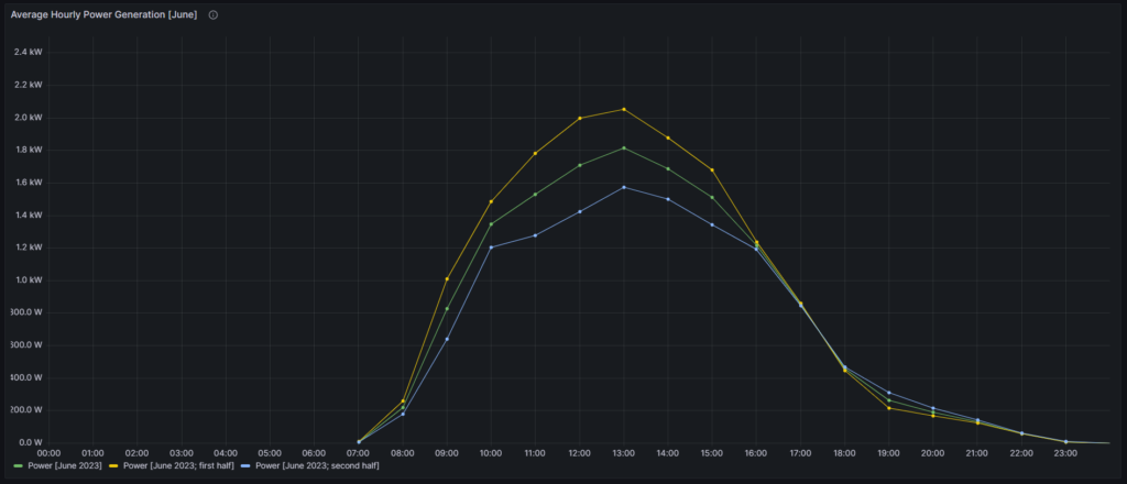
The green curve displays the average data over the whole month of June whereas the yellow curve represents the first half, and the blue curve represents the second half. We can see that this year (2023), the second half of June was much worse than the first half of June, in terms of power generation. Only in the time window [16:00-18:00], all three curves show the same values.
Power Distribution between 12:00 and 13:00 [June 2023]
Let us go back to the assumption we used for the second visualization on this article where we assumed a normal distribution of power values for a reasonably small timeframe (one hour over one month). Is this actually a true or maybe a wrong assumption? In order to get a better feeling, we use the built-in Grafana visualization Histogram and look how the power value samples (4 per hour) distribute in the month of June, in the first half of June (where we had a sunny sky), and in the second half of June (where we had a partially cloudy sky).
For the following three histograms, we use the panel options:
- Histogram → Bucket size: Set to 50
- Histogram → Bucket offset : Set to 0
- Standard options → Unit: Select Watt (W)
- Standard options → Min: Set to 0
- Standard options → Max: Set to 2500
- Standard options → Color scheme: Select Single color
The first histogram shows the distribution of power samples (120 in total) over the whole month of June:
SELECT zeitstempel, ROUND(leistung/1000) AS 'Power 12:00-13:00 [June 2023]' FROM anlage
WHERE (zeitstempel>'2023-06-01') AND (zeitstempel<'2023-07-01')
  AND (HOUR(zeitstempel)=12);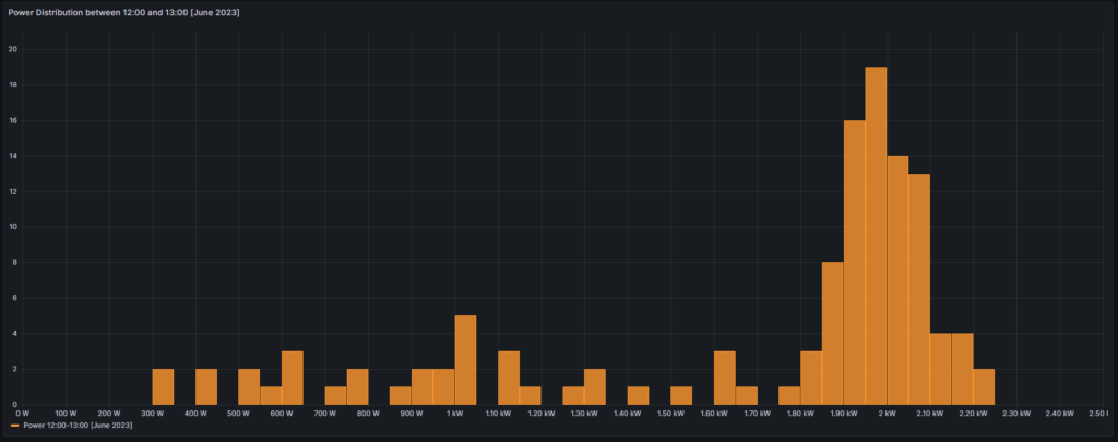
The second histogram shows the distribution of power samples (60 in total) over the first half of June:
SELECT zeitstempel, ROUND(leistung/1000) AS 'Power 12:00-13:00 [June 2023; first half]' FROM anlage
WHERE (zeitstempel>'2023-06-01') AND (zeitstempel<'2023-06-16')
  AND (HOUR(zeitstempel)=12);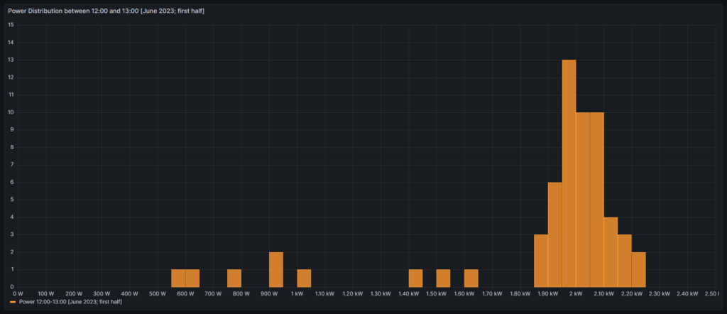
The third histogram shows the distribution of power samples (60 in total) over the second half of June:
SELECT zeitstempel, ROUND(leistung/1000) AS 'Power 12:00-13:00 [June 2023; second half]' FROM anlage
WHERE (zeitstempel>'2023-06-16') AND (zeitstempel<'2023-07-01')
  AND (HOUR(zeitstempel)=12);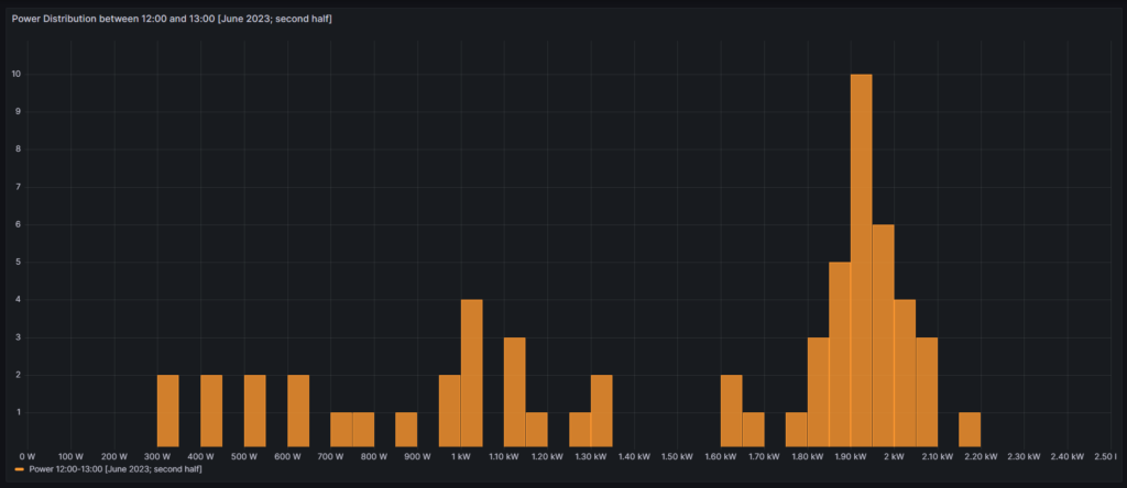
From all curves, we can see that the distribution that we see is by no means a normal distribution. It certainly has a region where we have a bell-shaped density of power values, but during periods with cloudy skies, we can also have many values in the range below the bell-shaped values of the solar generator. Therefore, the assumption of a normal distribution does not hold true in reality.
Conclusion
Visualizations
Grafana allows us to create advanced visualizations from MySQL data with little effort. The point with some less used visualizations in Grafana however, is that there is little documentation available, or to say it in a different way: Sometimes the documentation is sufficient if you already know how it works, but insufficient if you do not yet know how it works. I hope that at least with this article, I could contribute to enlarge knowledge.
Solar Power Generation
The data used in this example shows a solar power generation unit in Germany, facing the East. From the visualized data, we can draw several conclusions:
- Peak power of the installed solar power system is shortly before lunch time and decreases already significantly after 14:00.
- While power generation looks good until even October, from November on, the yield is poor.
- While the generated electricity in the winter months might still help to decrease the electricity bill, it becomes clear that if you were to use a heat pump for the heating of your home, you cannot count on solar power generation to support you in a meaningful way until you have some 50 kW+ peak solar capacity on a large roof.
- As the solar power generation peaks shortly before noon, it might make sense to combine units that face to the East and units that face to the West. This observation is in-line with recent proposals that claim that units facing South are not much better than a combination of units facing East and West (e.g., [3]).
Outlook
The visualizations given here are only an easy beginning. We might want to use more serious statistical analysis to answer questions like:
- Can we infer from a bad start in the morning (little power) that the rest of the day will stay like this?
- How probable is it that we have 3+ cloudy days (with little electricity) in a row, and that translates to: If it rained today, should I wait for 1…3 more days before I turn on the washing machine?
- Does it make economic sense to invest in a battery storage in order to capture excess electricity in summer days? How large should this battery be?
Files
The following dataset was used for the graphs:
Sources
- [1] = Smarthome: AVM-Steckdosen per Skript auslesen – Gabriel Rüeck (caipirinha.spdns.org)
- [2] = Download Grafana | Grafana Labs
- [3] = Ost-West-Ausrichtung von Photovoltaikanlagen (solarenergie.de)
Disclaimer
- Program codes and examples are for demonstration purposes only.
- Program codes are not recommended be used in production environments without further enhancements in terms of speed, failure-tolerance or cyber-security.
- While program codes have been tested, they might still contain errors.