Grafana Visualizations (Part 2)
Executive Summary
In this article, we use Grafana in order to examine real-world data of electricity consumption stored in a MariaDB database. As dynamic pricing (day-ahead market) is used, we also try to investigate how well I have fared so far with dynamic pricing.
Background
On 1st of March 2024, I switched from a traditional electricity provider to one with dynamic day-ahead pricing, in my case, Tibber. I wanted to try this contractual model and see if I could successfully manage to shift chunks of high electricity consumption such as:
- … loading the battery-electric vehicle (BEV) or the plug-in hybrid car (PHEV)
- … washing clothes
- … drying clothes in the electric dryer
to those times of the day when the electricity price is lower. I also wanted to see if that makes economic sense for me. And, after all, it is fun to play around with data and gain new insights.
As my electricity supplier, I had chosen Tibber because they were the first one I got to know and they offer a device called Pulse which can connect a digital electricity meter to their infrastructure for metering and billing purposes. Furthermore, they do have an API [1] which allows me to read out my own data; that was very important for me. I understand that meanwhile, there are several providers Tibber that have similar models and comparable features.
In my opinion, dynamic electricity prices will play an important role in the future. As we generate ever more energy from renewables (solar and wind power), there are times when a lot of electricity is generated or when we even see over-production, and there are times when less electricity will be produced (“dunkelflaute”). Dynamic prices are an excellent tool to motivate people to shift a part of their consumption pattern to times with a large offer in electricity supply (cheap price). An easy-to-understand example is washing clothes during the day in summer (rather than in the evening) when there is a large supply of solar energy; then, the price will experience a local minimum between lunch time and dinner time.
Preconditions
In order to use the approach described here, you should:
- … have access to a Linux machine or account
- … have a MySQL or MariaDB database server installed, configured, up and running
- … have a populated MySQL or MariaDB database like in our example to which you have access
- … have the package Grafana [2] installed, configured, up and running
- … have access to the data of your own electricity consumption and pricing information of your supplier or use the dataset linked below in this blog
- … have some understanding of day-ahead pricing in the electricity market [3]
- … have some basic knowledge of how to operate in a Linux environment and some basic understanding of shell scripts
Description and Usage
The Database
The base for the following visualizations is a fully populated MariaDB database with the following structure:
# Datenbank für Analysen mit Tibber
# V1.1; 2023-10-19, Gabriel Rüeck <gabriel@rueeck.de>, <gabriel@caipirinha.spdns.org>
# Delete existing databases
REVOKE ALL ON tibber.* FROM 'gabriel';
DROP DATABASE tibber;

# Create a new database
CREATE DATABASE tibber DEFAULT CHARSET utf8mb4 COLLATE utf8mb4_general_ci;
GRANT ALL ON tibber.* TO 'gabriel';
USE tibber;
SET default_storage_engine=Aria;

CREATE TABLE preise          (zeitstempel    DATETIME NOT NULL,\
                              preis          DECIMAL(5,4) NOT NULL,\
                              niveau         ENUM('VERY_CHEAP','CHEAP','NORMAL','EXPENSIVE','VERY_EXPENSIVE'));

CREATE TABLE verbrauch       (zeitstempel    DATETIME NOT NULL,\
                              energie        DECIMAL(5,3) NOT NULL,\
                              kosten         DECIMAL(5,4) NOT NULL);
The section Files at the end of this blog post provides real-world sample data which you can use to populate the database and do your own calculations and graphs. The database contains two tables. The one named preise contains the day-ahead prices and some price level tag which is determined by Tibber themselves according to [1]. The second tables named verbrauch contains the electrical energy I have consumed, and the cost associated with the consumption. zeitstempel in both tables indicates the date and the hour when the respective 1-hour-block with the respective electricity price or the electricity consumption starts. Consequently, the day is divided in 24 blocks of 1 hour. Data from the tables might look like this:
MariaDB [tibber]> SELECT * FROM preise WHERE DATE(zeitstempel)='2024-03-18';
+---------------------+--------+-----------+
| zeitstempel         | preis  | niveau    |
+---------------------+--------+-----------+
| 2024-03-18 00:00:00 | 0.2658 | NORMAL    |
| 2024-03-18 01:00:00 | 0.2575 | NORMAL    |
| 2024-03-18 02:00:00 | 0.2588 | NORMAL    |
| 2024-03-18 03:00:00 | 0.2601 | NORMAL    |
| 2024-03-18 04:00:00 | 0.2661 | NORMAL    |
| 2024-03-18 05:00:00 | 0.2737 | NORMAL    |
| 2024-03-18 06:00:00 | 0.2922 | NORMAL    |
| 2024-03-18 07:00:00 | 0.3059 | EXPENSIVE |
| 2024-03-18 08:00:00 | 0.3019 | EXPENSIVE |
| 2024-03-18 09:00:00 | 0.2880 | NORMAL    |
| 2024-03-18 10:00:00 | 0.2761 | NORMAL    |
| 2024-03-18 11:00:00 | 0.2688 | NORMAL    |
| 2024-03-18 12:00:00 | 0.2700 | NORMAL    |
| 2024-03-18 13:00:00 | 0.2707 | NORMAL    |
| 2024-03-18 14:00:00 | 0.2715 | NORMAL    |
| 2024-03-18 15:00:00 | 0.2768 | NORMAL    |
| 2024-03-18 16:00:00 | 0.2834 | NORMAL    |
| 2024-03-18 17:00:00 | 0.3176 | EXPENSIVE |
| 2024-03-18 18:00:00 | 0.3629 | EXPENSIVE |
| 2024-03-18 19:00:00 | 0.3400 | EXPENSIVE |
| 2024-03-18 20:00:00 | 0.3129 | EXPENSIVE |
| 2024-03-18 21:00:00 | 0.2861 | NORMAL    |
| 2024-03-18 22:00:00 | 0.2827 | NORMAL    |
| 2024-03-18 23:00:00 | 0.2781 | NORMAL    |
+---------------------+--------+-----------+
24 rows in set (0,002 sec)

MariaDB [tibber]> SELECT * FROM verbrauch WHERE DATE(zeitstempel)='2024-03-18';
+---------------------+---------+--------+
| zeitstempel         | energie | kosten |
+---------------------+---------+--------+
| 2024-03-18 00:00:00 |   0.554 | 0.1472 |
| 2024-03-18 01:00:00 |   0.280 | 0.0721 |
| 2024-03-18 02:00:00 |   0.312 | 0.0808 |
| 2024-03-18 03:00:00 |   0.307 | 0.0799 |
| 2024-03-18 04:00:00 |   0.282 | 0.0750 |
| 2024-03-18 05:00:00 |   0.315 | 0.0862 |
| 2024-03-18 06:00:00 |   0.377 | 0.1102 |
| 2024-03-18 07:00:00 |   0.368 | 0.1126 |
| 2024-03-18 08:00:00 |   0.275 | 0.0830 |
| 2024-03-18 09:00:00 |   0.793 | 0.2284 |
| 2024-03-18 10:00:00 |   1.041 | 0.2875 |
| 2024-03-18 11:00:00 |   0.453 | 0.1217 |
| 2024-03-18 12:00:00 |   0.362 | 0.0977 |
| 2024-03-18 13:00:00 |   0.005 | 0.0014 |
| 2024-03-18 14:00:00 |   0.027 | 0.0073 |
| 2024-03-18 15:00:00 |   0.144 | 0.0399 |
| 2024-03-18 16:00:00 |   0.248 | 0.0703 |
| 2024-03-18 17:00:00 |   0.363 | 0.1153 |
| 2024-03-18 18:00:00 |   0.381 | 0.1382 |
| 2024-03-18 19:00:00 |   0.360 | 0.1224 |
| 2024-03-18 20:00:00 |   0.354 | 0.1108 |
| 2024-03-18 21:00:00 |   0.382 | 0.1093 |
| 2024-03-18 22:00:00 |   0.373 | 0.1055 |
| 2024-03-18 23:00:00 |   0.417 | 0.1159 |
+---------------------+---------+--------+
24 rows in set (0,001 sec)
Connecting Grafana to the Database
Now we shall visualize the data in Grafana. Grafana is powerful and mighty visualization tool with which you can create state-of-the-art dashboards and professional visualizations. I must really laude the team behind Grafana for making such a powerful tool free for personal and other usage (for details to their licenses und usage models, see Licensing | Grafana Labs).
Before you can use data from a MySQL database in Grafana, you have to set up MySQL as a data source in Connections. Remember that MySQL is one of many possible data sources for Grafana and so, you have to walk through the jungle of offered data sources and find the MySQL connection and set up your data source accordingly. On my server, both Grafana and MariaDB run on the same machine, so there is no need for encryption, etc. My setup simply looks like this:
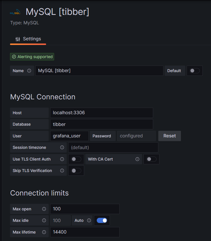
One step where I always stumble again is that in the entry mask for the connection setup, localhost:3306 is proposed in grey color as Host, but unless you type that in, too, Grafana will actually not use localhost:3306. So be sure to physically type that in.
Populating the Database
Tibber customers who have created an API token for themselves [4] can populate the database with the following bash script; in this script, you need to replace _API_TOKEN with your personal API token ( [4]) and _HOME_ID with your personal Home ID ([1]). The script further assumes that the user gabriel can login to the MySQL database without further authentication; this can be achieved by writing the MySQL login information in the file ~/.my.cnf.
#!/bin/bash
#
# Dieses Skript liest Daten für die Tibber-Datenbank und speichert das Ergebnis in einer MySQL-Datenbank ab.
# Das Skript wird einmal pro Tag aufgerufen.
#
# V1.3; 2024-03-24, Gabriel Rüeck <gabriel@rueeck.de>, <gabriel@caipirinha.spdns.org>
#
# CONSTANTS
declare -r    MYSQL_DATABASE='tibber'
declare -r    MYSQL_SERVER='localhost'
declare -r    MYSQL_USER='gabriel'
declare -r    TIBBER_API_TOKEN='_API_TOKEN'
declare -r    TIBBER_API_URL='https://api.tibber.com/v1-beta/gql'
declare -r    TIBBER_HOME_ID='_HOME_ID'

# VARIABLES

# PROGRAM
# Read price information for tomorrow
curl -s -S -H "Authorization: Bearer ${TIBBER_API_TOKEN}" -H "Content-Type: application/json" -X POST -d  '{ "query": "{viewer {home (id: \"'"${TIBBER_HOME_ID}"'\") {currentSubscription {priceInfo {tomorrow {total startsAt level }}}}}}" }' "${TIBBER_API_URL}" | jq -r '.data.viewer.home.currentSubscription.priceInfo.tomorrow[] | .total, .startsAt, .level' | while read cost; do
  read LINE
  read level
  timestamp=$(echo "${LINE%%+*}" | tr 'T' ' ')
  # Determine timezone offset and store the UTC datetime in the database
  offset="${LINE:23}"
  mysql --default-character-set=utf8mb4 -B -N -r -D "${MYSQL_DATABASE}" -h ${MYSQL_SERVER} -u ${MYSQL_USER} -e "INSERT INTO preise (zeitstempel,preis,niveau) VALUES (DATE_SUB(\"${timestamp}\",INTERVAL \"${offset}\" HOUR_MINUTE),${cost},\"${level}\");"
done

# Read consumption information from the past 24 hours
curl -s -S -H "Authorization: Bearer ${TIBBER_API_TOKEN}" -H "Content-Type: application/json" -X POST -d  '{ "query": "{viewer {home (id: \"'"${TIBBER_HOME_ID}"'\") {consumption (resolution: HOURLY, last: 24) {nodes {from to cost consumption}}}}}" }' "${TIBBER_API_URL}" | jq -r '.data.viewer.home.consumption.nodes[] | .from, .consumption, .cost' | while read LINE; do
  read consumption
  read cost
  timestamp=$(echo "${LINE%%+*}" | tr 'T' ' ')
  # Determine timezone offset and store the UTC datetime in the database
  offset="${LINE:23}"
  mysql --default-character-set=utf8mb4 -B -N -r -D "${MYSQL_DATABASE}" -h ${MYSQL_SERVER} -u ${MYSQL_USER} -e "INSERT INTO verbrauch (zeitstempel,energie,kosten) VALUES (DATE_SUB(\"${timestamp}\",INTERVAL \"${offset}\" HOUR_MINUTE),${consumption},${cost});"
done
In my case, I call this script with cron once per day, at 14:45 as Tibber releases the price information for the subsequent day only at 14:00. The script furthermore stores UTC timestamps in the database. Grafana will adjust them to the local time for graphs of the type Time series.
Easy Visualizations
Price level
One of my first visualizations was a table that shows the price level tags for today and tomorrow. The idea behind is that I would look at the table once per day during breakfast and immediately identify the sweet spots on where I could charge the car, turn on the washing machine, etc.
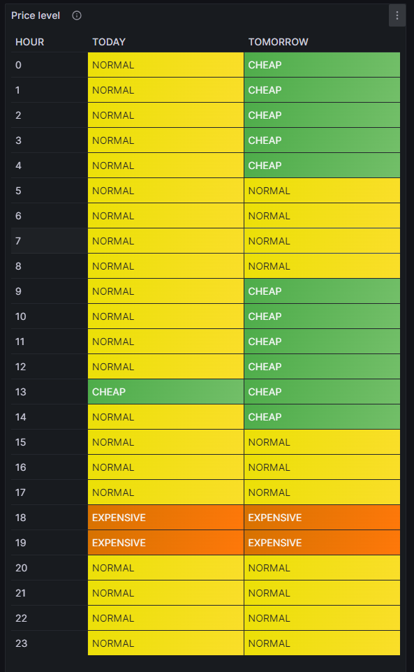
For this table, we use the built-in Grafana visualization Table. We select the according database, and our MySQL query is:
SELECT IF(DATE(DATE_ADD(zeitstempel,INTERVAL HOUR(TIMEDIFF(SYSDATE(),UTC_TIMESTAMP())) HOUR))=CURDATE(),'TODAY','TOMORROW') AS Tag, HOUR(DATE_ADD(zeitstempel,INTERVAL HOUR(TIMEDIFF(SYSDATE(),UTC_TIMESTAMP())) HOUR)) AS Stunde, niveau
FROM preise
WHERE DATE_ADD(zeitstempel,INTERVAL HOUR(TIMEDIFF(SYSDATE(),UTC_TIMESTAMP())) HOUR)>=CURDATE()
Group BY Tag, Stunde;
The query above lists one price level per line. However, in order to get the nice visualization shown above, we need to transpose the table with respect to the months, and therefore, we must select the built-in transformation Grouping to Matrix and enter our column names according to the image below:

Now, in order to get a beautiful visualization, we need to adjust some of the panel options, and those are:
- Cell options → Cell type: Set to Auto
- Standard options → Color scheme: Set to Single color
and we need to define some Value mappings:
- NORMAL → Select yellow color
- EXPENSIVE → Select orange color
- VERY_EXPENSIVE → Select red color
- CHEAP → Select green color
- VERY_CHEAP → Select blue color
and we need to define some Overrides:
- Override 1 → Fields with name: Select TODAY
- Override 1 → Cell options → Cell type: Set to Colored background
- Override 2 → Fields with name: Select TOMORROW
- Override 2 → Cell options → Cell type: Set to Colored background
- Override 3 → Fields with type: Select Stunde\Tag
- Override 3 → Column width → Set to 110
- Override 3 → Standard options → Display name: Type HOUR (That is only necessary because I initially did my query with German column names)
In the MySQL query above, you can find the sequence
DATE_ADD(zeitstempel,INTERVAL HOUR(TIMEDIFF(SYSDATE(),UTC_TIMESTAMP())) HOUR)which actually transforms the UTC timestamp into the timestamp of the local time of the machine where the MySQL server resides. In my case, this is the same machine that I use for Grafana. The sub-sequence
HOUR(TIMEDIFF(SYSDATE(),UTC_TIMESTAMP()))gives – in my case – back a 2 when we are in summer time as then we are at UTC+2h, and 1 when we are in winter time as then we are at UTC+1h. This sequence was necessary for me as the Grafana visualization Table does not do an automatic time conversion to the local time.
Electricity price (per kWh) and grid consumption
In the next visualization, we will look at a timeline of the electricity price per hour and our consumption pattern. This will look like this graph:
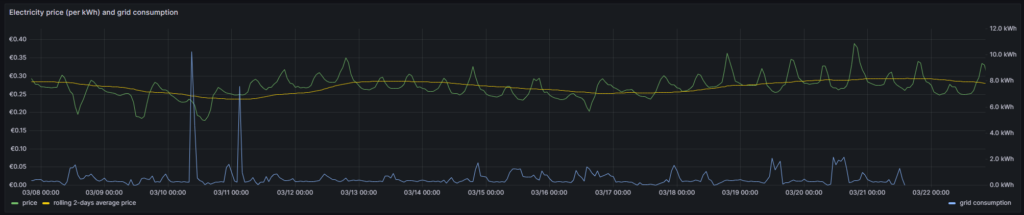
For this graph, we use the built-in Grafana visualization Time series. We select the according database, and we define two MySQL queries. The first one is named Price:
SELECT zeitstempel,
       preis AS 'price',
       AVG(preis) OVER (ORDER BY zeitstempel ROWS BETWEEN 47 PRECEDING AND CURRENT ROW) as 'rolling 2-days average price'
FROM preise;
The first query has the peculiarity that we do not only retrieve the price for each 1-hour block, but that we also calculate a rolling 2-days average over the extracted data. The second query is named Consumption and retrieves our energy consumption:
SELECT zeitstempel, energie AS 'grid consumption' FROM verbrauch;Again, we need to adjust some of the panel options, and those are:
- Standard options → Unit: Select (Euro) €
- Standard options → Min: Set to 0
- Standard options → Decimals: Set to 2
and we need to define some Overrides:
- Override 1 → Fields with name: Select grid consumption
- Override 1 → Axis → Placement: Select Right
- Override 1 → Standard options → Unit: Select Kilowatt-hour (kWh)
- Override 1 → Standard options → Decimals: Set to 1
In this graph, we can already get an indication on how well we time our energy consumption. Ideally, the peaks (local maximums) in energy consumption (blue line) should coincide with the local minimums of the electricity price (green line). As you can see with the two peaks of the blue line (charging the BEV), I did not always match this sweet spot. There might be good reasons for consuming electricity also at hours of higher prices, and some examples are:
- You have to drive away at a certain hour, and you need to charge the BEV now.
- You have solar generation at certain times of the day which you intend to use and therefore consume electricity (like for charging a BEV) when the sun shines. While you then might not consume at the cheapest hour, you might ultimately make good use of the additional solar energy.
- You want to watch TV in the evening when the electricity price is typically high.
This graph visualizes the data according to the timezone of the dashboard, so there is no need to add an offset to the UTC timestamps in the database.
Heatmap of the Tibber flexible hourly prices per kWh
In the next visualization, we look at a heatmap of the hourly prices and therefore, we use the plug-in Grafana visualization Hourly heatmap.
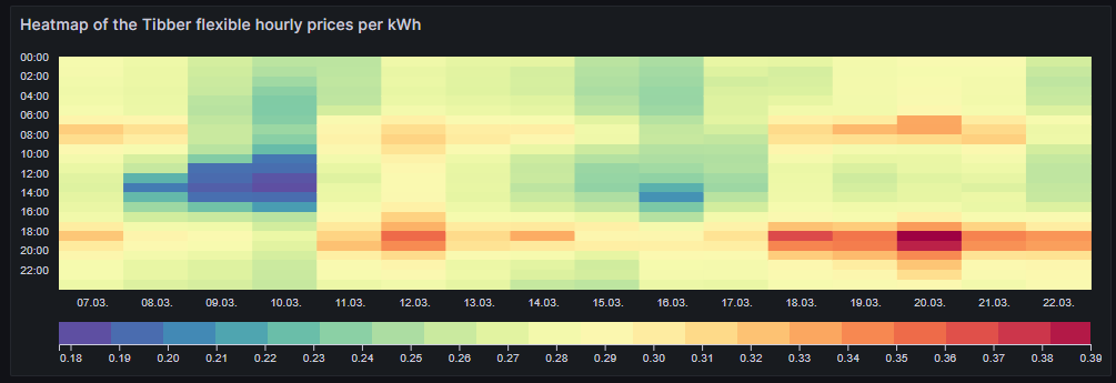
The query is very simple:
SELECT UNIX_TIMESTAMP(DATE_ADD(zeitstempel,INTERVAL HOUR(TIMEDIFF(SYSDATE(),UTC_TIMESTAMP())) HOUR)) AS time, preis FROM preise;However, we need to adjust some of the panel options, and those are:
- Dimensions → Time: Select time
- Dimensions → Value: Select price
- Hourly heatmap → From: Set to 00:00
- Hourly heatmap → To: Set to 00:00
- Hourly heatmap → Group by: Select 60 minutes
- Hourly heatmap → Calculation: Select Sum
- Hourly heatmap → Color palette: Select Spectral
- Hourly heatmap → Invert color palette → Activate
- Legend → Show legend → Activate
- Legend → Gradient quality: Select Low
- Standard options → Unit: Select (Euro) €
- Standard options → Decimals: Set to 2
- Standard options → Color scheme: Select From thresholds (by value)
With the heatmap, we have an easy-to-understand visualization on when the prices are high and on when they are low and on whether there is a regular pattern that we can observe. In this case, we can identify that in the evening (at dinner or TV time), the electricity price often seems to be high. Hence, this is not a good time to switch on powerful electric consumers or to start charging a BEV.
Similar to the Grafana visualization Table, you can find the sequence
DATE_ADD(zeitstempel,INTERVAL HOUR(TIMEDIFF(SYSDATE(),UTC_TIMESTAMP())) HOUR)because the Grafana visualization Hourly heatmap also does not do an automatic time conversion to the local time.
Complex Visualizations
Actual cost versus minimal cost, maximal cost, average cost per day
This visualization shows the daily electricity cost that I have incurred (blue line) and the cost I would have incurred if I had purchased the whole amount of electricity on the respective day:
- … during the cheapest hour on that day (green line)
- … during the most expensive hour on that day (red line)
- … at an average price (average of all hours) on that day (yellow line)
The closer the blue line is to the green line, the better I have shifted my consumption pattern to the hours of cheap electricity. In real life, one will always have to purchase electricity also in hours of expensive electricity unless one switches off all devices in a household at certain hours. So, in real life, the blue line will never be the same as the green line. A blue line between the yellow and the green line already indicates that one does well. The graph also shows that my consumption varies substantially from day to day. The graph uses the built-in Grafana visualization Time series. The last data point must not be considered as the last day is only calculated until 14:00 local time.
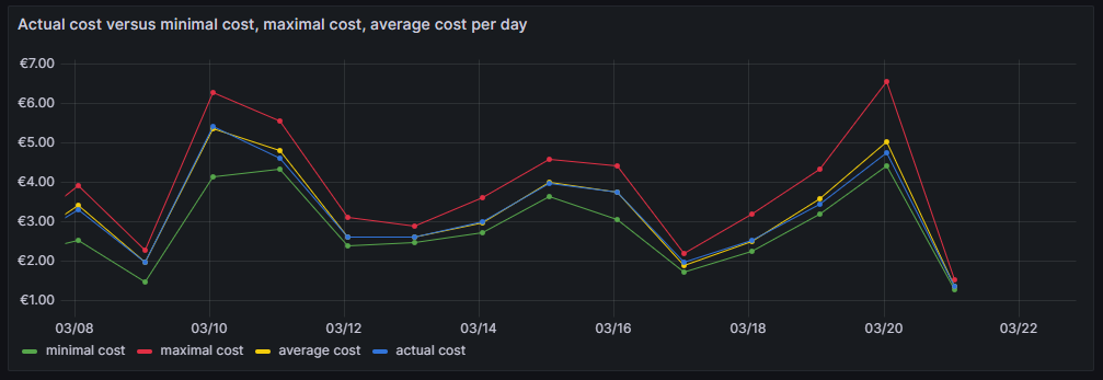
For this graph, we join the tables preise and verbrauch in a MySQL query and group the result by day:
SELECT DATE(preise.zeitstempel) AS 'date',
       MIN(preise.preis)*SUM(verbrauch.energie) AS 'minimal cost',
       MAX(preise.preis)*SUM(verbrauch.energie) AS 'maximal cost',
       AVG(preise.preis)*SUM(verbrauch.energie) AS 'average cost',
       SUM(verbrauch.kosten) AS 'actual cost'
FROM preise JOIN verbrauch ON verbrauch.zeitstempel=preise.zeitstempel
WHERE DATE(preise.zeitstempel)>'2024-03-03'
GROUP BY DATE(preise.zeitstempel);
The following panel options are recommended:
- Standard options → Unit: Select (Euro) €
- Standard options → Decimals: Set to 2
and the following Overrides are recommended:
- Override 1 → Fields with name: Select minimal cost
- Override 1 → Standard options → Color scheme: Select Single color, then select green
- Override 2 → Fields with name: Select maximal cost
- Override 2 → Standard options → Color scheme: Select Single color, then select red
- Override 3 → Fields with name: Select actual cost
- Override 3 → Standard options → Color scheme: Select Single color, then select blue
- Override 4 → Fields with name: Select average cost
- Override 4 → Standard options → Color scheme: Select Single color, then select yellow
Important: This graph adds up the data from a UTC day (not the local calendar day) and visualizes the data points according to the timezone of the dashboard.
Cumulated savings versus various fictive static electricity prices
This visualization shows us in a cumulative manner how much money I have saved using dynamic pricing versus fictive electricity contracts with different static prices per kWh (traditional contracts). The graph uses the built-in Grafana visualization Time series. The last data point must not be considered as the last day is only calculated until 14:00 local time.
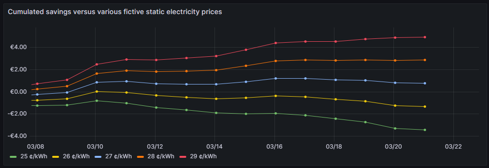
One can see that for traditional prices below 27 ¢/kWh, I would not have saved any money so far. 27 ¢/kWh is the price that I could get in a traditional electricity contract at the place where I live. However, it is too early yet to draw final conclusions. I intend to observe how the graphs advance when we get into summer as I expect that during summer, I will have more times at cheap electricity whereas in the subsequent winter, I will probably have more times at higher prices. The graph is done with this query:
SELECT DATE(preise.zeitstempel) AS 'Datum',
       SUM(0.25*SUM(verbrauch.energie)-SUM(verbrauch.kosten)) OVER (ORDER BY DATE(preise.zeitstempel)) as '25 ¢/kWh',
       SUM(0.26*SUM(verbrauch.energie)-SUM(verbrauch.kosten)) OVER (ORDER BY DATE(preise.zeitstempel)) as '26 ¢/kWh',
       SUM(0.27*SUM(verbrauch.energie)-SUM(verbrauch.kosten)) OVER (ORDER BY DATE(preise.zeitstempel)) as '27 ¢/kWh',
       SUM(0.28*SUM(verbrauch.energie)-SUM(verbrauch.kosten)) OVER (ORDER BY DATE(preise.zeitstempel)) as '28 ¢/kWh',
       SUM(0.29*SUM(verbrauch.energie)-SUM(verbrauch.kosten)) OVER (ORDER BY DATE(preise.zeitstempel)) as '29 ¢/kWh'
FROM preise JOIN verbrauch ON verbrauch.zeitstempel=preise.zeitstempel
WHERE DATE(preise.zeitstempel)>'2024-03-03'
GROUP BY DATE(preise.zeitstempel);
The following panel options are recommended:
- Standard options → Unit: Select (Euro) €
- Standard options → Decimals: Set to 2
Important: This graph adds up the data from a UTC day (not the local calendar day) and visualizes the data points according to the timezone of the dashboard.
Daily savings using Tibber flexible versus a fictive static price of 27 ¢/kWh
This next visualization shows how much money I have saved (green) or lost (red) using dynamic pricing versus a fictive electricity contract with a price of 27 ¢/kWh that – as mentioned before – I could get in a traditional electricity contract at the place where I live. The graph uses the built-in Grafana visualization Bar chart. The last data point must not be considered as the last day is only calculated until 14:00 local time.
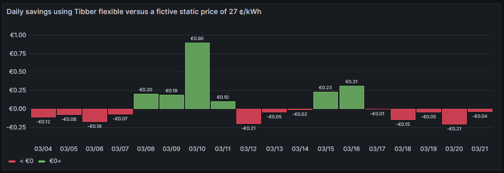
One can see that due to the nature of dynamic prices, I do not save money every day. It has been quite a mixed result so far. The graph is done with this query:
SELECT DATE_FORMAT(preise.zeitstempel,'%m/%d') AS 'Datum',
       0.27*SUM(verbrauch.energie)-SUM(verbrauch.kosten) AS 'Daily cost vs. average'
FROM preise JOIN verbrauch ON verbrauch.zeitstempel=preise.zeitstempel
WHERE DATE(preise.zeitstempel)>'2024-03-03'
GROUP BY DATE(preise.zeitstempel);
The following panel options are recommended:
- Bar chart → Color by field: Select Daily cost vs. average
- Standard options → Unit: Select (Euro) €
- Standard options → Decimals: Set to 2
- Standard options → Color scheme: Select From thresholds (by value)
- Thresholds → Enter 0, then select green
- Thresholds → Base: Select red
Important: This graph adds up the data from a UTC day (not the local calendar day).
Daily savings using Tibber flexible versus Tibber daily average price
A similar visualization shows how much money I have saved (green) or lost (red) using dynamic pricing versus the average price per day, calculated on all dynamic prices of that day. This graph shows me if I am successful in making use of dynamic pricing (green) or not (red). The graph uses the built-in Grafana visualization Bar chart. The last data point must not be considered as the last day is only calculated until 14:00 local time.
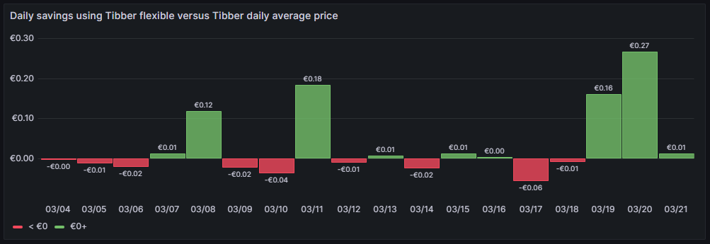
So far, it seems that while I do have “good” and “bad” days, on on the good days, I seem to save more money compared to the Tibber average price. The large green bars are those where I charge the BEV, and before I charge the BEV, I really carefully consider the electricity price of today and tomorrow. This graph is done with this query:
SELECT DATE_FORMAT(preise.zeitstempel,'%m/%d') AS 'Datum',
       AVG(preise.preis)*SUM(verbrauch.energie)-SUM(verbrauch.kosten) AS 'Daily cost vs. average'
FROM preise JOIN verbrauch ON verbrauch.zeitstempel=preise.zeitstempel
WHERE DATE(preise.zeitstempel)>'2024-03-03'
GROUP BY DATE(preise.zeitstempel);
The following panel options are recommended:
- Bar chart → Color by field: Select Daily cost vs. average
- Standard options → Unit: Select (Euro) €
- Standard options → Decimals: Set to 2
- Standard options → Color scheme: Select From thresholds (by value)
- Thresholds → Enter 0, then select green
- Thresholds → Base: Select red
Important: This graph adds up the data from a UTC day (not the local calendar day).
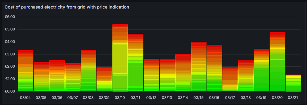
Cost of purchased electricity from grid with price indication
This is one of my favorite graphs as it contains a lot of information in one visualization. It shows the electricity cost per day, but also, how this cost is composed. Each day is a concatenation of 24 rectangles. The 24 rectangles represent the 24 hours of the day. Their color is different, ranging in shades from green to red. The green only rectangle (rgb: 0, 255, 0) is the cost that incurred at the cheapest hour of the day. The red only rectangle (rgb: 255, 0, 0) is the cost that incurred at the most expensive hour of the day. The shades in between ranging from green to red represent an ordered list of the hours from cheap to expensive. Large rectangles mean that a large part of the daily cost can be attributed to a consumption in that hour. Essentially, this means that the more green shades a day has, the more cost has incurred at hours of cheap electricity and the better I have used the dynamic pricing for me. The more red shades a day has, the more cost has incurred at hours of expensive electricity. A day with more red shades is not automatically a “bad” day. There might be reasons for a consumption at expensive hours, and some which are true in my case, are:
- I might cover the electricity demand at cheap hours by my solar panels so that during these hours, I do not have any grid consumption at all.
- I might deliberately decide to consume electricity at expensive hours during daylight because my solar panels cover a large part of the consumption at my home, maybe, because I charge the car and 50% of the electric energy comes from the solar panels anyway and I just buy the remaining 50% from the grid. While the grid consumption might be expensive, I anyway get 50% “for free” from the solar panels.
- I might deliberately decide to consume electricity at expensive hours because the ambient temperature outside the house is moderate or warm and I can heat the house with the air conditioner at high efficiency while I can switch off the central heating which runs by natural gas. In that case, even at high prices, I expect to have a better outcome overall because I might be able to switch off the central heating completely.
The graph uses the built-in Grafana visualization Bar chart. The last data point must not be considered as the last day is only calculated until 14:00 local time.
This graph uses this query:
SELECT DATE_FORMAT(preise.zeitstempel,'%m/%d') AS 'Datum',
       ROW_NUMBER() OVER (PARTITION BY DATE(preise.zeitstempel) ORDER BY preise.preis ASC) AS 'Row',
	   verbrauch.kosten AS 'Kosten'
FROM preise JOIN verbrauch ON verbrauch.zeitstempel=preise.zeitstempel
WHERE DATE(preise.zeitstempel)>'2024-03-03'
ORDER BY DATE(preise.zeitstempel) ASC, preise.preis ASC;
and the built-in transformation Grouping to Matrix:

The following panel options must be used:
- Standard options → Unit: Select (Euro) €
- Standard options → Min: Set to 0
- Standard options → Decimals: Set to 2
Additionally, we need to define exactly 24 Overrides:
- Override 1 → Fields with name: Select 1
- Override 1 → Standard options → Color scheme: Select Single color, then select Custom, then rgb(0, 255, 0)
- Override 2 → Fields with name: Select 2
- Override 2 → Standard options → Color scheme: Select Single color, then select Custom, then rgb(22, 255, 0)
- Override 3 → Fields with name: Select 3
- Override 3 → Standard options → Color scheme: Select Single color, then select Custom, then rgb(44, 255, 0)
- Override 4 → Fields with name: Select 4
- Override 4 → Standard options → Color scheme: Select Single color, then select Custom, then rgb(66, 255, 0)
- Override 5 → Fields with name: Select 5
- Override 5 → Standard options → Color scheme: Select Single color, then select Custom, then rgb(89, 255, 0)
- Override 6 → Fields with name: Select 6
- Override 6 → Standard options → Color scheme: Select Single color, then select Custom, then rgb(111, 255, 0)
- Override 7 → Fields with name: Select 7
- Override 7 → Standard options → Color scheme: Select Single color, then select Custom, then rgb(133, 255, 0)
- Override 8 → Fields with name: Select 8
- Override 8 → Standard options → Color scheme: Select Single color, then select Custom, then rgb(155, 255, 0)
- Override 9 → Fields with name: Select 9
- Override 9 → Standard options → Color scheme: Select Single color, then select Custom, then rgb(177, 255, 0)
- Override 10 → Fields with name: Select 10
- Override 10 → Standard options → Color scheme: Select Single color, then select Custom, then rgb(199, 255, 0)
- Override 11 → Fields with name: Select 11
- Override 11 → Standard options → Color scheme: Select Single color, then select Custom, then rgb(222, 255, 0)
- Override 12 → Fields with name: Select 12
- Override 12 → Standard options → Color scheme: Select Single color, then select Custom, then rgb(244, 255, 0)
- Override 13 → Fields with name: Select 13
- Override 13 → Standard options → Color scheme: Select Single color, then select Custom, then rgb(255, 244, 0)
- Override 14 → Fields with name: Select 14
- Override 14 → Standard options → Color scheme: Select Single color, then select Custom, then rgb(255, 222, 0)
- Override 15 → Fields with name: Select 15
- Override 15 → Standard options → Color scheme: Select Single color, then select Custom, then rgb(255, 200, 0)
- Override 16 → Fields with name: Select 16
- Override 16 → Standard options → Color scheme: Select Single color, then select Custom, then rgb(255, 177, 0)
- Override 17 → Fields with name: Select 17
- Override 17 → Standard options → Color scheme: Select Single color, then select Custom, then rgb(255, 155, 0)
- Override 18 → Fields with name: Select 18
- Override 18 → Standard options → Color scheme: Select Single color, then select Custom, then rgb(255, 133, 0)
- Override 19 → Fields with name: Select 19
- Override 19 → Standard options → Color scheme: Select Single color, then select Custom, then rgb(255, 110, 0)
- Override 20 → Fields with name: Select 20
- Override 20 → Standard options → Color scheme: Select Single color, then select Custom, then rgb(255, 89, 0)
- Override 21 → Fields with name: Select 21
- Override 21 → Standard options → Color scheme: Select Single color, then select Custom, then rgb(255, 66, 0)
- Override 22 → Fields with name: Select 22
- Override 22 → Standard options → Color scheme: Select Single color, then select Custom, then rgb(255, 44, 0)
- Override 23 → Fields with name: Select 23
- Override 23 → Standard options → Color scheme: Select Single color, then select Custom, then rgb(255, 22, 0)
- Override 24 → Fields with name: Select 24
- Override 24 → Standard options → Color scheme: Select Single color, then select Custom, then rgb(255, 0, 0)
Important: This graph adds up the data from a UTC day (not the local calendar day).
Conclusion
Even with a relatively simple dataset, we can create insightful visualizations with Grafana that can help us to interpret complex relationships. In my case, the visualizations shall help me to answer the questions:
- Do I fare well with dynamic pricing as compared to a traditional electricity contract with static prices?
- Am I able to shift consumption pattern of large energy chunks efficiently to those hours where electricity is cheaper?
As I mentioned, there might be reasons to buy electricity also at expensive hours. The fact that I have support of solar panels during the day might tilt the decision to consume electric energy aways from the cheapest hours to hours where a large part of that consumption is anyway covered by the solar panels. Or I might decide to heat with the air conditioners because the temperature difference between outside and inside of the house is small and the air conditioners can run with a high efficiency. In that case, I trade in natural gas consumption versus electricity consumption.
Outlook
It would be interesting to consider the energy that the solar panels generate “for free” (not really for free, but as they have been installed, they are already “sunk cost”) and visualize the resulting electricity cost from the mix of solar energy with energy consumed from the grid.
Likewise, it might be interesting as well as challenging to derive a good model that uses a battery and dynamic electricity prices as well as the energy from the solar panels to minimize cost of the energy consumption from the grid. How large should this battery be? When should it be charged from the grid and when should it return its energy to the consumers in the house?
Files
The following dataset was used for the graphs:
Sources
- [1] = Tibber Developer
- [2] = Download Grafana | Grafana Labs
- [3] = day-ahead market – an overview
- [4] = Tibber Developer: Communicating with the API
Disclaimer
- Program codes and examples are for demonstration purposes only.
- Program codes are not recommended be used in production environments without further enhancements in terms of speed, failure-tolerance or cyber-security.
- While program codes have been tested, they might still contain errors.
- I am in neither affiliated nor linked to companies named in this blog post.