Learnings from Dynamic Electricity Pricing
Executive Summary
Unlike previous articles, I chose to split this new blog post into two parts. In the first part (Findings), I will elaborate on my findings as a consumer with dynamic electricity prices (day-ahead market) in connection with a small solar electricity generation unit. We will look at various visualizations that help to understand the impact and to gain some more insight in how dynamic electricity prices can be useful. In the second part (Annex: Technical Details), technically interested folks will find the respective queries and sample data with which they can replicate the findings or even do their own examination with the sample data. As in previous articles, Grafana is used in connection with a MariaDB database.
Background
On 1st of March 2024, I switched from a traditional electricity provider to one with dynamic day-ahead pricing, in my case, Tibber. I wanted to try this contractual model and see if I could successfully manage to shift chunks of high electricity consumption such as:
- … loading the battery-electric vehicle (BEV) or the plug-in hybrid car (PHEV)
- … washing clothes
- … drying clothes in the electric dryer
to those times of the day when the electricity price is lower. I also wanted to see if that makes economic sense for me. And, after all, it is fun to play around with data and gain new insights.
As my electricity supplier, I had chosen Tibber because they were the first one I got to know and they offer a device called Pulse which can connect a digital electricity meter to their infrastructure for metering and billing purposes. Furthermore, they do have an API [1] which allows me to read out my own data; that was very important for me. I understand that meanwhile, there are several providers Tibber that have similar models and comparable features.
Findings
Price and consumption patterns
The graph below shows five curves and is an upgraded version of the respective graph in [6] visualizing data over two weeks:
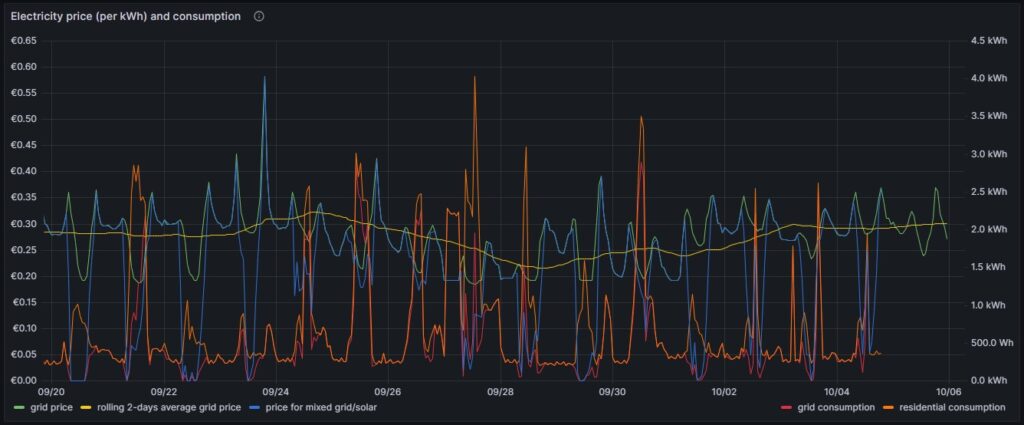
As in [6], the green curve is the hourly price of the day-ahead market. It is well recognizable that the price has peaks in the evening and in the morning at breakfast time when residential consumption is high, but little solar energy is available in Germany. The yellow curve is a two-days floating average and shows that the average price is not below a fixed rate electricity contract, an important point that we shall discuss later. The orange curve is the consumption of my house; the higher peaks indicate times when I charged one of the cars using an ICCB (one phase, current: 10 A). The red curve shows the consumption of the grid. During the day, when there is sunshine, the red curve lies below the orange curve as a part of the overall consumed electricity comes from the solar panels. At nighttime, the red curve will exactly lie on the orange curve as there is no solar electricity generation. The blue curve shows the average electricity price per kWh based on a mixed calculation of the grid price and zero for my own solar electricity generation. One might argue whether zero is an adequate assumption as also solar panels cost money, but as I do have them installed already, I consider them to be sunk cost now. The blue curve show an interesting behavior: When my consumption is low, the blue curve shows a small average price. When the consumption of the house is less than the power that is generated by the solar panels, then the blue curve is flat zero. When, however, I consume a lot of power, then, the blue curve approaches the green curve. At nighttime when there is no solar energy generation, the blue curve lies identical with the green curve.
My goal is to consume more electricity in the times when either the green curve points to a low electricity price or when there is enough electricity generated by the solar panels so that my average price that I pay (blue curve) is reasonable low. This also explains why I mostly the ICCB (one phase, 10 A) to charge the cars as then, I still can get a good average price (although charging takes a lot more time then). I think that by looking at the curves, I have adapted my consumption pattern well to the varying electricity price.
Actual cost, minimal cost, maximal cost, average cost per day
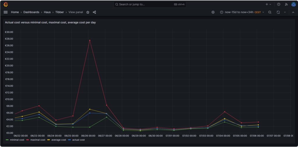
The graph above shows four curves. The green curve is the cost that I would have incurred if I had bought all the electricity of the respective day in the hour of the cheapest electricity price. This would only be possible if I had a battery that could bridge the remaining 23 hours of the day (and probably some hours more as the cheapest hour of the following day is not necessarily 00:00-01:00). The red curve is the cost that I would have incurred if I had bought all the electricity of the respective day in the hour of the most expensive electricity price. The yellow curve is the average cost of the respective day, the multiplication of the average price per kWh of that day by my consumed energy. The blue curve is the real cost that I have paid. If the blue curve is between the yellow curve and the green curve, then this is very good, and I have succeeded in shifting my consumption versus the hours with cheaper electricity. Without a battery, it is almost impossible to come very close to the green line.
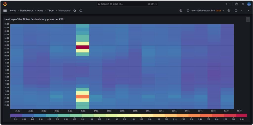
The graph above shows one peculiarity as on 2024-06-26, there were some hours with an extremely high price, but that was due to a communication error that decoupled the auction in Germany from the rest of Europe [7], clearly (and hopefully) a one-time event.
Price heatmap of the hourly prices per kWh
The one-time event with unusually high prices [7] is well visible in the price heatmap that was already introduced and explained in [6]. The one-time event overshadows all price fluctuations in the rest of the week.
Cost and amount of purchased electricity from grid with price indication
The first graph shown below was already introduced and explained in [6] and shows the cost of purchased electricity from the grid in 24 rectangles, whereby each rectangle represents an hour. The order of the rectangles starts with the most expensive hour at the top and ends with the least expensive hour at the bottom. The larger the rectangle, the more money has been spent in the respective hour. I already explained in [6] that the goal should be – if electricity has to be purchased from the grid at all – the purchases ideally should happen in times when the price is low. In the graph those are the rectangles with green or at maximum yellow color. The rectangles with orange and red color indicate purchases during times of a high electricity price. In reality, one will not be able to avoid purchases at times of a high price completely. My experience is that in summer, I let the air conditioning systems run also in the evening hours when the electricity price is higher, just to keep the house at reasonable temperatures inside. Similarly, in spring and autumn, I opt for leaving the central heating switched off and try to heat the rooms in which I am usually with the air conditioning systems (in heating mode) as in spring and autumn, the difference in temperature between outside and inside is not too high, and the air conditioning systems will have a high efficiency.
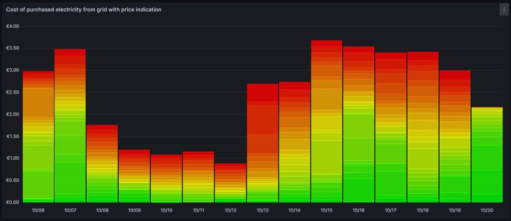
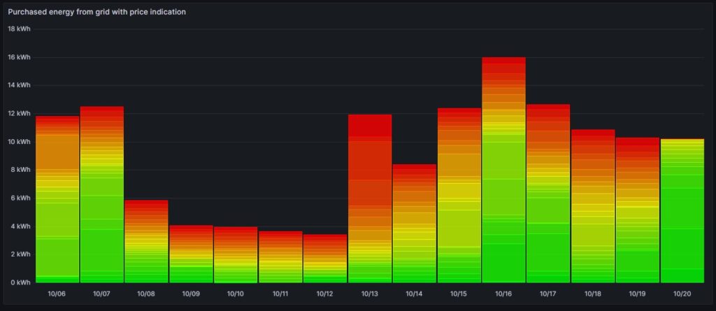
Then, for 13-Oct (10/13), one can see that in fact I bought substantial electricity at high prices. The reason for that was that I returned home at night and had to re-charge the car for the next day. So, one cannot always avoid purchasing electricity at high prices.
The next chart offers another view on the same topic. Rather than looking at the cost of the purchased electricity, we look at the amount of purchased electricity. This offers an interesting insight. Except for 13-Oct, the amount of electricity that is purchased at hours with a high price, is less than 5 kWh. This means that with an energy-storage system (ESS), it should be possible to charge a battery of around 5 kWh during times of a lower electricity price and to discharge the battery and supply the house during times of a high electricity price so that ideally, there would be no or only minimally sized orange and red rectangles. Of course, this only makes sense if the low prices and the high prices per day differ substantially as the ESS will have losses of 10%…20%. And in fact, this is exactly an idea that I am planning to try out within the next months (so stay tuned).
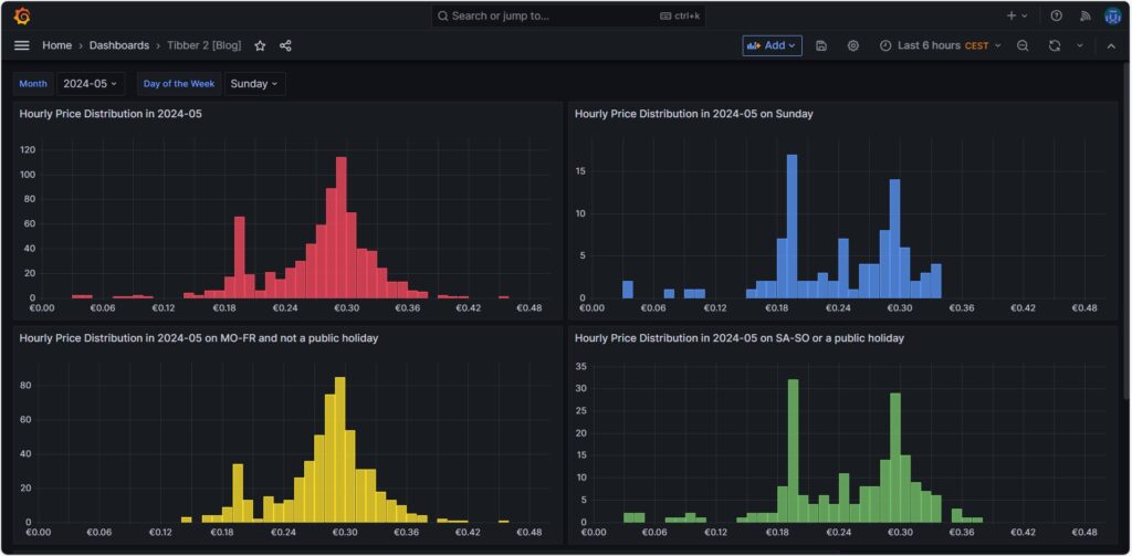
Hourly price distribution
Another finding which was interesting for me was that the price of electricity is not necessarily cheaper on the weekend (at least not in May 2024). One might assume that because industry consumption is low on the weekend, the price of electricity is lower. And that is true to some parts, as the lowest prices that occur within a whole month tend to happen on the weekend (green histogram). We can also see a peak at around 19 ¢/kWh in the green histogram which is much lower in the yellow histogram. However, there are also many hours with prices that are similar to the prices that we have during the week (yellow histogram).
Monthly hourly price curves
The following three graphs show the hourly price curves over the hour of the day per month; the selected Day of the Week is irrelevant for this graph as only the variable Month is used.
The green curve shows the minimum hourly price per kWh that occurred in the selected month. The red curve shows the maximum hourly price per kWh that occurred in the selected month. The yellow curve shows the average hourly price per kWh that occurred in the selected month. The blue curve shows the average hourly price per kWh that I have experienced in the selected month, calculating my own solar electricity generation as “free of cost” (like the blue curve of the graph in chapter Price and consumption patterns).
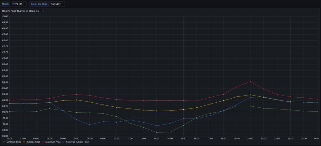
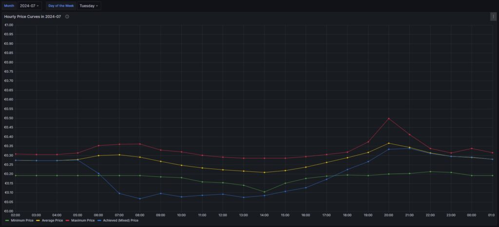
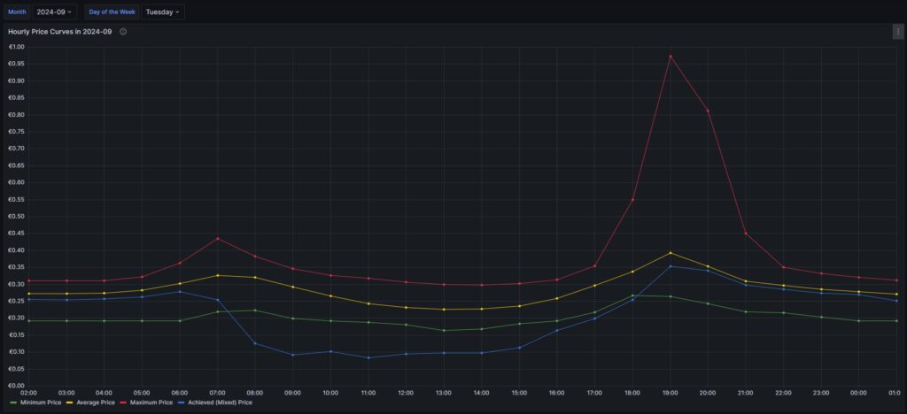
There are a couple of interesting findings that can easily be seen in the curves:
- Prices tend to be higher in the early morning (06:00-08:00) and in the evening (18:00-21:00). The evening price peak is higher than the one in the morning.
- The price gap in the morning, but especially in the evening hours between the minimum and the maximum hourly price seems to increase from May to September. I do not yet know if this is because of the season, or if the market has become more volatile in general.
- In my personal situation (the solar modules face East), I am not bothered by the price peak in the morning, as I seem to have already quite a good power generation (blue curve descending in the morning). That is, however, different in the evening; then, I am personally affected by the price peak.
For me, this is an indication that it might make sense to install a battery and charge it during the day and discharge it especially in the evening hours (18:00-21:00) when the price peaks.
Electricity price levels
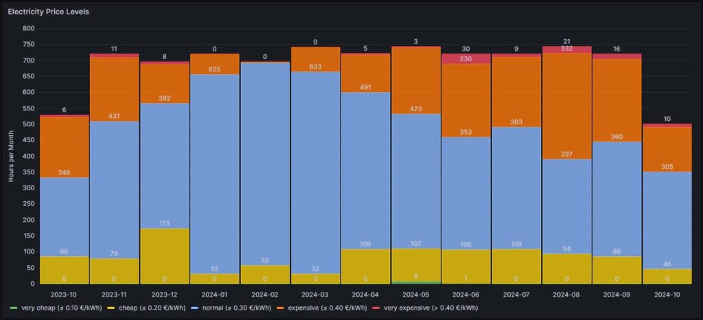
In order to look into the hourly prices from a different perspective, I have grouped the hourly prices into five categories:
- Price per kWh ≤10 ¢/kWh (green block), labelled as very cheap
- Price per kWh >10 ¢/kWh and ≤20 ¢/kWh (yellow block), labelled as cheap
- Price per kWh >20 ¢/kWh and ≤30 ¢/kWh (blue block), labelled as normal
- Price per kWh >30 ¢/kWh and ≤40 ¢/kWh (orange block), labelled as expensive
- Price per kWh >40 ¢/kWh (red block), labelled as very expensive
For each month (except for Oct 2023, Oct 2024) the sum of the blocks in different colors are the hours of the respective month; depending on the number of days per month, the number of hours vary, of course. Larger blocks correspond to more hours in the respective price category. Do not pay attention to the numbers listed in the graph in white color as some numbers are missing. I will give a numerical statistic below the graph.
| Month | very cheap (≤ 10 ¢/kWh) | cheap (≤ 20 ¢/kWh) | normal (≤ 30 ¢/kWh) | expensive (≤ 40 ¢/kWh) | very expensive (> 40 ¢/kWh) |
| 2023-10 | 0 | 86 | 248 | 189 | 6 |
| 2023-11 | 0 | 79 | 431 | 199 | 11 |
| 2023-12 | 0 | 173 | 392 | 123 | 8 |
| 2024-01 | 0 | 32 | 625 | 63 | 0 |
| 2024-02 | 0 | 58 | 635 | 3 | 0 |
| 2024-03 | 0 | 32 | 633 | 78 | 0 |
| 2024-04 | 0 | 109 | 491 | 117 | 5 |
| 2024-05 | 8 | 102 | 423 | 208 | 3 |
| 2024-06 | 1 | 106 | 353 | 230 | 30 |
| 2024-07 | 0 | 109 | 383 | 219 | 9 |
| 2024-08 | 0 | 94 | 297 | 332 | 21 |
| 2024-09 | 0 | 86 | 360 | 258 | 16 |
| 2024-10 | 0 | 46 | 305 | 141 | 10 |
Before I had generated this graph and the ones of the previous chapter, my initial assumption had been that in summer, the prices would go down compared to winter. And to some part, this is true. There is a higher number of hours in the category “cheap” (yellow block). However, the category “expensive” (orange block) increases even more in summer. And even the category “very expensive” (red block) becomes noticeable whereas the category “very cheap” (green block) does not manifest itself, not even in summer. I do not have an explanation for this; my assumption though is that maybe in winter, some fossil power stations are active that are switched off in summer and that therefore, the price is much more susceptible to the change in the electricity offer over the day. I suspect that during the day, there is mostly enough solar electricity generation, and in the evening, gas power stations need to be started that then determine the price level and lead to increased prices. However, I do not have any statistics underpinning this assumption.
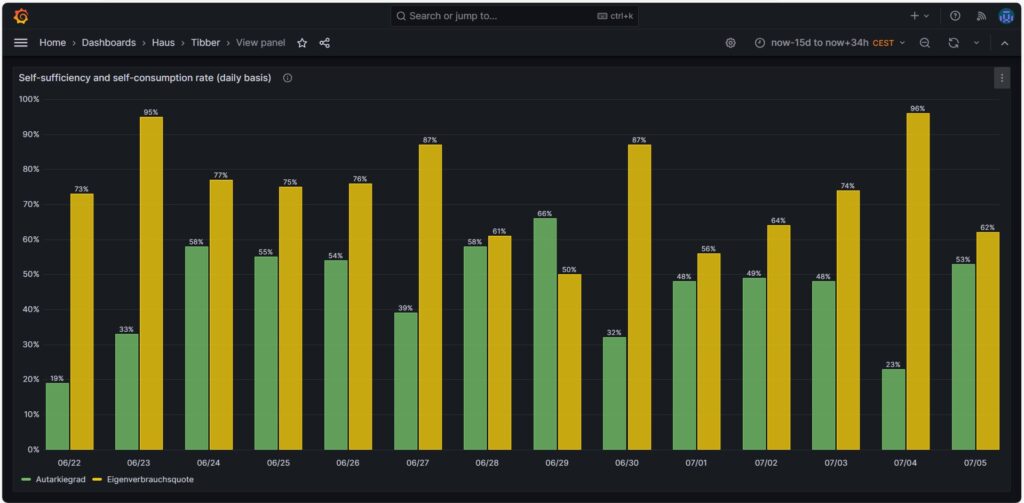
Self-sufficiency (Autarkie) and sef-consumption (Eigenverbrauch)
I am not much of a friend of looking at the values of self-sufficiency (de: Autarkie) and self-consumption (de: Eigenverbrauch), and this is for the following reasons:
- If you do not live in a place where an electricity grid is not available or where the grid is very unreliable, it does not make sense to strive for complete self-sufficiency. It is still economically best if you use your electricity during the day and consume electricity from the grid at night. Similarly, you will probably need to buy electricity from the grid in winter, at least in Central or Northern Europe as in winter, the output from your own solar electricity generation is usually insufficient to power the consumption of your house.
- The value for self-consumption varies strongly with your consumption pattern and with the solar intensity on the respective day. The only conclusion that you can draw from observing the self-consumption values over a longer time frame is:
- If your values are constantly low, then you probably have spent into too large of a solar system.
- If your values are constantly high or 100%, then it might make sense to add some more solar panels to your system.
Nevertheless, for the sake of completion, here are some example values from July of this year.
Conclusion
- The field of dynamic electricity pricing is technically very interesting and certainly helps to sharpen awareness for the need to consume electricity precisely then, when there is a lot of it available.
- Economically, having a dynamic electricity price can make sense under certain conditions. I side with [8] when I say:
- For a household without an electric car or another large electricity consumer, it does not make sense to use dynamic electricity pricing. The consumption of the washing machine, the dryer, and the dishwasher are not large enough to really draw a benefit.
- For a household with an electric car that has a large battery (e.g., some 80+ kWh, unfortunately not my use case), it makes sense then when you have the flexibility to charge the car during times with a low electricity price.
Annex: Technical Details
Preconditions
In order to use the approach described below, you should:
- … have access to a Linux machine or account
- … have a MySQL or MariaDB database server installed, configured, up and running
- … have the package Grafana [2] installed, configured, up and running
- … have the package Node-RED [3] installed, configured, up and running
- … have access to the data of your own electricity consumption and pricing information of your supplier or use the dataset linked below in this blog
- … have some basic knowledge of how to operate in a Linux environment and some basic understanding of shell scripts
- … have read and understood the previous blog post [6], especially the part on how to connect Grafana to the MySQL or MariaDB database server
The Database
The base for the following visualizations is a fully populated MariaDB database with the following structure:
# Datenbank für Analysen mit Tibber
# V2.0; 2024-09-12, Gabriel Rüeck <gabriel@rueeck.de>, <gabriel@caipirinha.spdns.org>
# Delete existing databases
REVOKE ALL ON tibber.* FROM 'gabriel';
DROP DATABASE tibber;

# Create a new database
CREATE DATABASE tibber DEFAULT CHARSET utf8mb4 COLLATE utf8mb4_general_ci;
GRANT ALL ON tibber.* TO 'gabriel';
USE tibber;
SET default_storage_engine=Aria;

CREATE TABLE preise         (uid               INT UNSIGNED NOT NULL PRIMARY KEY AUTO_INCREMENT,\
                             zeitstempel       DATETIME NOT NULL UNIQUE,\
                             preis             DECIMAL(5,4),\
                             niveau            ENUM('VERY_CHEAP','CHEAP','NORMAL','EXPENSIVE','VERY_EXPENSIVE'));

CREATE TABLE verbrauch      (uid               INT UNSIGNED NOT NULL PRIMARY KEY AUTO_INCREMENT,\
                             zeitstempel       DATETIME NOT NULL UNIQUE,\
                             energie           DECIMAL(5,3),\
                             kosten            DECIMAL(5,4));

CREATE TABLE zaehler        (uid               INT UNSIGNED NOT NULL PRIMARY KEY AUTO_INCREMENT,\
                             zeitstempel       TIMESTAMP NOT NULL DEFAULT UTC_TIMESTAMP,\
                             bezug             DECIMAL(9,3) DEFAULT NULL,\
                             erzeugung         DECIMAL(9,3) DEFAULT NULL,\
                             einspeisung       DECIMAL(9,3) DEFAULT NULL);
Data Acquisition
Data for the MariaDB database is acquired with two different methods.
The tables preise and verbrauch are populated with the following bash script. You will need a valid API token of your Tibber account [4]; in this script, you need to replace _API_TOKEN with your personal API token ([4]) and _HOME_ID with your personal Home ID ([1]). The script further assumes that the user gabriel can login to the MySQL database without further authentication; this can be achieved by writing the MySQL login information in the file ~/.my.cnf.
#!/bin/bash
#
# Dieses Skript liest Daten für die Tibber-Datenbank und speichert das Ergebnis in einer MySQL-Datenbank ab.
# Das Skript wird einmal pro Tag aufgerufen.
#
# V2.0; 2024-09-12, Gabriel Rüeck <gabriel@rueeck.de>, <gabriel@caipirinha.spdns.org>
#
# CONSTANTS
declare -r    MYSQL_DATABASE='tibber'
declare -r    MYSQL_SERVER='localhost'
declare -r    MYSQL_USER='gabriel'
declare -r    TIBBER_API_TOKEN='_API_TOKEN'
declare -r    TIBBER_API_URL='https://api.tibber.com/v1-beta/gql'
declare -r    TIBBER_HOME_ID='_HOME_ID'

# VARIABLES

# PROGRAM
# Read price information for tomorrow
curl -s -S -H "Authorization: Bearer ${TIBBER_API_TOKEN}" -H "Content-Type: application/json" -X POST -d  '{ "query": "{viewer {home (id: \"'"${TIBBER_HOME_ID}"'\") {currentSubscription {priceInfo {tomorrow {total startsAt level }}}}}}" }' "${TIBBER_API_URL}" | jq -r '.data.viewer.home.currentSubscription.priceInfo.tomorrow[] | .total, .startsAt, .level' | while read cost; do
  read LINE
  read level
  timestamp=$(echo "${LINE%%+*}" | tr 'T' ' ')
  # Determine timezone offset and store the UTC datetime in the database
  offset="${LINE:23}"
  mysql --default-character-set=utf8mb4 -B -N -r -D "${MYSQL_DATABASE}" -h ${MYSQL_SERVER} -u ${MYSQL_USER} -e "INSERT INTO preise (zeitstempel,preis,niveau) VALUES (DATE_SUB(\"${timestamp}\",INTERVAL \"${offset}\" HOUR_MINUTE),${cost},\"${level}\");"
done

# Read consumption information from the past 24 hours
curl -s -S -H "Authorization: Bearer ${TIBBER_API_TOKEN}" -H "Content-Type: application/json" -X POST -d  '{ "query": "{viewer {home (id: \"'"${TIBBER_HOME_ID}"'\") {consumption (resolution: HOURLY, last: 24) {nodes {from to cost consumption}}}}}" }' "${TIBBER_API_URL}" | jq -r '.data.viewer.home.consumption.nodes[] | .from, .consumption, .cost' | while read LINE; do
  read consumption
  read cost
  timestamp=$(echo "${LINE%%+*}" | tr 'T' ' ')
  # Determine timezone offset and store the UTC datetime in the database
  offset="${LINE:23}"
  mysql --default-character-set=utf8mb4 -B -N -r -D "${MYSQL_DATABASE}" -h ${MYSQL_SERVER} -u ${MYSQL_USER} -e "INSERT INTO verbrauch (zeitstempel,energie,kosten) VALUES (DATE_SUB(\"${timestamp}\",INTERVAL \"${offset}\" HOUR_MINUTE),${consumption},${cost});"
done
The table zaehler is populated via a Node-RED flow that reads data from the Tibber API [4] as well as from the AVM socket FRITZ!DECT 210 and stores new values for the columns bezug, erzeugung, einspeisung every 15 minutes. I used a Node-RED flow for this because otherwise, I would have to program code for the access of the Tibber API [4] and include code [5] for the AVM socket FRITZ!DECT 210. However, I do plan to enlarge the functionality later with an Energy Storage System (ESS) and a battery, and so Node-RED seemed suitable to me. The flow is shown here; it contains some additional nodes apart from the now needed functionality, and it is still in development:
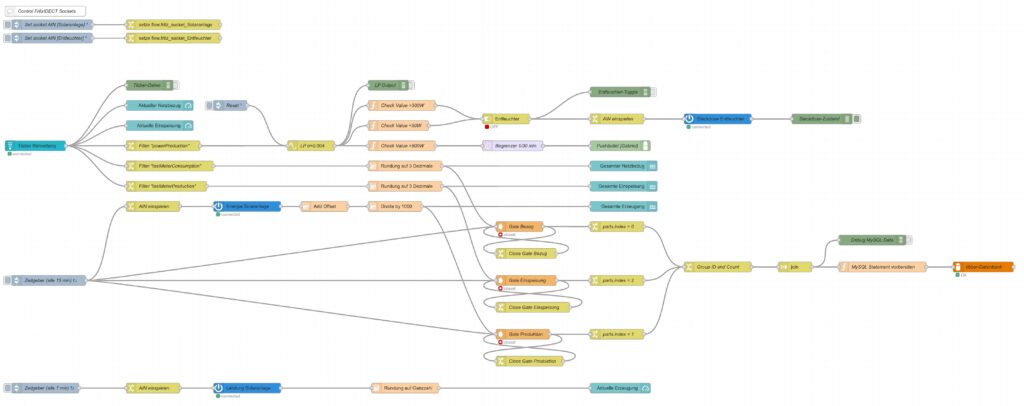
I have decided not to publish the JSON code here as I am not yet entirely familiar with Node-RED [3] and would not know how to remove my personal tokens from the JSON code.
Queries for the Graphs
Price and Consumption Patterns
The graph is based on four queries that correspond to the green and yellow, to the red, to the orange and to the blue curve:
SELECT zeitstempel,
       preis AS 'grid price',
       AVG(preis) OVER (ORDER BY zeitstempel ROWS BETWEEN 47 PRECEDING AND CURRENT ROW) as 'rolling 2-days average grid price'
FROM preise;

SELECT zeitstempel, energie AS 'grid consumption' FROM verbrauch;

SELECT alt.zeitstempel,
       (neu.bezug-alt.bezug+neu.erzeugung-alt.erzeugung-neu.einspeisung+alt.einspeisung) AS 'residential consumption'
FROM zaehler AS neu JOIN zaehler AS alt ON neu.uid=(alt.uid+4)
WHERE MINUTE(alt.zeitstempel)=0;

SELECT alt.zeitstempel,
       ROUND(preise.preis*(neu.bezug-alt.bezug)/(neu.bezug-alt.bezug+neu.erzeugung-alt.erzeugung-neu.einspeisung+alt.einspeisung),4) AS 'price for mixed grid/solar'
FROM zaehler AS neu
JOIN zaehler AS alt ON neu.uid=(alt.uid+4)
LEFT JOIN preise ON DATE_FORMAT(preise.zeitstempel, "%Y%m%d%H%i")=DATE_FORMAT(alt.zeitstempel, "%Y%m%d%H%i")
WHERE MINUTE(alt.zeitstempel)=0
  AND preise.zeitstempel>=DATE_SUB(CURRENT_DATE(),INTERVAL 30 DAY);
Actual cost, minimal cost, maximal cost, average cost per day
This graph uses only one query:
SELECT DATE(preise.zeitstempel) AS 'date',
       MIN(preise.preis)*SUM(verbrauch.energie) AS 'minimal cost',
       MAX(preise.preis)*SUM(verbrauch.energie) AS 'maximal cost',
       AVG(preise.preis)*SUM(verbrauch.energie) AS 'average cost',
       SUM(verbrauch.kosten) AS 'actual cost'
FROM preise JOIN verbrauch ON verbrauch.zeitstempel=preise.zeitstempel
WHERE DATE(preise.zeitstempel)>'2024-03-03'
GROUP BY DATE(preise.zeitstempel);
Cost and amount of purchased electricity from grid with price indication
The first graph (Cost of purchased electricity from grid with price indication) uses the query:
SELECT DATE_FORMAT(preise.zeitstempel,'%m/%d') AS 'Datum',
       ROW_NUMBER() OVER (PARTITION BY DATE(preise.zeitstempel) ORDER BY preise.preis ASC) AS 'Row',
	   verbrauch.kosten AS 'Kosten'
FROM preise JOIN verbrauch ON verbrauch.zeitstempel=preise.zeitstempel
WHERE DATE(preise.zeitstempel)>DATE_ADD(CURDATE(), INTERVAL -15 DAY)
ORDER BY DATE(preise.zeitstempel) ASC, preise.preis ASC;
The second graph (Amount of purchased electricity from grid with price indication) uses the query:
SELECT DATE_FORMAT(preise.zeitstempel,'%m/%d') AS 'Datum',
       ROW_NUMBER() OVER (PARTITION BY DATE(preise.zeitstempel) ORDER BY preise.preis ASC) AS 'Row',
	   verbrauch.energie AS 'Energie'
FROM preise JOIN verbrauch ON verbrauch.zeitstempel=preise.zeitstempel
WHERE DATE(preise.zeitstempel)>DATE_ADD(CURDATE(), INTERVAL -15 DAY)
ORDER BY DATE(preise.zeitstempel) ASC, preise.preis ASC;
Hourly price distribution
The red histogram uses the query:
SELECT preis FROM preise WHERE DATE_FORMAT(zeitstempel,'%Y-%m')='${Month}';The blue histogram uses the query:
SELECT preis FROM preise
WHERE DATE_FORMAT(zeitstempel,'%Y-%m')='${Month}'
  AND DAYNAME(zeitstempel)='${Weekday}';
The yellow histogram uses the query:
SELECT preis FROM preise
WHERE DATE_FORMAT(zeitstempel,'%Y-%m')='${Month}'
  AND WEEKDAY(zeitstempel)<5
  AND DATE(zeitstempel) NOT IN (SELECT datum FROM aux_feiertage);
The green histogram uses the query:
SELECT preis FROM preise
WHERE DATE_FORMAT(zeitstempel,'%Y-%m')='${Month}'
  AND WEEKDAY(zeitstempel)>=5
  OR DATE(zeitstempel) IN (SELECT datum FROM aux_feiertage WHERE DATE_FORMAT(zeitstempel,'%Y-%m')='${Month}');
The tables use these variables on the respective Grafana dasboard as well as the additional helper table aux_feiertage (indicating national holidays) in the MariaDB database.
The variable Month on the Grafana dasboard has the query:
SELECT DISTINCT(DATE_FORMAT(zeitstempel,'%Y-%m')) FROM preise;The variable Weekday on the Grafana dasboard has the query:
SELECT aux_wochentage.wochentag AS Weekday
FROM aux_wochentage JOIN aux_sprachen ON aux_sprachen.id_sprache=aux_wochentage.id_sprache
WHERE aux_sprachen.sprachcode='en'
ORDER BY aux_wochentage.id_tag ASC;
The last query also uses the tables aux_wochentage and aux_sprachen in order to offer a multi-lingual interface (not really necessary for the functionality). The tables are:
CREATE TABLE aux_wochentage (id_tag            TINYINT UNSIGNED NOT NULL,\
                             id_sprache        TINYINT UNSIGNED NOT NULL,\
                             wochentag         VARCHAR(30) NOT NULL);

CREATE TABLE aux_sprachen   (id_sprache        TINYINT UNSIGNED NOT NULL PRIMARY KEY,\
                             sprachcode        CHAR(2),\
                             sprache           VARCHAR(30));

CREATE TABLE aux_feiertage  (uid               SMALLINT UNSIGNED NOT NULL PRIMARY KEY AUTO_INCREMENT,\
                             datum             DATE NOT NULL,\
                             beschreibung      VARCHAR(50));

INSERT INTO aux_sprachen   VALUES (0,'en','English'),\
                                  (1,'de','Deutsch'),\
                                  (2,'pt','Português'),\
                                  (3,'zh','中文');

INSERT INTO aux_wochentage VALUES (0,0,'Monday'),\
                                  (1,0,'Tuesday'),\
                                  (2,0,'Wednesday'),\
                                  (3,0,'Thursday'),\
                                  (4,0,'Friday'),\
                                  (5,0,'Saturday'),\
                                  (6,0,'Sunday'),\
                                  (0,1,'Montag'),\
                                  (1,1,'Dienstag'),\
                                  (2,1,'Mittwoch'),\
                                  (3,1,'Donnerstag'),\
                                  (4,1,'Freitag'),\
                                  (5,1,'Samstag'),\
                                  (6,1,'Sonntag'),\
                                  (0,2,'segunda-feira'),\
                                  (1,2,'terça-feira'),\
                                  (2,2,'quarta-feira'),\
                                  (3,2,'quinta-feira'),\
                                  (4,2,'sexta-feira'),\
                                  (5,2,'sábado'),\
                                  (6,2,'domingo'),\
                                  (0,3,'星期一'),\
                                  (1,3,'星期二'),\
                                  (2,3,'星期三'),\
                                  (3,3,'星期四'),\
                                  (4,3,'星期五'),\
                                  (5,3,'星期六'),\
                                  (6,3,'星期日');

INSERT INTO aux_feiertage (datum, beschreibung) VALUES ('2023-01-01','Neujahr'),\
                               ('2023-01-06','Heilige Drei Könige'),\
                               ('2023-04-07','Karfreitag'),\
                               ('2023-04-10','Ostermontag'),\
                               ('2023-05-01','Tag der Arbeit'),\
                               ('2023-05-18','Christi Himmelfahrt'),\
                               ('2023-05-29','Pfingstmontag'),\
                               ('2023-06-08','Fronleichnam'),\
                               ('2023-08-15','Mariä Himmelfahrt'),\
                               ('2023-10-03','Tag der Deutschen Einheit'),\
                               ('2023-11-01','Allerheiligen'),\
                               ('2023-12-25','1. Weihnachtstag'),\
                               ('2023-12-26','2. Weihnachtstag'),\
                               ('2024-01-01','Neujahr'),\
                               ('2024-01-06','Heilige Drei Könige'),\
                               ('2024-03-29','Karfreitag'),\
                               ('2024-04-01','Ostermontag'),\
                               ('2024-05-01','Tag der Arbeit'),\
                               ('2024-05-09','Christi Himmelfahrt'),\
                               ('2024-05-20','Pfingstmontag'),\
                               ('2024-05-30','Fronleichnam'),\
                               ('2024-08-15','Mariä Himmelfahrt'),\
                               ('2024-10-03','Tag der Deutschen Einheit'),\
                               ('2024-11-01','Allerheiligen'),\
                               ('2024-12-25','1. Weihnachtstag'),\
                               ('2024-12-26','2. Weihnachtstag'),\
                               ('2025-01-01','Neujahr'),\
                               ('2025-01-06','Heilige Drei Könige'),\
                               ('2025-04-18','Karfreitag'),\
                               ('2025-04-21','Ostermontag'),\
                               ('2025-05-01','Tag der Arbeit'),\
                               ('2025-05-29','Christi Himmelfahrt'),\
                               ('2025-06-09','Pfingstmontag'),\
                               ('2025-06-19','Fronleichnam'),\
                               ('2025-08-15','Mariä Himmelfahrt'),\
                               ('2025-10-03','Tag der Deutschen Einheit'),\
                               ('2025-11-01','Allerheiligen'),\
                               ('2025-12-25','1. Weihnachtstag'),\
                               ('2025-12-26','2. Weihnachtstag');
Monthly hourly price curves
This graph uses only one query:
SELECT preise.zeitstempel AS 'time',
       MIN(preise.preis) AS 'Minimum Price',
       ROUND(AVG(preise.preis),4) AS 'Average Price',
       MAX(preise.preis) AS 'Maximum Price',
       ROUND((SUM(verbrauch.kosten)/(SUM(neu.bezug)-SUM(alt.bezug)+SUM(neu.erzeugung)-SUM(alt.erzeugung)-SUM(neu.einspeisung)+SUM(alt.einspeisung))),4) AS 'Achieved (Mixed) Price'
FROM preise
   INNER JOIN verbrauch ON preise.zeitstempel=verbrauch.zeitstempel
   LEFT JOIN zaehler AS alt ON DATE_FORMAT(alt.zeitstempel,"%Y%m%d%H%i")=DATE_FORMAT(preise.zeitstempel,"%Y%m%d%H%i")
   INNER JOIN zaehler AS neu ON neu.uid=(alt.uid+4)
WHERE DATE_FORMAT(preise.zeitstempel,'%Y-%m')='${Month}'
GROUP BY TIME(preise.zeitstempel);
It is important to keep in mind that the results from the query show the timespan of the first day of the month (and only the first day) between 00:00 UTC and 23:59 UTC; hence the time window on the Grafana dashboard has to be chosen accordingly (e.g. from 2024-07-01 02:00:00 to 2024-07-02 01:00:00 in the timezone CEST).
Electricity price levels
This graph uses only one query:
SELECT DATE_FORMAT(zeitstempel,'%Y-%m') AS 'Month',
        COUNT(CASE WHEN preis<=0.1 THEN preis END) AS 'very cheap (≤ 0.10 €/kWh)',
        COUNT(CASE WHEN preis>0.1 AND preis<=0.2 THEN preis END) AS 'cheap (≤ 0.20 €/kWh)',
        COUNT(CASE WHEN preis>0.2 AND preis<=0.3 THEN preis END) AS 'normal (≤ 0.30 €/kWh)',
        COUNT(CASE WHEN preis>0.3 AND preis<=0.4 THEN preis END) AS 'expensive (≤ 0.40 €/kWh)',
        COUNT(CASE WHEN preis>0.4 THEN preis END) AS 'very expensive (> 0.40 €/kWh)'
FROM preise
GROUP BY Month;
Self-sufficiency (Autarkie) and sef-consumption (Eigenverbrauch)
This graph uses only one query:
SELECT DATE_FORMAT(alt.zeitstempel,'%m/%d') AS 'Datum',
       ROUND((neu.erzeugung-alt.erzeugung-neu.einspeisung+alt.einspeisung)*100/(neu.bezug-alt.bezug+neu.erzeugung-alt.erzeugung-neu.einspeisung+alt.einspeisung)) AS 'Autarkiegrad',
       ROUND((neu.erzeugung-alt.erzeugung-neu.einspeisung+alt.einspeisung)*100/(neu.erzeugung-alt.erzeugung)) AS 'Eigenverbrauchsquote'
FROM zaehler AS neu
JOIN zaehler AS alt ON neu.uid=(alt.uid+96)
WHERE HOUR(alt.zeitstempel)=0
  AND MINUTE(alt.zeitstempel)=0
  AND alt.zeitstempel>=DATE_SUB(CURRENT_DATE(),INTERVAL 14 DAY);
Files
The following dataset was used for the graphs:
Sources
- [1] = Tibber Developer
- [2] = Download Grafana | Grafana Labs
- [3] = Node-RED
- [4] = Tibber Developer: Communicating with the API
- [5] = Smarthome: AVM-Steckdosen per Skript auslesen
- [6] = Grafana Visualizations (Part 2)
- [7] = Strom: heute Extrempreise für Kunden im EPEX SPOT – ISPEX
- [8] = Dynamischer Stromtarif – Warum fallen ALLE darauf rein?
Disclaimer
- Program codes and examples are for demonstration purposes only.
- Program codes are not recommended be used in production environments without further enhancements in terms of speed, failure-tolerance or cyber-security.
- While program codes have been tested, they might still contain errors.
- I am neither affiliated nor linked to companies named in this blog post.