Statistics
Learnings from Dynamic Electricity Pricing
Executive Summary
Unlike previous articles, I chose to split this new blog post into two parts. In the first part (Findings), I will elaborate on my findings as a consumer with dynamic electricity prices (day-ahead market) in connection with a small solar electricity generation unit. We will look at various visualizations that help to understand the impact and to gain some more insight in how dynamic electricity prices can be useful. In the second part (Annex: Technical Details), technically interested folks will find the respective queries and sample data with which they can replicate the findings or even do their own examination with the sample data. As in previous articles, Grafana is used in connection with a MariaDB database.
Background
On 1st of March 2024, I switched from a traditional electricity provider to one with dynamic day-ahead pricing, in my case, Tibber. I wanted to try this contractual model and see if I could successfully manage to shift chunks of high electricity consumption such as:
- … loading the battery-electric vehicle (BEV) or the plug-in hybrid car (PHEV)
- … washing clothes
- … drying clothes in the electric dryer
to those times of the day when the electricity price is lower. I also wanted to see if that makes economic sense for me. And, after all, it is fun to play around with data and gain new insights.
As my electricity supplier, I had chosen Tibber because they were the first one I got to know and they offer a device called Pulse which can connect a digital electricity meter to their infrastructure for metering and billing purposes. Furthermore, they do have an API [1] which allows me to read out my own data; that was very important for me. I understand that meanwhile, there are several providers Tibber that have similar models and comparable features.
Findings
Price and consumption patterns
The graph below shows five curves and is an upgraded version of the respective graph in [6] visualizing data over two weeks:
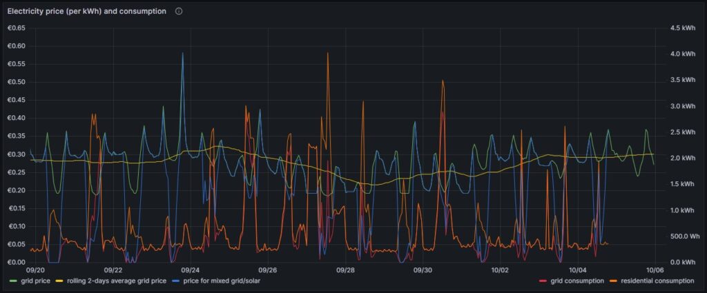
As in [6], the green curve is the hourly price of the day-ahead market. It is well recognizable that the price has peaks in the evening and in the morning at breakfast time when residential consumption is high, but little solar energy is available in Germany. The yellow curve is a two-days floating average and shows that the average price is not below a fixed rate electricity contract, an important point that we shall discuss later. The orange curve is the consumption of my house; the higher peaks indicate times when I charged one of the cars using an ICCB (one phase, current: 10 A). The red curve shows the consumption of the grid. During the day, when there is sunshine, the red curve lies below the orange curve as a part of the overall consumed electricity comes from the solar panels. At nighttime, the red curve will exactly lie on the orange curve as there is no solar electricity generation. The blue curve shows the average electricity price per kWh based on a mixed calculation of the grid price and zero for my own solar electricity generation. One might argue whether zero is an adequate assumption as also solar panels cost money, but as I do have them installed already, I consider them to be sunk cost now. The blue curve show an interesting behavior: When my consumption is low, the blue curve shows a small average price. When the consumption of the house is less than the power that is generated by the solar panels, then the blue curve is flat zero. When, however, I consume a lot of power, then, the blue curve approaches the green curve. At nighttime when there is no solar energy generation, the blue curve lies identical with the green curve.
My goal is to consume more electricity in the times when either the green curve points to a low electricity price or when there is enough electricity generated by the solar panels so that my average price that I pay (blue curve) is reasonable low. This also explains why I mostly the ICCB (one phase, 10 A) to charge the cars as then, I still can get a good average price (although charging takes a lot more time then). I think that by looking at the curves, I have adapted my consumption pattern well to the varying electricity price.
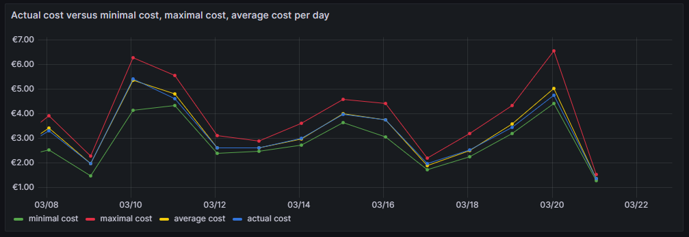
Actual cost, minimal cost, maximal cost, average cost per day
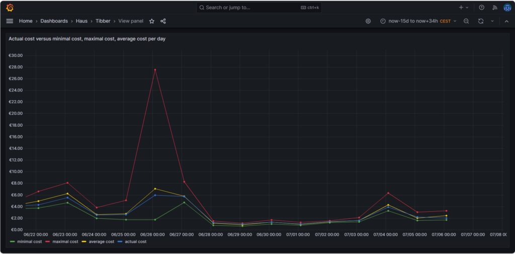
The graph above shows four curves. The green curve is the cost that I would have incurred if I had bought all the electricity of the respective day in the hour of the cheapest electricity price. This would only be possible if I had a battery that could bridge the remaining 23 hours of the day (and probably some hours more as the cheapest hour of the following day is not necessarily 00:00-01:00). The red curve is the cost that I would have incurred if I had bought all the electricity of the respective day in the hour of the most expensive electricity price. The yellow curve is the average cost of the respective day, the multiplication of the average price per kWh of that day by my consumed energy. The blue curve is the real cost that I have paid. If the blue curve is between the yellow curve and the green curve, then this is very good, and I have succeeded in shifting my consumption versus the hours with cheaper electricity. Without a battery, it is almost impossible to come very close to the green line.
The graph above shows one peculiarity as on 2024-06-26, there were some hours with an extremely high price, but that was due to a communication error that decoupled the auction in Germany from the rest of Europe [7], clearly (and hopefully) a one-time event.
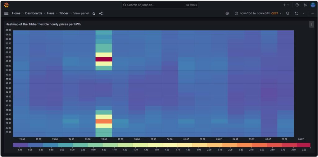
Price heatmap of the hourly prices per kWh
The one-time event with unusually high prices [7] is well visible in the price heatmap that was already introduced and explained in [6]. The one-time event overshadows all price fluctuations in the rest of the week.
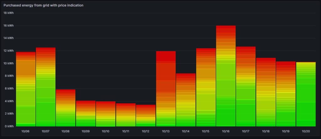
Cost and amount of purchased electricity from grid with price indication
The first graph shown below was already introduced and explained in [6] and shows the cost of purchased electricity from the grid in 24 rectangles, whereby each rectangle represents an hour. The order of the rectangles starts with the most expensive hour at the top and ends with the least expensive hour at the bottom. The larger the rectangle, the more money has been spent in the respective hour. I already explained in [6] that the goal should be – if electricity has to be purchased from the grid at all – the purchases ideally should happen in times when the price is low. In the graph those are the rectangles with green or at maximum yellow color. The rectangles with orange and red color indicate purchases during times of a high electricity price. In reality, one will not be able to avoid purchases at times of a high price completely. My experience is that in summer, I let the air conditioning systems run also in the evening hours when the electricity price is higher, just to keep the house at reasonable temperatures inside. Similarly, in spring and autumn, I opt for leaving the central heating switched off and try to heat the rooms in which I am usually with the air conditioning systems (in heating mode) as in spring and autumn, the difference in temperature between outside and inside is not too high, and the air conditioning systems will have a high efficiency.
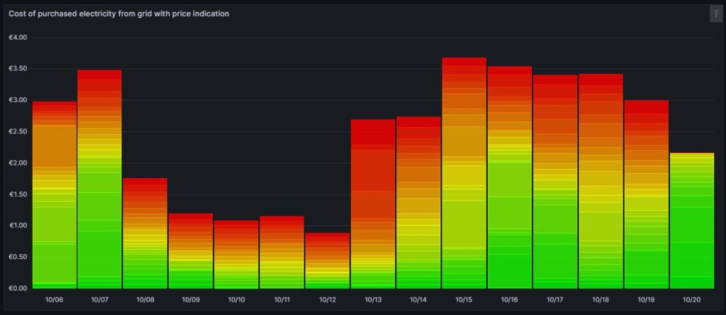
Then, for 13-Oct (10/13), one can see that in fact I bought substantial electricity at high prices. The reason for that was that I returned home at night and had to re-charge the car for the next day. So, one cannot always avoid purchasing electricity at high prices.
The next chart offers another view on the same topic. Rather than looking at the cost of the purchased electricity, we look at the amount of purchased electricity. This offers an interesting insight. Except for 13-Oct, the amount of electricity that is purchased at hours with a high price, is less than 5 kWh. This means that with an energy-storage system (ESS), it should be possible to charge a battery of around 5 kWh during times of a lower electricity price and to discharge the battery and supply the house during times of a high electricity price so that ideally, there would be no or only minimally sized orange and red rectangles. Of course, this only makes sense if the low prices and the high prices per day differ substantially as the ESS will have losses of 10%…20%. And in fact, this is exactly an idea that I am planning to try out within the next months (so stay tuned).
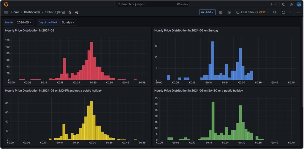
Hourly price distribution
Another finding which was interesting for me was that the price of electricity is not necessarily cheaper on the weekend (at least not in May 2024). One might assume that because industry consumption is low on the weekend, the price of electricity is lower. And that is true to some parts, as the lowest prices that occur within a whole month tend to happen on the weekend (green histogram). We can also see a peak at around 19 ¢/kWh in the green histogram which is much lower in the yellow histogram. However, there are also many hours with prices that are similar to the prices that we have during the week (yellow histogram).
Monthly hourly price curves
The following three graphs show the hourly price curves over the hour of the day per month; the selected Day of the Week is irrelevant for this graph as only the variable Month is used.
The green curve shows the minimum hourly price per kWh that occurred in the selected month. The red curve shows the maximum hourly price per kWh that occurred in the selected month. The yellow curve shows the average hourly price per kWh that occurred in the selected month. The blue curve shows the average hourly price per kWh that I have experienced in the selected month, calculating my own solar electricity generation as “free of cost” (like the blue curve of the graph in chapter Price and consumption patterns).
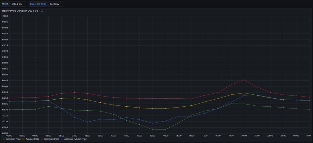
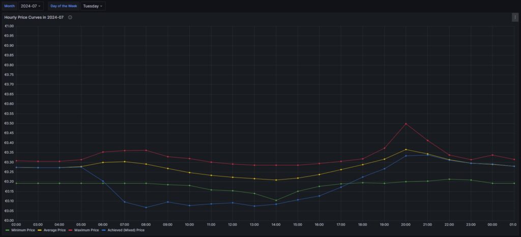
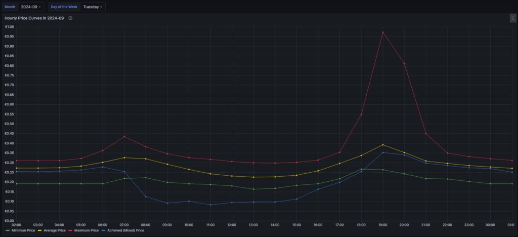
There are a couple of interesting findings that can easily be seen in the curves:
- Prices tend to be higher in the early morning (06:00-08:00) and in the evening (18:00-21:00). The evening price peak is higher than the one in the morning.
- The price gap in the morning, but especially in the evening hours between the minimum and the maximum hourly price seems to increase from May to September. I do not yet know if this is because of the season, or if the market has become more volatile in general.
- In my personal situation (the solar modules face East), I am not bothered by the price peak in the morning, as I seem to have already quite a good power generation (blue curve descending in the morning). That is, however, different in the evening; then, I am personally affected by the price peak.
For me, this is an indication that it might make sense to install a battery and charge it during the day and discharge it especially in the evening hours (18:00-21:00) when the price peaks.
Electricity price levels
In order to look into the hourly prices from a different perspective, I have grouped the hourly prices into five categories:
- Price per kWh ≤10 ¢/kWh (green block), labelled as very cheap
- Price per kWh >10 ¢/kWh and ≤20 ¢/kWh (yellow block), labelled as cheap
- Price per kWh >20 ¢/kWh and ≤30 ¢/kWh (blue block), labelled as normal
- Price per kWh >30 ¢/kWh and ≤40 ¢/kWh (orange block), labelled as expensive
- Price per kWh >40 ¢/kWh (red block), labelled as very expensive
For each month (except for Oct 2023, Oct 2024) the sum of the blocks in different colors are the hours of the respective month; depending on the number of days per month, the number of hours vary, of course. Larger blocks correspond to more hours in the respective price category. Do not pay attention to the numbers listed in the graph in white color as some numbers are missing. I will give a numerical statistic below the graph.
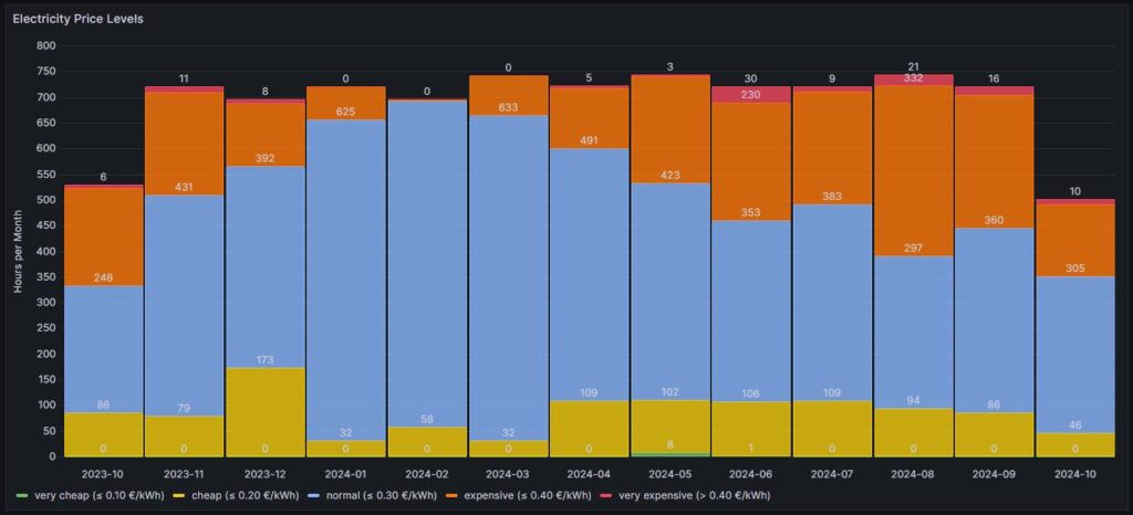
| Month | very cheap (≤ 10 ¢/kWh) | cheap (≤ 20 ¢/kWh) | normal (≤ 30 ¢/kWh) | expensive (≤ 40 ¢/kWh) | very expensive (> 40 ¢/kWh) |
| 2023-10 | 0 | 86 | 248 | 189 | 6 |
| 2023-11 | 0 | 79 | 431 | 199 | 11 |
| 2023-12 | 0 | 173 | 392 | 123 | 8 |
| 2024-01 | 0 | 32 | 625 | 63 | 0 |
| 2024-02 | 0 | 58 | 635 | 3 | 0 |
| 2024-03 | 0 | 32 | 633 | 78 | 0 |
| 2024-04 | 0 | 109 | 491 | 117 | 5 |
| 2024-05 | 8 | 102 | 423 | 208 | 3 |
| 2024-06 | 1 | 106 | 353 | 230 | 30 |
| 2024-07 | 0 | 109 | 383 | 219 | 9 |
| 2024-08 | 0 | 94 | 297 | 332 | 21 |
| 2024-09 | 0 | 86 | 360 | 258 | 16 |
| 2024-10 | 0 | 46 | 305 | 141 | 10 |
Before I had generated this graph and the ones of the previous chapter, my initial assumption had been that in summer, the prices would go down compared to winter. And to some part, this is true. There is a higher number of hours in the category “cheap” (yellow block). However, the category “expensive” (orange block) increases even more in summer. And even the category “very expensive” (red block) becomes noticeable whereas the category “very cheap” (green block) does not manifest itself, not even in summer. I do not have an explanation for this; my assumption though is that maybe in winter, some fossil power stations are active that are switched off in summer and that therefore, the price is much more susceptible to the change in the electricity offer over the day. I suspect that during the day, there is mostly enough solar electricity generation, and in the evening, gas power stations need to be started that then determine the price level and lead to increased prices. However, I do not have any statistics underpinning this assumption.
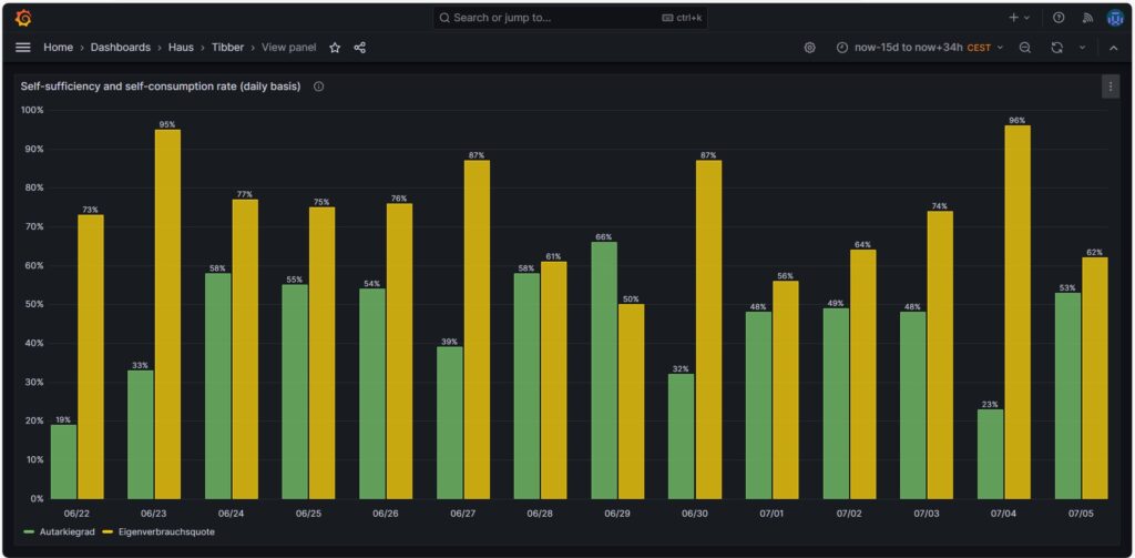
Self-sufficiency (Autarkie) and sef-consumption (Eigenverbrauch)
I am not much of a friend of looking at the values of self-sufficiency (de: Autarkie) and self-consumption (de: Eigenverbrauch), and this is for the following reasons:
- If you do not live in a place where an electricity grid is not available or where the grid is very unreliable, it does not make sense to strive for complete self-sufficiency. It is still economically best if you use your electricity during the day and consume electricity from the grid at night. Similarly, you will probably need to buy electricity from the grid in winter, at least in Central or Northern Europe as in winter, the output from your own solar electricity generation is usually insufficient to power the consumption of your house.
- The value for self-consumption varies strongly with your consumption pattern and with the solar intensity on the respective day. The only conclusion that you can draw from observing the self-consumption values over a longer time frame is:
- If your values are constantly low, then you probably have spent into too large of a solar system.
- If your values are constantly high or 100%, then it might make sense to add some more solar panels to your system.
Nevertheless, for the sake of completion, here are some example values from July of this year.
Conclusion
- The field of dynamic electricity pricing is technically very interesting and certainly helps to sharpen awareness for the need to consume electricity precisely then, when there is a lot of it available.
- Economically, having a dynamic electricity price can make sense under certain conditions. I side with [8] when I say:
- For a household without an electric car or another large electricity consumer, it does not make sense to use dynamic electricity pricing. The consumption of the washing machine, the dryer, and the dishwasher are not large enough to really draw a benefit.
- For a household with an electric car that has a large battery (e.g., some 80+ kWh, unfortunately not my use case), it makes sense then when you have the flexibility to charge the car during times with a low electricity price.
Annex: Technical Details
Preconditions
In order to use the approach described below, you should:
- … have access to a Linux machine or account
- … have a MySQL or MariaDB database server installed, configured, up and running
- … have the package Grafana [2] installed, configured, up and running
- … have the package Node-RED [3] installed, configured, up and running
- … have access to the data of your own electricity consumption and pricing information of your supplier or use the dataset linked below in this blog
- … have some basic knowledge of how to operate in a Linux environment and some basic understanding of shell scripts
- … have read and understood the previous blog post [6], especially the part on how to connect Grafana to the MySQL or MariaDB database server
The Database
The base for the following visualizations is a fully populated MariaDB database with the following structure:
# Datenbank für Analysen mit Tibber
# V2.0; 2024-09-12, Gabriel Rüeck <gabriel@rueeck.de>, <gabriel@caipirinha.spdns.org>
# Delete existing databases
REVOKE ALL ON tibber.* FROM 'gabriel';
DROP DATABASE tibber;

# Create a new database
CREATE DATABASE tibber DEFAULT CHARSET utf8mb4 COLLATE utf8mb4_general_ci;
GRANT ALL ON tibber.* TO 'gabriel';
USE tibber;
SET default_storage_engine=Aria;

CREATE TABLE preise         (uid               INT UNSIGNED NOT NULL PRIMARY KEY AUTO_INCREMENT,\
                             zeitstempel       DATETIME NOT NULL UNIQUE,\
                             preis             DECIMAL(5,4),\
                             niveau            ENUM('VERY_CHEAP','CHEAP','NORMAL','EXPENSIVE','VERY_EXPENSIVE'));

CREATE TABLE verbrauch      (uid               INT UNSIGNED NOT NULL PRIMARY KEY AUTO_INCREMENT,\
                             zeitstempel       DATETIME NOT NULL UNIQUE,\
                             energie           DECIMAL(5,3),\
                             kosten            DECIMAL(5,4));

CREATE TABLE zaehler        (uid               INT UNSIGNED NOT NULL PRIMARY KEY AUTO_INCREMENT,\
                             zeitstempel       TIMESTAMP NOT NULL DEFAULT UTC_TIMESTAMP,\
                             bezug             DECIMAL(9,3) DEFAULT NULL,\
                             erzeugung         DECIMAL(9,3) DEFAULT NULL,\
                             einspeisung       DECIMAL(9,3) DEFAULT NULL);
Data Acquisition
Data for the MariaDB database is acquired with two different methods.
The tables preise and verbrauch are populated with the following bash script. You will need a valid API token of your Tibber account [4]; in this script, you need to replace _API_TOKEN with your personal API token ([4]) and _HOME_ID with your personal Home ID ([1]). The script further assumes that the user gabriel can login to the MySQL database without further authentication; this can be achieved by writing the MySQL login information in the file ~/.my.cnf.
#!/bin/bash
#
# Dieses Skript liest Daten für die Tibber-Datenbank und speichert das Ergebnis in einer MySQL-Datenbank ab.
# Das Skript wird einmal pro Tag aufgerufen.
#
# V2.0; 2024-09-12, Gabriel Rüeck <gabriel@rueeck.de>, <gabriel@caipirinha.spdns.org>
#
# CONSTANTS
declare -r    MYSQL_DATABASE='tibber'
declare -r    MYSQL_SERVER='localhost'
declare -r    MYSQL_USER='gabriel'
declare -r    TIBBER_API_TOKEN='_API_TOKEN'
declare -r    TIBBER_API_URL='https://api.tibber.com/v1-beta/gql'
declare -r    TIBBER_HOME_ID='_HOME_ID'

# VARIABLES

# PROGRAM
# Read price information for tomorrow
curl -s -S -H "Authorization: Bearer ${TIBBER_API_TOKEN}" -H "Content-Type: application/json" -X POST -d  '{ "query": "{viewer {home (id: \"'"${TIBBER_HOME_ID}"'\") {currentSubscription {priceInfo {tomorrow {total startsAt level }}}}}}" }' "${TIBBER_API_URL}" | jq -r '.data.viewer.home.currentSubscription.priceInfo.tomorrow[] | .total, .startsAt, .level' | while read cost; do
  read LINE
  read level
  timestamp=$(echo "${LINE%%+*}" | tr 'T' ' ')
  # Determine timezone offset and store the UTC datetime in the database
  offset="${LINE:23}"
  mysql --default-character-set=utf8mb4 -B -N -r -D "${MYSQL_DATABASE}" -h ${MYSQL_SERVER} -u ${MYSQL_USER} -e "INSERT INTO preise (zeitstempel,preis,niveau) VALUES (DATE_SUB(\"${timestamp}\",INTERVAL \"${offset}\" HOUR_MINUTE),${cost},\"${level}\");"
done

# Read consumption information from the past 24 hours
curl -s -S -H "Authorization: Bearer ${TIBBER_API_TOKEN}" -H "Content-Type: application/json" -X POST -d  '{ "query": "{viewer {home (id: \"'"${TIBBER_HOME_ID}"'\") {consumption (resolution: HOURLY, last: 24) {nodes {from to cost consumption}}}}}" }' "${TIBBER_API_URL}" | jq -r '.data.viewer.home.consumption.nodes[] | .from, .consumption, .cost' | while read LINE; do
  read consumption
  read cost
  timestamp=$(echo "${LINE%%+*}" | tr 'T' ' ')
  # Determine timezone offset and store the UTC datetime in the database
  offset="${LINE:23}"
  mysql --default-character-set=utf8mb4 -B -N -r -D "${MYSQL_DATABASE}" -h ${MYSQL_SERVER} -u ${MYSQL_USER} -e "INSERT INTO verbrauch (zeitstempel,energie,kosten) VALUES (DATE_SUB(\"${timestamp}\",INTERVAL \"${offset}\" HOUR_MINUTE),${consumption},${cost});"
done
The table zaehler is populated via a Node-RED flow that reads data from the Tibber API [4] as well as from the AVM socket FRITZ!DECT 210 and stores new values for the columns bezug, erzeugung, einspeisung every 15 minutes. I used a Node-RED flow for this because otherwise, I would have to program code for the access of the Tibber API [4] and include code [5] for the AVM socket FRITZ!DECT 210. However, I do plan to enlarge the functionality later with an Energy Storage System (ESS) and a battery, and so Node-RED seemed suitable to me. The flow is shown here; it contains some additional nodes apart from the now needed functionality, and it is still in development:
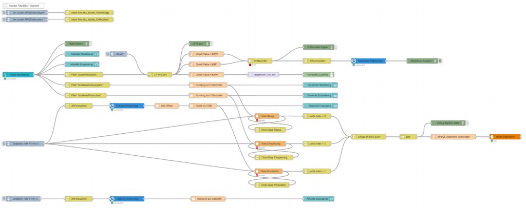
I have decided not to publish the JSON code here as I am not yet entirely familiar with Node-RED [3] and would not know how to remove my personal tokens from the JSON code.
Queries for the Graphs
Price and Consumption Patterns
The graph is based on four queries that correspond to the green and yellow, to the red, to the orange and to the blue curve:
SELECT zeitstempel,
       preis AS 'grid price',
       AVG(preis) OVER (ORDER BY zeitstempel ROWS BETWEEN 47 PRECEDING AND CURRENT ROW) as 'rolling 2-days average grid price'
FROM preise;

SELECT zeitstempel, energie AS 'grid consumption' FROM verbrauch;

SELECT alt.zeitstempel,
       (neu.bezug-alt.bezug+neu.erzeugung-alt.erzeugung-neu.einspeisung+alt.einspeisung) AS 'residential consumption'
FROM zaehler AS neu JOIN zaehler AS alt ON neu.uid=(alt.uid+4)
WHERE MINUTE(alt.zeitstempel)=0;

SELECT alt.zeitstempel,
       ROUND(preise.preis*(neu.bezug-alt.bezug)/(neu.bezug-alt.bezug+neu.erzeugung-alt.erzeugung-neu.einspeisung+alt.einspeisung),4) AS 'price for mixed grid/solar'
FROM zaehler AS neu
JOIN zaehler AS alt ON neu.uid=(alt.uid+4)
LEFT JOIN preise ON DATE_FORMAT(preise.zeitstempel, "%Y%m%d%H%i")=DATE_FORMAT(alt.zeitstempel, "%Y%m%d%H%i")
WHERE MINUTE(alt.zeitstempel)=0
  AND preise.zeitstempel>=DATE_SUB(CURRENT_DATE(),INTERVAL 30 DAY);
Actual cost, minimal cost, maximal cost, average cost per day
This graph uses only one query:
SELECT DATE(preise.zeitstempel) AS 'date',
       MIN(preise.preis)*SUM(verbrauch.energie) AS 'minimal cost',
       MAX(preise.preis)*SUM(verbrauch.energie) AS 'maximal cost',
       AVG(preise.preis)*SUM(verbrauch.energie) AS 'average cost',
       SUM(verbrauch.kosten) AS 'actual cost'
FROM preise JOIN verbrauch ON verbrauch.zeitstempel=preise.zeitstempel
WHERE DATE(preise.zeitstempel)>'2024-03-03'
GROUP BY DATE(preise.zeitstempel);
Cost and amount of purchased electricity from grid with price indication
The first graph (Cost of purchased electricity from grid with price indication) uses the query:
SELECT DATE_FORMAT(preise.zeitstempel,'%m/%d') AS 'Datum',
       ROW_NUMBER() OVER (PARTITION BY DATE(preise.zeitstempel) ORDER BY preise.preis ASC) AS 'Row',
	   verbrauch.kosten AS 'Kosten'
FROM preise JOIN verbrauch ON verbrauch.zeitstempel=preise.zeitstempel
WHERE DATE(preise.zeitstempel)>DATE_ADD(CURDATE(), INTERVAL -15 DAY)
ORDER BY DATE(preise.zeitstempel) ASC, preise.preis ASC;
The second graph (Amount of purchased electricity from grid with price indication) uses the query:
SELECT DATE_FORMAT(preise.zeitstempel,'%m/%d') AS 'Datum',
       ROW_NUMBER() OVER (PARTITION BY DATE(preise.zeitstempel) ORDER BY preise.preis ASC) AS 'Row',
	   verbrauch.energie AS 'Energie'
FROM preise JOIN verbrauch ON verbrauch.zeitstempel=preise.zeitstempel
WHERE DATE(preise.zeitstempel)>DATE_ADD(CURDATE(), INTERVAL -15 DAY)
ORDER BY DATE(preise.zeitstempel) ASC, preise.preis ASC;
Hourly price distribution
The red histogram uses the query:
SELECT preis FROM preise WHERE DATE_FORMAT(zeitstempel,'%Y-%m')='${Month}';The blue histogram uses the query:
SELECT preis FROM preise
WHERE DATE_FORMAT(zeitstempel,'%Y-%m')='${Month}'
  AND DAYNAME(zeitstempel)='${Weekday}';
The yellow histogram uses the query:
SELECT preis FROM preise
WHERE DATE_FORMAT(zeitstempel,'%Y-%m')='${Month}'
  AND WEEKDAY(zeitstempel)<5
  AND DATE(zeitstempel) NOT IN (SELECT datum FROM aux_feiertage);
The green histogram uses the query:
SELECT preis FROM preise
WHERE DATE_FORMAT(zeitstempel,'%Y-%m')='${Month}'
  AND WEEKDAY(zeitstempel)>=5
  OR DATE(zeitstempel) IN (SELECT datum FROM aux_feiertage WHERE DATE_FORMAT(zeitstempel,'%Y-%m')='${Month}');
The tables use these variables on the respective Grafana dasboard as well as the additional helper table aux_feiertage (indicating national holidays) in the MariaDB database.
The variable Month on the Grafana dasboard has the query:
SELECT DISTINCT(DATE_FORMAT(zeitstempel,'%Y-%m')) FROM preise;The variable Weekday on the Grafana dasboard has the query:
SELECT aux_wochentage.wochentag AS Weekday
FROM aux_wochentage JOIN aux_sprachen ON aux_sprachen.id_sprache=aux_wochentage.id_sprache
WHERE aux_sprachen.sprachcode='en'
ORDER BY aux_wochentage.id_tag ASC;
The last query also uses the tables aux_wochentage and aux_sprachen in order to offer a multi-lingual interface (not really necessary for the functionality). The tables are:
CREATE TABLE aux_wochentage (id_tag            TINYINT UNSIGNED NOT NULL,\
                             id_sprache        TINYINT UNSIGNED NOT NULL,\
                             wochentag         VARCHAR(30) NOT NULL);

CREATE TABLE aux_sprachen   (id_sprache        TINYINT UNSIGNED NOT NULL PRIMARY KEY,\
                             sprachcode        CHAR(2),\
                             sprache           VARCHAR(30));

CREATE TABLE aux_feiertage  (uid               SMALLINT UNSIGNED NOT NULL PRIMARY KEY AUTO_INCREMENT,\
                             datum             DATE NOT NULL,\
                             beschreibung      VARCHAR(50));

INSERT INTO aux_sprachen   VALUES (0,'en','English'),\
                                  (1,'de','Deutsch'),\
                                  (2,'pt','Português'),\
                                  (3,'zh','中文');

INSERT INTO aux_wochentage VALUES (0,0,'Monday'),\
                                  (1,0,'Tuesday'),\
                                  (2,0,'Wednesday'),\
                                  (3,0,'Thursday'),\
                                  (4,0,'Friday'),\
                                  (5,0,'Saturday'),\
                                  (6,0,'Sunday'),\
                                  (0,1,'Montag'),\
                                  (1,1,'Dienstag'),\
                                  (2,1,'Mittwoch'),\
                                  (3,1,'Donnerstag'),\
                                  (4,1,'Freitag'),\
                                  (5,1,'Samstag'),\
                                  (6,1,'Sonntag'),\
                                  (0,2,'segunda-feira'),\
                                  (1,2,'terça-feira'),\
                                  (2,2,'quarta-feira'),\
                                  (3,2,'quinta-feira'),\
                                  (4,2,'sexta-feira'),\
                                  (5,2,'sábado'),\
                                  (6,2,'domingo'),\
                                  (0,3,'星期一'),\
                                  (1,3,'星期二'),\
                                  (2,3,'星期三'),\
                                  (3,3,'星期四'),\
                                  (4,3,'星期五'),\
                                  (5,3,'星期六'),\
                                  (6,3,'星期日');

INSERT INTO aux_feiertage (datum, beschreibung) VALUES ('2023-01-01','Neujahr'),\
                               ('2023-01-06','Heilige Drei Könige'),\
                               ('2023-04-07','Karfreitag'),\
                               ('2023-04-10','Ostermontag'),\
                               ('2023-05-01','Tag der Arbeit'),\
                               ('2023-05-18','Christi Himmelfahrt'),\
                               ('2023-05-29','Pfingstmontag'),\
                               ('2023-06-08','Fronleichnam'),\
                               ('2023-08-15','Mariä Himmelfahrt'),\
                               ('2023-10-03','Tag der Deutschen Einheit'),\
                               ('2023-11-01','Allerheiligen'),\
                               ('2023-12-25','1. Weihnachtstag'),\
                               ('2023-12-26','2. Weihnachtstag'),\
                               ('2024-01-01','Neujahr'),\
                               ('2024-01-06','Heilige Drei Könige'),\
                               ('2024-03-29','Karfreitag'),\
                               ('2024-04-01','Ostermontag'),\
                               ('2024-05-01','Tag der Arbeit'),\
                               ('2024-05-09','Christi Himmelfahrt'),\
                               ('2024-05-20','Pfingstmontag'),\
                               ('2024-05-30','Fronleichnam'),\
                               ('2024-08-15','Mariä Himmelfahrt'),\
                               ('2024-10-03','Tag der Deutschen Einheit'),\
                               ('2024-11-01','Allerheiligen'),\
                               ('2024-12-25','1. Weihnachtstag'),\
                               ('2024-12-26','2. Weihnachtstag'),\
                               ('2025-01-01','Neujahr'),\
                               ('2025-01-06','Heilige Drei Könige'),\
                               ('2025-04-18','Karfreitag'),\
                               ('2025-04-21','Ostermontag'),\
                               ('2025-05-01','Tag der Arbeit'),\
                               ('2025-05-29','Christi Himmelfahrt'),\
                               ('2025-06-09','Pfingstmontag'),\
                               ('2025-06-19','Fronleichnam'),\
                               ('2025-08-15','Mariä Himmelfahrt'),\
                               ('2025-10-03','Tag der Deutschen Einheit'),\
                               ('2025-11-01','Allerheiligen'),\
                               ('2025-12-25','1. Weihnachtstag'),\
                               ('2025-12-26','2. Weihnachtstag');
Monthly hourly price curves
This graph uses only one query:
SELECT preise.zeitstempel AS 'time',
       MIN(preise.preis) AS 'Minimum Price',
       ROUND(AVG(preise.preis),4) AS 'Average Price',
       MAX(preise.preis) AS 'Maximum Price',
       ROUND((SUM(verbrauch.kosten)/(SUM(neu.bezug)-SUM(alt.bezug)+SUM(neu.erzeugung)-SUM(alt.erzeugung)-SUM(neu.einspeisung)+SUM(alt.einspeisung))),4) AS 'Achieved (Mixed) Price'
FROM preise
   INNER JOIN verbrauch ON preise.zeitstempel=verbrauch.zeitstempel
   LEFT JOIN zaehler AS alt ON DATE_FORMAT(alt.zeitstempel,"%Y%m%d%H%i")=DATE_FORMAT(preise.zeitstempel,"%Y%m%d%H%i")
   INNER JOIN zaehler AS neu ON neu.uid=(alt.uid+4)
WHERE DATE_FORMAT(preise.zeitstempel,'%Y-%m')='${Month}'
GROUP BY TIME(preise.zeitstempel);
It is important to keep in mind that the results from the query show the timespan of the first day of the month (and only the first day) between 00:00 UTC and 23:59 UTC; hence the time window on the Grafana dashboard has to be chosen accordingly (e.g. from 2024-07-01 02:00:00 to 2024-07-02 01:00:00 in the timezone CEST).
Electricity price levels
This graph uses only one query:
SELECT DATE_FORMAT(zeitstempel,'%Y-%m') AS 'Month',
        COUNT(CASE WHEN preis<=0.1 THEN preis END) AS 'very cheap (≤ 0.10 €/kWh)',
        COUNT(CASE WHEN preis>0.1 AND preis<=0.2 THEN preis END) AS 'cheap (≤ 0.20 €/kWh)',
        COUNT(CASE WHEN preis>0.2 AND preis<=0.3 THEN preis END) AS 'normal (≤ 0.30 €/kWh)',
        COUNT(CASE WHEN preis>0.3 AND preis<=0.4 THEN preis END) AS 'expensive (≤ 0.40 €/kWh)',
        COUNT(CASE WHEN preis>0.4 THEN preis END) AS 'very expensive (> 0.40 €/kWh)'
FROM preise
GROUP BY Month;
Self-sufficiency (Autarkie) and sef-consumption (Eigenverbrauch)
This graph uses only one query:
SELECT DATE_FORMAT(alt.zeitstempel,'%m/%d') AS 'Datum',
       ROUND((neu.erzeugung-alt.erzeugung-neu.einspeisung+alt.einspeisung)*100/(neu.bezug-alt.bezug+neu.erzeugung-alt.erzeugung-neu.einspeisung+alt.einspeisung)) AS 'Autarkiegrad',
       ROUND((neu.erzeugung-alt.erzeugung-neu.einspeisung+alt.einspeisung)*100/(neu.erzeugung-alt.erzeugung)) AS 'Eigenverbrauchsquote'
FROM zaehler AS neu
JOIN zaehler AS alt ON neu.uid=(alt.uid+96)
WHERE HOUR(alt.zeitstempel)=0
  AND MINUTE(alt.zeitstempel)=0
  AND alt.zeitstempel>=DATE_SUB(CURRENT_DATE(),INTERVAL 14 DAY);
Files
The following dataset was used for the graphs:
Sources
- [1] = Tibber Developer
- [2] = Download Grafana | Grafana Labs
- [3] = Node-RED
- [4] = Tibber Developer: Communicating with the API
- [5] = Smarthome: AVM-Steckdosen per Skript auslesen
- [6] = Grafana Visualizations (Part 2)
- [7] = Strom: heute Extrempreise für Kunden im EPEX SPOT – ISPEX
- [8] = Dynamischer Stromtarif – Warum fallen ALLE darauf rein?
Disclaimer
- Program codes and examples are for demonstration purposes only.
- Program codes are not recommended be used in production environments without further enhancements in terms of speed, failure-tolerance or cyber-security.
- While program codes have been tested, they might still contain errors.
- I am neither affiliated nor linked to companies named in this blog post.
Grafana Visualizations (Part 2)
Executive Summary
In this article, we use Grafana in order to examine real-world data of electricity consumption stored in a MariaDB database. As dynamic pricing (day-ahead market) is used, we also try to investigate how well I have fared so far with dynamic pricing.
Background
On 1st of March 2024, I switched from a traditional electricity provider to one with dynamic day-ahead pricing, in my case, Tibber. I wanted to try this contractual model and see if I could successfully manage to shift chunks of high electricity consumption such as:
- … loading the battery-electric vehicle (BEV) or the plug-in hybrid car (PHEV)
- … washing clothes
- … drying clothes in the electric dryer
to those times of the day when the electricity price is lower. I also wanted to see if that makes economic sense for me. And, after all, it is fun to play around with data and gain new insights.
As my electricity supplier, I had chosen Tibber because they were the first one I got to know and they offer a device called Pulse which can connect a digital electricity meter to their infrastructure for metering and billing purposes. Furthermore, they do have an API [1] which allows me to read out my own data; that was very important for me. I understand that meanwhile, there are several providers Tibber that have similar models and comparable features.
In my opinion, dynamic electricity prices will play an important role in the future. As we generate ever more energy from renewables (solar and wind power), there are times when a lot of electricity is generated or when we even see over-production, and there are times when less electricity will be produced (“dunkelflaute”). Dynamic prices are an excellent tool to motivate people to shift a part of their consumption pattern to times with a large offer in electricity supply (cheap price). An easy-to-understand example is washing clothes during the day in summer (rather than in the evening) when there is a large supply of solar energy; then, the price will experience a local minimum between lunch time and dinner time.
Preconditions
In order to use the approach described here, you should:
- … have access to a Linux machine or account
- … have a MySQL or MariaDB database server installed, configured, up and running
- … have a populated MySQL or MariaDB database like in our example to which you have access
- … have the package Grafana [2] installed, configured, up and running
- … have access to the data of your own electricity consumption and pricing information of your supplier or use the dataset linked below in this blog
- … have some understanding of day-ahead pricing in the electricity market [3]
- … have some basic knowledge of how to operate in a Linux environment and some basic understanding of shell scripts
Description and Usage
The Database
The base for the following visualizations is a fully populated MariaDB database with the following structure:
# Datenbank für Analysen mit Tibber
# V1.1; 2023-10-19, Gabriel Rüeck <gabriel@rueeck.de>, <gabriel@caipirinha.spdns.org>
# Delete existing databases
REVOKE ALL ON tibber.* FROM 'gabriel';
DROP DATABASE tibber;

# Create a new database
CREATE DATABASE tibber DEFAULT CHARSET utf8mb4 COLLATE utf8mb4_general_ci;
GRANT ALL ON tibber.* TO 'gabriel';
USE tibber;
SET default_storage_engine=Aria;

CREATE TABLE preise          (zeitstempel    DATETIME NOT NULL,\
                              preis          DECIMAL(5,4) NOT NULL,\
                              niveau         ENUM('VERY_CHEAP','CHEAP','NORMAL','EXPENSIVE','VERY_EXPENSIVE'));

CREATE TABLE verbrauch       (zeitstempel    DATETIME NOT NULL,\
                              energie        DECIMAL(5,3) NOT NULL,\
                              kosten         DECIMAL(5,4) NOT NULL);
The section Files at the end of this blog post provides real-world sample data which you can use to populate the database and do your own calculations and graphs. The database contains two tables. The one named preise contains the day-ahead prices and some price level tag which is determined by Tibber themselves according to [1]. The second tables named verbrauch contains the electrical energy I have consumed, and the cost associated with the consumption. zeitstempel in both tables indicates the date and the hour when the respective 1-hour-block with the respective electricity price or the electricity consumption starts. Consequently, the day is divided in 24 blocks of 1 hour. Data from the tables might look like this:
MariaDB [tibber]> SELECT * FROM preise WHERE DATE(zeitstempel)='2024-03-18';
+---------------------+--------+-----------+
| zeitstempel         | preis  | niveau    |
+---------------------+--------+-----------+
| 2024-03-18 00:00:00 | 0.2658 | NORMAL    |
| 2024-03-18 01:00:00 | 0.2575 | NORMAL    |
| 2024-03-18 02:00:00 | 0.2588 | NORMAL    |
| 2024-03-18 03:00:00 | 0.2601 | NORMAL    |
| 2024-03-18 04:00:00 | 0.2661 | NORMAL    |
| 2024-03-18 05:00:00 | 0.2737 | NORMAL    |
| 2024-03-18 06:00:00 | 0.2922 | NORMAL    |
| 2024-03-18 07:00:00 | 0.3059 | EXPENSIVE |
| 2024-03-18 08:00:00 | 0.3019 | EXPENSIVE |
| 2024-03-18 09:00:00 | 0.2880 | NORMAL    |
| 2024-03-18 10:00:00 | 0.2761 | NORMAL    |
| 2024-03-18 11:00:00 | 0.2688 | NORMAL    |
| 2024-03-18 12:00:00 | 0.2700 | NORMAL    |
| 2024-03-18 13:00:00 | 0.2707 | NORMAL    |
| 2024-03-18 14:00:00 | 0.2715 | NORMAL    |
| 2024-03-18 15:00:00 | 0.2768 | NORMAL    |
| 2024-03-18 16:00:00 | 0.2834 | NORMAL    |
| 2024-03-18 17:00:00 | 0.3176 | EXPENSIVE |
| 2024-03-18 18:00:00 | 0.3629 | EXPENSIVE |
| 2024-03-18 19:00:00 | 0.3400 | EXPENSIVE |
| 2024-03-18 20:00:00 | 0.3129 | EXPENSIVE |
| 2024-03-18 21:00:00 | 0.2861 | NORMAL    |
| 2024-03-18 22:00:00 | 0.2827 | NORMAL    |
| 2024-03-18 23:00:00 | 0.2781 | NORMAL    |
+---------------------+--------+-----------+
24 rows in set (0,002 sec)

MariaDB [tibber]> SELECT * FROM verbrauch WHERE DATE(zeitstempel)='2024-03-18';
+---------------------+---------+--------+
| zeitstempel         | energie | kosten |
+---------------------+---------+--------+
| 2024-03-18 00:00:00 |   0.554 | 0.1472 |
| 2024-03-18 01:00:00 |   0.280 | 0.0721 |
| 2024-03-18 02:00:00 |   0.312 | 0.0808 |
| 2024-03-18 03:00:00 |   0.307 | 0.0799 |
| 2024-03-18 04:00:00 |   0.282 | 0.0750 |
| 2024-03-18 05:00:00 |   0.315 | 0.0862 |
| 2024-03-18 06:00:00 |   0.377 | 0.1102 |
| 2024-03-18 07:00:00 |   0.368 | 0.1126 |
| 2024-03-18 08:00:00 |   0.275 | 0.0830 |
| 2024-03-18 09:00:00 |   0.793 | 0.2284 |
| 2024-03-18 10:00:00 |   1.041 | 0.2875 |
| 2024-03-18 11:00:00 |   0.453 | 0.1217 |
| 2024-03-18 12:00:00 |   0.362 | 0.0977 |
| 2024-03-18 13:00:00 |   0.005 | 0.0014 |
| 2024-03-18 14:00:00 |   0.027 | 0.0073 |
| 2024-03-18 15:00:00 |   0.144 | 0.0399 |
| 2024-03-18 16:00:00 |   0.248 | 0.0703 |
| 2024-03-18 17:00:00 |   0.363 | 0.1153 |
| 2024-03-18 18:00:00 |   0.381 | 0.1382 |
| 2024-03-18 19:00:00 |   0.360 | 0.1224 |
| 2024-03-18 20:00:00 |   0.354 | 0.1108 |
| 2024-03-18 21:00:00 |   0.382 | 0.1093 |
| 2024-03-18 22:00:00 |   0.373 | 0.1055 |
| 2024-03-18 23:00:00 |   0.417 | 0.1159 |
+---------------------+---------+--------+
24 rows in set (0,001 sec)
Connecting Grafana to the Database
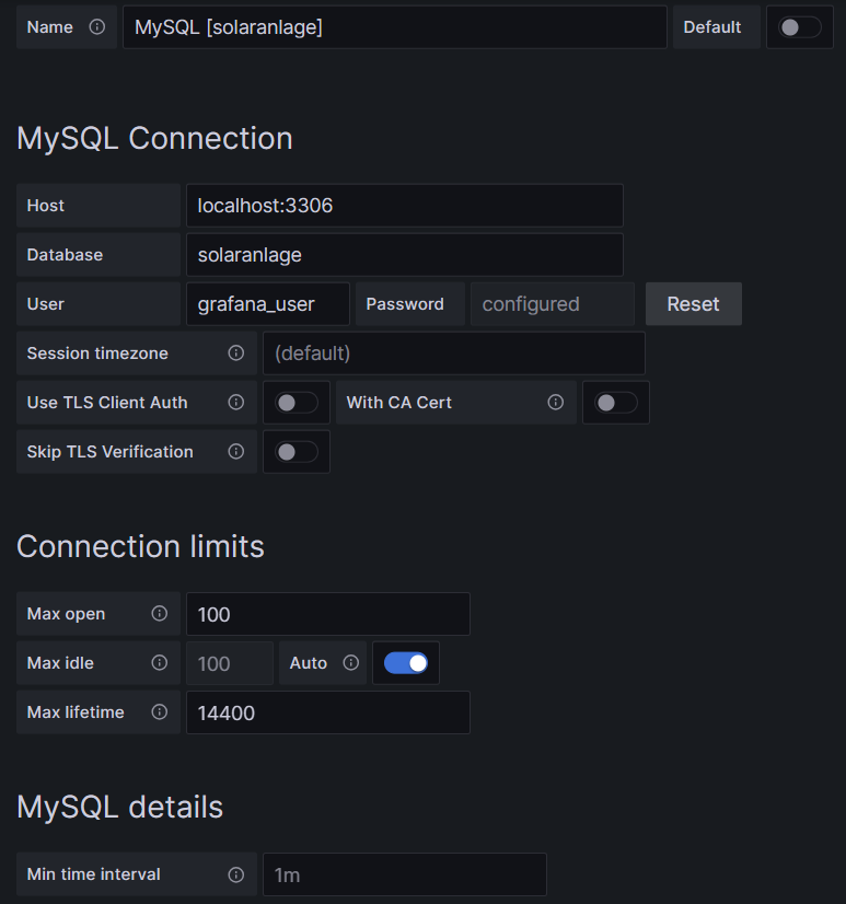
Now we shall visualize the data in Grafana. Grafana is powerful and mighty visualization tool with which you can create state-of-the-art dashboards and professional visualizations. I must really laude the team behind Grafana for making such a powerful tool free for personal and other usage (for details to their licenses und usage models, see Licensing | Grafana Labs).
Before you can use data from a MySQL database in Grafana, you have to set up MySQL as a data source in Connections. Remember that MySQL is one of many possible data sources for Grafana and so, you have to walk through the jungle of offered data sources and find the MySQL connection and set up your data source accordingly. On my server, both Grafana and MariaDB run on the same machine, so there is no need for encryption, etc. My setup simply looks like this:
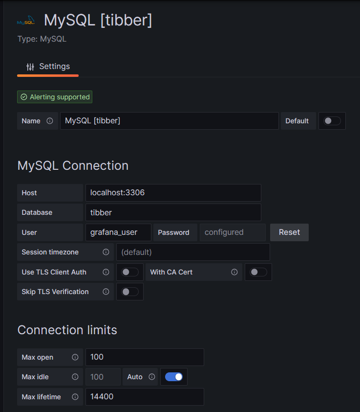
One step where I always stumble again is that in the entry mask for the connection setup, localhost:3306 is proposed in grey color as Host, but unless you type that in, too, Grafana will actually not use localhost:3306. So be sure to physically type that in.
Populating the Database
Tibber customers who have created an API token for themselves [4] can populate the database with the following bash script; in this script, you need to replace _API_TOKEN with your personal API token ( [4]) and _HOME_ID with your personal Home ID ([1]). The script further assumes that the user gabriel can login to the MySQL database without further authentication; this can be achieved by writing the MySQL login information in the file ~/.my.cnf.
#!/bin/bash
#
# Dieses Skript liest Daten für die Tibber-Datenbank und speichert das Ergebnis in einer MySQL-Datenbank ab.
# Das Skript wird einmal pro Tag aufgerufen.
#
# V1.3; 2024-03-24, Gabriel Rüeck <gabriel@rueeck.de>, <gabriel@caipirinha.spdns.org>
#
# CONSTANTS
declare -r    MYSQL_DATABASE='tibber'
declare -r    MYSQL_SERVER='localhost'
declare -r    MYSQL_USER='gabriel'
declare -r    TIBBER_API_TOKEN='_API_TOKEN'
declare -r    TIBBER_API_URL='https://api.tibber.com/v1-beta/gql'
declare -r    TIBBER_HOME_ID='_HOME_ID'

# VARIABLES

# PROGRAM
# Read price information for tomorrow
curl -s -S -H "Authorization: Bearer ${TIBBER_API_TOKEN}" -H "Content-Type: application/json" -X POST -d  '{ "query": "{viewer {home (id: \"'"${TIBBER_HOME_ID}"'\") {currentSubscription {priceInfo {tomorrow {total startsAt level }}}}}}" }' "${TIBBER_API_URL}" | jq -r '.data.viewer.home.currentSubscription.priceInfo.tomorrow[] | .total, .startsAt, .level' | while read cost; do
  read LINE
  read level
  timestamp=$(echo "${LINE%%+*}" | tr 'T' ' ')
  # Determine timezone offset and store the UTC datetime in the database
  offset="${LINE:23}"
  mysql --default-character-set=utf8mb4 -B -N -r -D "${MYSQL_DATABASE}" -h ${MYSQL_SERVER} -u ${MYSQL_USER} -e "INSERT INTO preise (zeitstempel,preis,niveau) VALUES (DATE_SUB(\"${timestamp}\",INTERVAL \"${offset}\" HOUR_MINUTE),${cost},\"${level}\");"
done

# Read consumption information from the past 24 hours
curl -s -S -H "Authorization: Bearer ${TIBBER_API_TOKEN}" -H "Content-Type: application/json" -X POST -d  '{ "query": "{viewer {home (id: \"'"${TIBBER_HOME_ID}"'\") {consumption (resolution: HOURLY, last: 24) {nodes {from to cost consumption}}}}}" }' "${TIBBER_API_URL}" | jq -r '.data.viewer.home.consumption.nodes[] | .from, .consumption, .cost' | while read LINE; do
  read consumption
  read cost
  timestamp=$(echo "${LINE%%+*}" | tr 'T' ' ')
  # Determine timezone offset and store the UTC datetime in the database
  offset="${LINE:23}"
  mysql --default-character-set=utf8mb4 -B -N -r -D "${MYSQL_DATABASE}" -h ${MYSQL_SERVER} -u ${MYSQL_USER} -e "INSERT INTO verbrauch (zeitstempel,energie,kosten) VALUES (DATE_SUB(\"${timestamp}\",INTERVAL \"${offset}\" HOUR_MINUTE),${consumption},${cost});"
done
In my case, I call this script with cron once per day, at 14:45 as Tibber releases the price information for the subsequent day only at 14:00. The script furthermore stores UTC timestamps in the database. Grafana will adjust them to the local time for graphs of the type Time series.
Easy Visualizations
Price level
One of my first visualizations was a table that shows the price level tags for today and tomorrow. The idea behind is that I would look at the table once per day during breakfast and immediately identify the sweet spots on where I could charge the car, turn on the washing machine, etc.
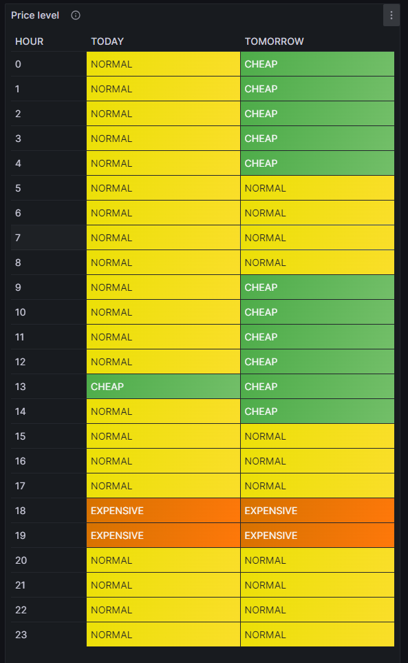
For this table, we use the built-in Grafana visualization Table. We select the according database, and our MySQL query is:
SELECT IF(DATE(DATE_ADD(zeitstempel,INTERVAL HOUR(TIMEDIFF(SYSDATE(),UTC_TIMESTAMP())) HOUR))=CURDATE(),'TODAY','TOMORROW') AS Tag, HOUR(DATE_ADD(zeitstempel,INTERVAL HOUR(TIMEDIFF(SYSDATE(),UTC_TIMESTAMP())) HOUR)) AS Stunde, niveau
FROM preise
WHERE DATE_ADD(zeitstempel,INTERVAL HOUR(TIMEDIFF(SYSDATE(),UTC_TIMESTAMP())) HOUR)>=CURDATE()
Group BY Tag, Stunde;
The query above lists one price level per line. However, in order to get the nice visualization shown above, we need to transpose the table with respect to the months, and therefore, we must select the built-in transformation Grouping to Matrix and enter our column names according to the image below:

Now, in order to get a beautiful visualization, we need to adjust some of the panel options, and those are:
- Cell options → Cell type: Set to Auto
- Standard options → Color scheme: Set to Single color
and we need to define some Value mappings:
- NORMAL → Select yellow color
- EXPENSIVE → Select orange color
- VERY_EXPENSIVE → Select red color
- CHEAP → Select green color
- VERY_CHEAP → Select blue color
and we need to define some Overrides:
- Override 1 → Fields with name: Select TODAY
- Override 1 → Cell options → Cell type: Set to Colored background
- Override 2 → Fields with name: Select TOMORROW
- Override 2 → Cell options → Cell type: Set to Colored background
- Override 3 → Fields with type: Select Stunde\Tag
- Override 3 → Column width → Set to 110
- Override 3 → Standard options → Display name: Type HOUR (That is only necessary because I initially did my query with German column names)
In the MySQL query above, you can find the sequence
DATE_ADD(zeitstempel,INTERVAL HOUR(TIMEDIFF(SYSDATE(),UTC_TIMESTAMP())) HOUR)which actually transforms the UTC timestamp into the timestamp of the local time of the machine where the MySQL server resides. In my case, this is the same machine that I use for Grafana. The sub-sequence
HOUR(TIMEDIFF(SYSDATE(),UTC_TIMESTAMP()))gives – in my case – back a 2 when we are in summer time as then we are at UTC+2h, and 1 when we are in winter time as then we are at UTC+1h. This sequence was necessary for me as the Grafana visualization Table does not do an automatic time conversion to the local time.
Electricity price (per kWh) and grid consumption
In the next visualization, we will look at a timeline of the electricity price per hour and our consumption pattern. This will look like this graph:
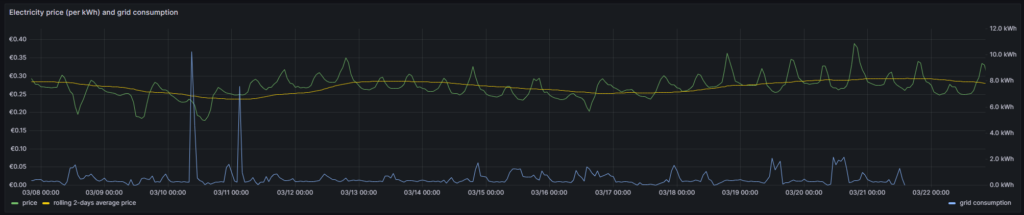
For this graph, we use the built-in Grafana visualization Time series. We select the according database, and we define two MySQL queries. The first one is named Price:
SELECT zeitstempel,
       preis AS 'price',
       AVG(preis) OVER (ORDER BY zeitstempel ROWS BETWEEN 47 PRECEDING AND CURRENT ROW) as 'rolling 2-days average price'
FROM preise;
The first query has the peculiarity that we do not only retrieve the price for each 1-hour block, but that we also calculate a rolling 2-days average over the extracted data. The second query is named Consumption and retrieves our energy consumption:
SELECT zeitstempel, energie AS 'grid consumption' FROM verbrauch;Again, we need to adjust some of the panel options, and those are:
- Standard options → Unit: Select (Euro) €
- Standard options → Min: Set to 0
- Standard options → Decimals: Set to 2
and we need to define some Overrides:
- Override 1 → Fields with name: Select grid consumption
- Override 1 → Axis → Placement: Select Right
- Override 1 → Standard options → Unit: Select Kilowatt-hour (kWh)
- Override 1 → Standard options → Decimals: Set to 1
In this graph, we can already get an indication on how well we time our energy consumption. Ideally, the peaks (local maximums) in energy consumption (blue line) should coincide with the local minimums of the electricity price (green line). As you can see with the two peaks of the blue line (charging the BEV), I did not always match this sweet spot. There might be good reasons for consuming electricity also at hours of higher prices, and some examples are:
- You have to drive away at a certain hour, and you need to charge the BEV now.
- You have solar generation at certain times of the day which you intend to use and therefore consume electricity (like for charging a BEV) when the sun shines. While you then might not consume at the cheapest hour, you might ultimately make good use of the additional solar energy.
- You want to watch TV in the evening when the electricity price is typically high.
This graph visualizes the data according to the timezone of the dashboard, so there is no need to add an offset to the UTC timestamps in the database.
Heatmap of the Tibber flexible hourly prices per kWh
In the next visualization, we look at a heatmap of the hourly prices and therefore, we use the plug-in Grafana visualization Hourly heatmap.
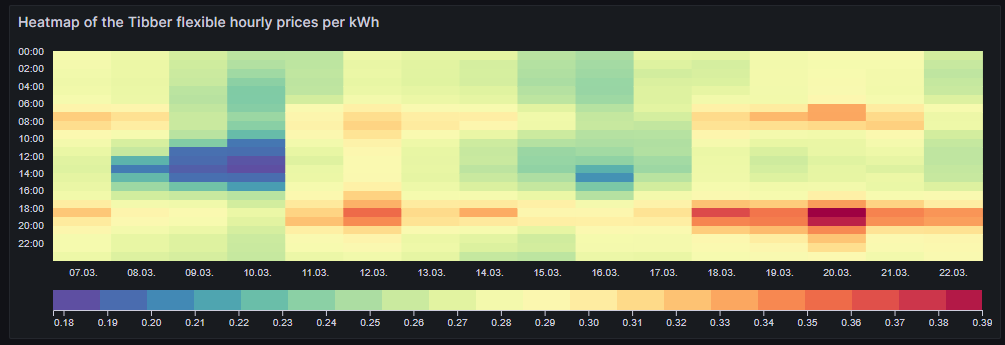
The query is very simple:
SELECT UNIX_TIMESTAMP(DATE_ADD(zeitstempel,INTERVAL HOUR(TIMEDIFF(SYSDATE(),UTC_TIMESTAMP())) HOUR)) AS time, preis FROM preise;However, we need to adjust some of the panel options, and those are:
- Dimensions → Time: Select time
- Dimensions → Value: Select price
- Hourly heatmap → From: Set to 00:00
- Hourly heatmap → To: Set to 00:00
- Hourly heatmap → Group by: Select 60 minutes
- Hourly heatmap → Calculation: Select Sum
- Hourly heatmap → Color palette: Select Spectral
- Hourly heatmap → Invert color palette → Activate
- Legend → Show legend → Activate
- Legend → Gradient quality: Select Low
- Standard options → Unit: Select (Euro) €
- Standard options → Decimals: Set to 2
- Standard options → Color scheme: Select From thresholds (by value)
With the heatmap, we have an easy-to-understand visualization on when the prices are high and on when they are low and on whether there is a regular pattern that we can observe. In this case, we can identify that in the evening (at dinner or TV time), the electricity price often seems to be high. Hence, this is not a good time to switch on powerful electric consumers or to start charging a BEV.
Similar to the Grafana visualization Table, you can find the sequence
DATE_ADD(zeitstempel,INTERVAL HOUR(TIMEDIFF(SYSDATE(),UTC_TIMESTAMP())) HOUR)because the Grafana visualization Hourly heatmap also does not do an automatic time conversion to the local time.
Complex Visualizations
Actual cost versus minimal cost, maximal cost, average cost per day
This visualization shows the daily electricity cost that I have incurred (blue line) and the cost I would have incurred if I had purchased the whole amount of electricity on the respective day:
- … during the cheapest hour on that day (green line)
- … during the most expensive hour on that day (red line)
- … at an average price (average of all hours) on that day (yellow line)
The closer the blue line is to the green line, the better I have shifted my consumption pattern to the hours of cheap electricity. In real life, one will always have to purchase electricity also in hours of expensive electricity unless one switches off all devices in a household at certain hours. So, in real life, the blue line will never be the same as the green line. A blue line between the yellow and the green line already indicates that one does well. The graph also shows that my consumption varies substantially from day to day. The graph uses the built-in Grafana visualization Time series. The last data point must not be considered as the last day is only calculated until 14:00 local time.
For this graph, we join the tables preise and verbrauch in a MySQL query and group the result by day:
SELECT DATE(preise.zeitstempel) AS 'date',
       MIN(preise.preis)*SUM(verbrauch.energie) AS 'minimal cost',
       MAX(preise.preis)*SUM(verbrauch.energie) AS 'maximal cost',
       AVG(preise.preis)*SUM(verbrauch.energie) AS 'average cost',
       SUM(verbrauch.kosten) AS 'actual cost'
FROM preise JOIN verbrauch ON verbrauch.zeitstempel=preise.zeitstempel
WHERE DATE(preise.zeitstempel)>'2024-03-03'
GROUP BY DATE(preise.zeitstempel);
The following panel options are recommended:
- Standard options → Unit: Select (Euro) €
- Standard options → Decimals: Set to 2
and the following Overrides are recommended:
- Override 1 → Fields with name: Select minimal cost
- Override 1 → Standard options → Color scheme: Select Single color, then select green
- Override 2 → Fields with name: Select maximal cost
- Override 2 → Standard options → Color scheme: Select Single color, then select red
- Override 3 → Fields with name: Select actual cost
- Override 3 → Standard options → Color scheme: Select Single color, then select blue
- Override 4 → Fields with name: Select average cost
- Override 4 → Standard options → Color scheme: Select Single color, then select yellow
Important: This graph adds up the data from a UTC day (not the local calendar day) and visualizes the data points according to the timezone of the dashboard.
Cumulated savings versus various fictive static electricity prices
This visualization shows us in a cumulative manner how much money I have saved using dynamic pricing versus fictive electricity contracts with different static prices per kWh (traditional contracts). The graph uses the built-in Grafana visualization Time series. The last data point must not be considered as the last day is only calculated until 14:00 local time.
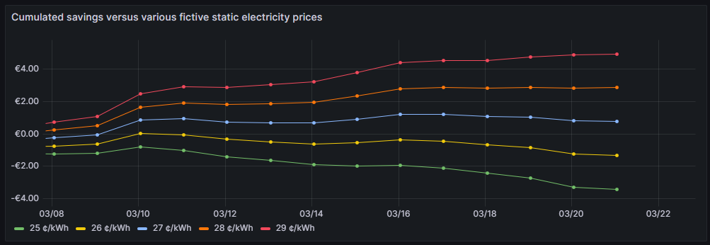
One can see that for traditional prices below 27 ¢/kWh, I would not have saved any money so far. 27 ¢/kWh is the price that I could get in a traditional electricity contract at the place where I live. However, it is too early yet to draw final conclusions. I intend to observe how the graphs advance when we get into summer as I expect that during summer, I will have more times at cheap electricity whereas in the subsequent winter, I will probably have more times at higher prices. The graph is done with this query:
SELECT DATE(preise.zeitstempel) AS 'Datum',
       SUM(0.25*SUM(verbrauch.energie)-SUM(verbrauch.kosten)) OVER (ORDER BY DATE(preise.zeitstempel)) as '25 ¢/kWh',
       SUM(0.26*SUM(verbrauch.energie)-SUM(verbrauch.kosten)) OVER (ORDER BY DATE(preise.zeitstempel)) as '26 ¢/kWh',
       SUM(0.27*SUM(verbrauch.energie)-SUM(verbrauch.kosten)) OVER (ORDER BY DATE(preise.zeitstempel)) as '27 ¢/kWh',
       SUM(0.28*SUM(verbrauch.energie)-SUM(verbrauch.kosten)) OVER (ORDER BY DATE(preise.zeitstempel)) as '28 ¢/kWh',
       SUM(0.29*SUM(verbrauch.energie)-SUM(verbrauch.kosten)) OVER (ORDER BY DATE(preise.zeitstempel)) as '29 ¢/kWh'
FROM preise JOIN verbrauch ON verbrauch.zeitstempel=preise.zeitstempel
WHERE DATE(preise.zeitstempel)>'2024-03-03'
GROUP BY DATE(preise.zeitstempel);
The following panel options are recommended:
- Standard options → Unit: Select (Euro) €
- Standard options → Decimals: Set to 2
Important: This graph adds up the data from a UTC day (not the local calendar day) and visualizes the data points according to the timezone of the dashboard.
Daily savings using Tibber flexible versus a fictive static price of 27 ¢/kWh
This next visualization shows how much money I have saved (green) or lost (red) using dynamic pricing versus a fictive electricity contract with a price of 27 ¢/kWh that – as mentioned before – I could get in a traditional electricity contract at the place where I live. The graph uses the built-in Grafana visualization Bar chart. The last data point must not be considered as the last day is only calculated until 14:00 local time.
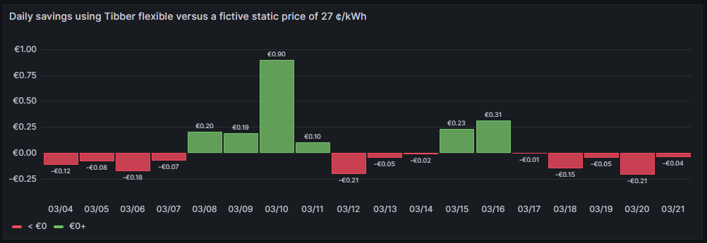
One can see that due to the nature of dynamic prices, I do not save money every day. It has been quite a mixed result so far. The graph is done with this query:
SELECT DATE_FORMAT(preise.zeitstempel,'%m/%d') AS 'Datum',
       0.27*SUM(verbrauch.energie)-SUM(verbrauch.kosten) AS 'Daily cost vs. average'
FROM preise JOIN verbrauch ON verbrauch.zeitstempel=preise.zeitstempel
WHERE DATE(preise.zeitstempel)>'2024-03-03'
GROUP BY DATE(preise.zeitstempel);
The following panel options are recommended:
- Bar chart → Color by field: Select Daily cost vs. average
- Standard options → Unit: Select (Euro) €
- Standard options → Decimals: Set to 2
- Standard options → Color scheme: Select From thresholds (by value)
- Thresholds → Enter 0, then select green
- Thresholds → Base: Select red
Important: This graph adds up the data from a UTC day (not the local calendar day).
Daily savings using Tibber flexible versus Tibber daily average price
A similar visualization shows how much money I have saved (green) or lost (red) using dynamic pricing versus the average price per day, calculated on all dynamic prices of that day. This graph shows me if I am successful in making use of dynamic pricing (green) or not (red). The graph uses the built-in Grafana visualization Bar chart. The last data point must not be considered as the last day is only calculated until 14:00 local time.
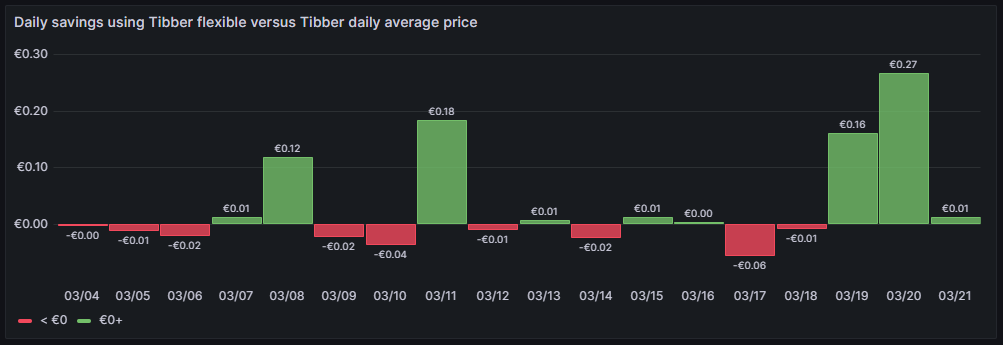
So far, it seems that while I do have “good” and “bad” days, on on the good days, I seem to save more money compared to the Tibber average price. The large green bars are those where I charge the BEV, and before I charge the BEV, I really carefully consider the electricity price of today and tomorrow. This graph is done with this query:
SELECT DATE_FORMAT(preise.zeitstempel,'%m/%d') AS 'Datum',
       AVG(preise.preis)*SUM(verbrauch.energie)-SUM(verbrauch.kosten) AS 'Daily cost vs. average'
FROM preise JOIN verbrauch ON verbrauch.zeitstempel=preise.zeitstempel
WHERE DATE(preise.zeitstempel)>'2024-03-03'
GROUP BY DATE(preise.zeitstempel);
The following panel options are recommended:
- Bar chart → Color by field: Select Daily cost vs. average
- Standard options → Unit: Select (Euro) €
- Standard options → Decimals: Set to 2
- Standard options → Color scheme: Select From thresholds (by value)
- Thresholds → Enter 0, then select green
- Thresholds → Base: Select red
Important: This graph adds up the data from a UTC day (not the local calendar day).
Cost of purchased electricity from grid with price indication
This is one of my favorite graphs as it contains a lot of information in one visualization. It shows the electricity cost per day, but also, how this cost is composed. Each day is a concatenation of 24 rectangles. The 24 rectangles represent the 24 hours of the day. Their color is different, ranging in shades from green to red. The green only rectangle (rgb: 0, 255, 0) is the cost that incurred at the cheapest hour of the day. The red only rectangle (rgb: 255, 0, 0) is the cost that incurred at the most expensive hour of the day. The shades in between ranging from green to red represent an ordered list of the hours from cheap to expensive. Large rectangles mean that a large part of the daily cost can be attributed to a consumption in that hour. Essentially, this means that the more green shades a day has, the more cost has incurred at hours of cheap electricity and the better I have used the dynamic pricing for me. The more red shades a day has, the more cost has incurred at hours of expensive electricity. A day with more red shades is not automatically a “bad” day. There might be reasons for a consumption at expensive hours, and some which are true in my case, are:
- I might cover the electricity demand at cheap hours by my solar panels so that during these hours, I do not have any grid consumption at all.
- I might deliberately decide to consume electricity at expensive hours during daylight because my solar panels cover a large part of the consumption at my home, maybe, because I charge the car and 50% of the electric energy comes from the solar panels anyway and I just buy the remaining 50% from the grid. While the grid consumption might be expensive, I anyway get 50% “for free” from the solar panels.
- I might deliberately decide to consume electricity at expensive hours because the ambient temperature outside the house is moderate or warm and I can heat the house with the air conditioner at high efficiency while I can switch off the central heating which runs by natural gas. In that case, even at high prices, I expect to have a better outcome overall because I might be able to switch off the central heating completely.
The graph uses the built-in Grafana visualization Bar chart. The last data point must not be considered as the last day is only calculated until 14:00 local time.
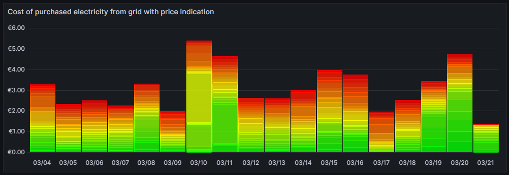
This graph uses this query:
SELECT DATE_FORMAT(preise.zeitstempel,'%m/%d') AS 'Datum',
       ROW_NUMBER() OVER (PARTITION BY DATE(preise.zeitstempel) ORDER BY preise.preis ASC) AS 'Row',
	   verbrauch.kosten AS 'Kosten'
FROM preise JOIN verbrauch ON verbrauch.zeitstempel=preise.zeitstempel
WHERE DATE(preise.zeitstempel)>'2024-03-03'
ORDER BY DATE(preise.zeitstempel) ASC, preise.preis ASC;
and the built-in transformation Grouping to Matrix:

The following panel options must be used:
- Standard options → Unit: Select (Euro) €
- Standard options → Min: Set to 0
- Standard options → Decimals: Set to 2
Additionally, we need to define exactly 24 Overrides:
- Override 1 → Fields with name: Select 1
- Override 1 → Standard options → Color scheme: Select Single color, then select Custom, then rgb(0, 255, 0)
- Override 2 → Fields with name: Select 2
- Override 2 → Standard options → Color scheme: Select Single color, then select Custom, then rgb(22, 255, 0)
- Override 3 → Fields with name: Select 3
- Override 3 → Standard options → Color scheme: Select Single color, then select Custom, then rgb(44, 255, 0)
- Override 4 → Fields with name: Select 4
- Override 4 → Standard options → Color scheme: Select Single color, then select Custom, then rgb(66, 255, 0)
- Override 5 → Fields with name: Select 5
- Override 5 → Standard options → Color scheme: Select Single color, then select Custom, then rgb(89, 255, 0)
- Override 6 → Fields with name: Select 6
- Override 6 → Standard options → Color scheme: Select Single color, then select Custom, then rgb(111, 255, 0)
- Override 7 → Fields with name: Select 7
- Override 7 → Standard options → Color scheme: Select Single color, then select Custom, then rgb(133, 255, 0)
- Override 8 → Fields with name: Select 8
- Override 8 → Standard options → Color scheme: Select Single color, then select Custom, then rgb(155, 255, 0)
- Override 9 → Fields with name: Select 9
- Override 9 → Standard options → Color scheme: Select Single color, then select Custom, then rgb(177, 255, 0)
- Override 10 → Fields with name: Select 10
- Override 10 → Standard options → Color scheme: Select Single color, then select Custom, then rgb(199, 255, 0)
- Override 11 → Fields with name: Select 11
- Override 11 → Standard options → Color scheme: Select Single color, then select Custom, then rgb(222, 255, 0)
- Override 12 → Fields with name: Select 12
- Override 12 → Standard options → Color scheme: Select Single color, then select Custom, then rgb(244, 255, 0)
- Override 13 → Fields with name: Select 13
- Override 13 → Standard options → Color scheme: Select Single color, then select Custom, then rgb(255, 244, 0)
- Override 14 → Fields with name: Select 14
- Override 14 → Standard options → Color scheme: Select Single color, then select Custom, then rgb(255, 222, 0)
- Override 15 → Fields with name: Select 15
- Override 15 → Standard options → Color scheme: Select Single color, then select Custom, then rgb(255, 200, 0)
- Override 16 → Fields with name: Select 16
- Override 16 → Standard options → Color scheme: Select Single color, then select Custom, then rgb(255, 177, 0)
- Override 17 → Fields with name: Select 17
- Override 17 → Standard options → Color scheme: Select Single color, then select Custom, then rgb(255, 155, 0)
- Override 18 → Fields with name: Select 18
- Override 18 → Standard options → Color scheme: Select Single color, then select Custom, then rgb(255, 133, 0)
- Override 19 → Fields with name: Select 19
- Override 19 → Standard options → Color scheme: Select Single color, then select Custom, then rgb(255, 110, 0)
- Override 20 → Fields with name: Select 20
- Override 20 → Standard options → Color scheme: Select Single color, then select Custom, then rgb(255, 89, 0)
- Override 21 → Fields with name: Select 21
- Override 21 → Standard options → Color scheme: Select Single color, then select Custom, then rgb(255, 66, 0)
- Override 22 → Fields with name: Select 22
- Override 22 → Standard options → Color scheme: Select Single color, then select Custom, then rgb(255, 44, 0)
- Override 23 → Fields with name: Select 23
- Override 23 → Standard options → Color scheme: Select Single color, then select Custom, then rgb(255, 22, 0)
- Override 24 → Fields with name: Select 24
- Override 24 → Standard options → Color scheme: Select Single color, then select Custom, then rgb(255, 0, 0)
Important: This graph adds up the data from a UTC day (not the local calendar day).
Conclusion
Even with a relatively simple dataset, we can create insightful visualizations with Grafana that can help us to interpret complex relationships. In my case, the visualizations shall help me to answer the questions:
- Do I fare well with dynamic pricing as compared to a traditional electricity contract with static prices?
- Am I able to shift consumption pattern of large energy chunks efficiently to those hours where electricity is cheaper?
As I mentioned, there might be reasons to buy electricity also at expensive hours. The fact that I have support of solar panels during the day might tilt the decision to consume electric energy aways from the cheapest hours to hours where a large part of that consumption is anyway covered by the solar panels. Or I might decide to heat with the air conditioners because the temperature difference between outside and inside of the house is small and the air conditioners can run with a high efficiency. In that case, I trade in natural gas consumption versus electricity consumption.
Outlook
It would be interesting to consider the energy that the solar panels generate “for free” (not really for free, but as they have been installed, they are already “sunk cost”) and visualize the resulting electricity cost from the mix of solar energy with energy consumed from the grid.
Likewise, it might be interesting as well as challenging to derive a good model that uses a battery and dynamic electricity prices as well as the energy from the solar panels to minimize cost of the energy consumption from the grid. How large should this battery be? When should it be charged from the grid and when should it return its energy to the consumers in the house?
Files
The following dataset was used for the graphs:
Sources
- [1] = Tibber Developer
- [2] = Download Grafana | Grafana Labs
- [3] = day-ahead market – an overview
- [4] = Tibber Developer: Communicating with the API
Disclaimer
- Program codes and examples are for demonstration purposes only.
- Program codes are not recommended be used in production environments without further enhancements in terms of speed, failure-tolerance or cyber-security.
- While program codes have been tested, they might still contain errors.
- I am in neither affiliated nor linked to companies named in this blog post.
Grafana Visualizations (Part 1)
Executive Summary
In this article, we do first steps into visualizations in Grafana of data stored in a MariaDB database and draw conclusions from the visualizations. In this case, we look at meaningful data from solar power generation.
Preconditions
In order to use the approach described here, you should:
- … have access to a Linux machine or account
- … have a MySQL or MariaDB database server installed, configured, up and running
- … have a populated MySQL or MariaDB database like in our example to which you have access
- … have the package Grafana [2] installed, configured, up and running
- … have some basic knowledge of how to operate in a Linux environment and some basic understanding of shell scripts
Description and Usage
The base for the following visualizations is a fully populated database of the following structure:
# Datenbank für Analysen der Solaranlage
# V1.1; 2023-12-10, Gabriel Rüeck <gabriel@rueeck.de>, <gabriel@caipirinha.spdns.org>
# Delete existing databases
REVOKE ALL ON solaranlage.* FROM 'gabriel';
DROP DATABASE solaranlage;

# Create a new database
CREATE DATABASE solaranlage DEFAULT CHARSET utf8mb4 COLLATE utf8mb4_general_ci;
GRANT ALL ON solaranlage.* TO 'gabriel';
USE solaranlage;
SET default_storage_engine=Aria;

CREATE TABLE anlage          (uid            INT UNSIGNED NOT NULL PRIMARY KEY AUTO_INCREMENT,\
                              zeitstempel    TIMESTAMP NOT NULL DEFAULT CURRENT_TIMESTAMP,\
                              leistung       INT UNSIGNED DEFAULT NULL,\
energie INT UNSIGNED DEFAULT NULL);[1] explains how such a database can be filled with real-world data using smart home devices whose data is then stored in the database. For now, we assume that the database already is fully populated and contains large amount of data of the type:
MariaDB [solaranlage]> SELECT * FROM anlage LIMIT 20;
+-----+---------------------+----------+---------+
| uid | zeitstempel         | leistung | energie |
+-----+---------------------+----------+---------+
|   1 | 2023-05-02 05:00:08 |        0 | 5086300 |
|   2 | 2023-05-02 05:15:07 |        0 | 5086300 |
|   3 | 2023-05-02 05:30:07 |        0 | 5086300 |
|   4 | 2023-05-02 05:45:07 |        0 | 5086300 |
|   5 | 2023-05-02 06:00:07 |        0 | 5086300 |
|   6 | 2023-05-02 06:15:07 |    12660 | 5086301 |
|   7 | 2023-05-02 06:30:07 |    39830 | 5086307 |
|   8 | 2023-05-02 06:45:08 |    44270 | 5086318 |
|   9 | 2023-05-02 07:00:07 |    78170 | 5086333 |
|  10 | 2023-05-02 07:15:07 |   187030 | 5086367 |
|  11 | 2023-05-02 07:30:07 |   312630 | 5086424 |
|  12 | 2023-05-02 07:45:08 |   665900 | 5086556 |
|  13 | 2023-05-02 08:00:07 |   729560 | 5086733 |
|  14 | 2023-05-02 08:15:08 |   573700 | 5086889 |
|  15 | 2023-05-02 08:30:07 |   288030 | 5086985 |
|  16 | 2023-05-02 08:45:07 |   444170 | 5087065 |
|  17 | 2023-05-02 09:00:08 |   655880 | 5087217 |
|  18 | 2023-05-02 09:15:07 |   974600 | 5087476 |
|  19 | 2023-05-02 09:30:08 |  1219150 | 5087839 |
|  20 | 2023-05-02 09:45:07 |   772690 | 5088024 |
+-----+---------------------+----------+---------+
20 rows in set (0,000 sec)
whereby the values in column leistung represent the current power generation in mW and the values in energy represent the accumulated energy in Wh.
Now we shall visualize the data of the solar power generation in Grafana. Grafana is powerful and mighty visualization tool with which you can create state-of-the-art dashboards and professional visualizations. I must really laude the team behind Grafana for making such a powerful tool free for personal and other usage (for details to their licenses und usage models, see Licensing | Grafana Labs).
Before you can use data from a MySQL database in Grafana, you have to set up MySQL as a data source in Connections. Remember that MySQL is one of many possible data sources for Grafana and so, you have to walk through the jungle of offered data sources and find the MySQL connection and set up your data source accordingly. On my server, both Grafana and MariaDB run on the same machine, so there is no need for encryption, etc. My setup simply looks like this:
One step where I always stumble again is that in the entry mask for the connection setup, localhost:3306 is proposed in grey color as Host, but unless you type that in, too, Grafana will actually not use localhost:3306. So be sure to physically type that in.
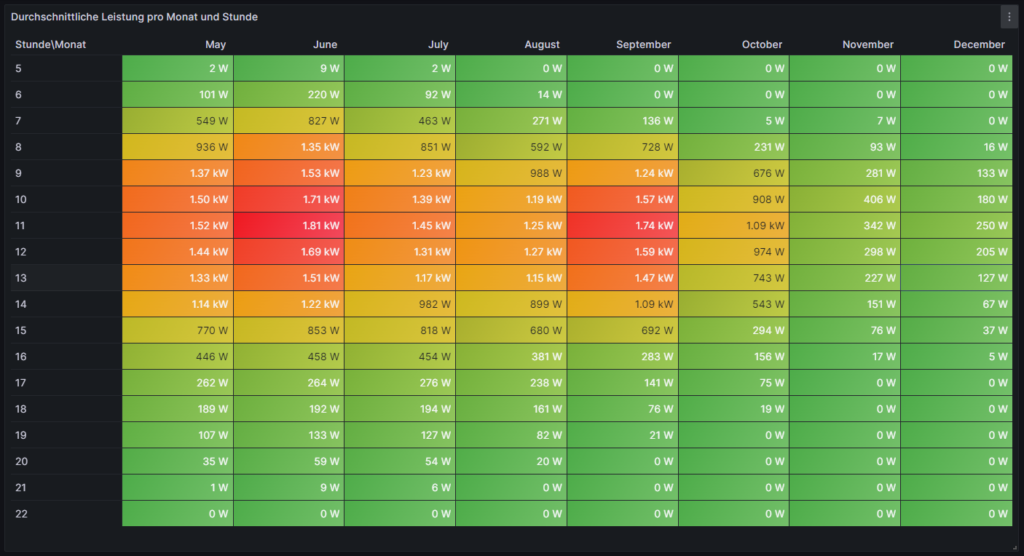
Average Power per Month and Hour of the Day (I)
For this, we use the built-in Grafana visualization Table. We select the according database, and our MySQL query is:
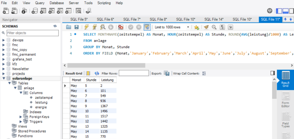
SELECT MONTHNAME(zeitstempel) AS Monat, HOUR(zeitstempel) AS Stunde, ROUND(AVG(leistung)/1000) AS Leistung
FROM anlage
GROUP BY Monat, Stunde
ORDER BY FIELD (Monat,'January','February','March','April','May','June','July','August','September','October','November','December'), Stunde ASC;
This query delivers us an ordered list of power values grouped and ordered by (the correct sequence of) month, and subsequently by the hour of the day as shown below:
However, this is not enough to get the table view we want in Grafana as the power values are still one-dimensional (only one value per line). We need to transpose the table with respect to the months, and therefore, we must select the built-in transformation Grouping to Matrix for this visualization and enter our column names according to the image below:

Now, in order to get a beautiful visualization, we need to adjust some of the panel options, and those are:
- Cell options → Cell type: Set to Colored background
- Standard options → Color scheme: Set to Green-Yellow-Red (by value)
and we need to define some Overrides:
- Override 1 → Fields with name: Select Stunde\Monat
- Override 1 → Cell options → Cell type: Set to Auto
- Override 2 → Fields with type: Select Number
- Override 2 → Standard options → Unit: Select Watt (W)
Then, ideally, you should see something like this:
Average Power per Month and Hour of the Day (II)
This visualization is similar to the one of the previous chapter. However, we slightly modify the MySQL query to:
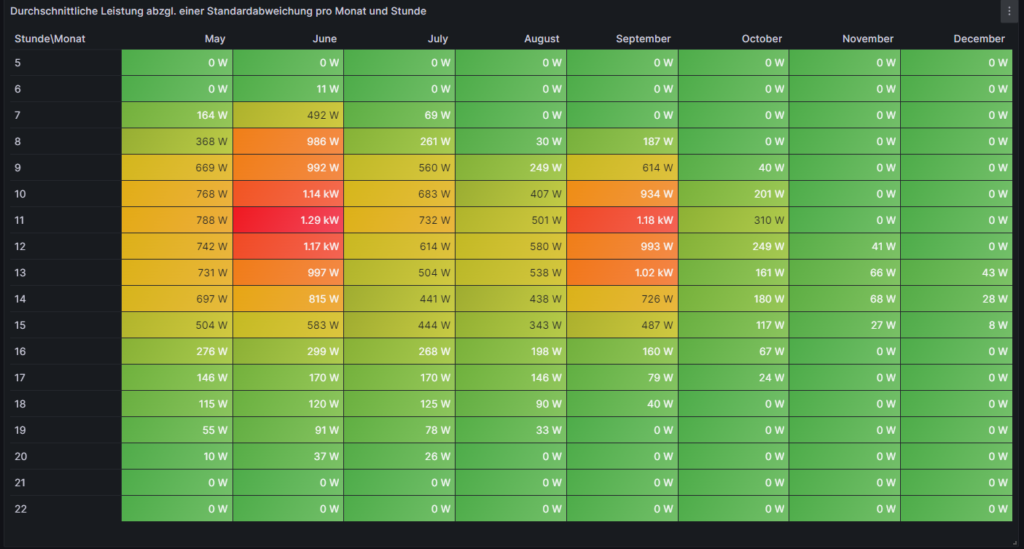
SELECT MONTHNAME(zeitstempel) AS Monat, HOUR(zeitstempel) AS Stunde, ROUND(GREATEST((AVG(leistung)-STDDEV(leistung))/1000,0.0)) AS 'Ø-1σ'
FROM anlage
GROUP BY Monat, Stunde
ORDER BY FIELD (Monat,'January','February','March','April','May','June','July','August','September','October','November','December'), Stunde ASC;
Doing so, we assume that there is some reasonable normal distribution in the timeframe of one month among the values in the same hourly time interval which, strictly speaking, is not true. Further below, we will look into this assumption. Using this unproven assumption, if we subtract 1σ from the average power value and use the resulting value or zero (whichever is higher), then we come to a value where we can say: “Probably (84%), in this month and in this hour, we generate at least x watts of power.” So if someone was looking, for example, for an answer to the question on “When would be the best hour to start the washing machine and ideally use my solar energy for it?”, then, in June, this would be somewhen between 10:00…12:00, but in September, it might be 11:00…13:00, a detail which we might not have uncovered in the visualization of the previous chapter. Of course, you might argue that common sense (“Look out of the window and turn on the washing machine when the sun is shining.”) makes most sense, and that is true in our example. However, for automated systems that must run daily, such information might be valuable.
Heatmap of the Hourly and Daily Power Generation
For this, we use the plug-in Grafana visualization Hourly heatmap. We select the according database, and our MySQL query is very simple:
SELECT UNIX_TIMESTAMP(zeitstempel) AS time, ROUND(leistung/1000) AS power FROM anlage;This time, there is also no need for any transformation, but again, we should adjust some panel options in order to beautify our graph, and these are:
- Hourly heatmap → From: Set to 05:00
- Hourly heatmap → To: Set to 23:00
- Hourly heatmap → Group by: Select 60 minutes
- Hourly heatmap → Calculation: Select Mean
- Hourly heatmap → Color palette: Select Spectral
- Hourly heatmap → Invert color palette: (enabled)
- Legend → Gradient quality: Select Low (it already computes long enough in Low mode)
- Standard options → Unit: Select Watt (W)
Then, ideally, after some seconds, you should see something like this:

This visualization is time-consuming. Keep in mind that if you have large amounts of data, it might take several seconds until the graph build up. The Hourly Heatmap is also more detailed than the previous visualizations, and we can point with the mouse pointer on a certain rectangle and get to know the average power on this day and in this hour (if the database has at least one power value per hour). It even shows fluctuations occurring in one day only which might go unnoticed in the previous visualizations. We can realize, for example, that the lower average power which was generated in July this year was not because the sky is greyer in July than in other months, but that there were a few 2…3 days periods with clouded sky where the electricity generation dropped while other days were just perfectly sunny as in June or August. We can also see how the daylight hours dramatically decrease when we reach November.
Daily Energy Generation, split into Time Ranges
The next graph shall visualize the daily energy generation of the solar system over the time, and we split the day into 4 time ranges (morning, lunch, afternoon, evening). The 4 time ranges are not equally large, so you have to pay close attention to the description of the time range. Of course, you can easily change the MySQL query and adapt the time ranges to your own needs. We use the built-in Grafana visualization Time Series. We select the according database, and our MySQL query uses the timestamp and the energy values of the dataset. We also use the uid as we calculate the differences in the (ever increasing) energy value between two consecutive value sets in the dataset.
SELECT DATE(past.zeitstempel) AS time,
       CASE
         WHEN (HOUR(past.zeitstempel)<11) THEN '05:00-11:00'
         WHEN (HOUR(past.zeitstempel)>=11) AND (HOUR(past.zeitstempel)<14) THEN '11:00-14:00'
         WHEN (HOUR(past.zeitstempel)>=14) AND (HOUR(past.zeitstempel)<17) THEN '14:00-17:00'
         WHEN (HOUR(past.zeitstempel)>=17) THEN '17:00-22:00'
       END AS metric,
       SUM(IF(present.energie>=past.energie,IF((present.energie-past.energie<4000),(present.energie-past.energie),NULL),NULL)) AS value
FROM anlage AS present INNER JOIN anlage AS past ON present.uid=past.uid+1
GROUP BY time,metric;
In order to better understand the MySQL query, here are some explanations:
- We determine the time ranges in the form of a CASE statement in which we determine our time ranges and what shall be the textual output for a certain time range.
- We sum up the differences between consecutive energy values in the database over the respective time ranges. This is the task of the SUM operator.
- There might be missing energy values in the dataset, maybe because of network outages or (temporary) issues in the MySQL socket. The IF clauses inside the SUM operator help us to determine if the result of (present.energie-past.energie) would be negative (in case that present.energie is NULL) or if we have an unrealistic value (≥4000) because past.energie is NULL. Such values will be skipped in the calculation.
- We consult the same tables (anlage) two times, one time named as present and one time named as past whereby past the dataset immediately before present is.
- Keep in mind that as time we use the value of past.zeitstempel so that we include the last value that still fits into the time range (although for the calculation of the energy difference, present.zeitstempel would already be the next hour value, e.g.: (past.zeitstempel=16:45 and present.zeitstempel=17:00).
We furthermore should adjust some panel options in order to beautify our graph, and these are:
- Graph styles → Fill opacity: Set to 45%
- Graph styles → Stack Series: Select Normal
- Standard options → Unit: Select Watt-hour (Wh)
- Standard options → Min: Set to 0
- Standard options → Decimals: Set to 0
- Standard options → Color scheme: Select to Classic palette
On the left side, just above the code window, we have to switch from Table to Time Series:
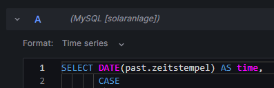
The graph should now look like this:
There is one interesting characteristic of the built-in Grafana visualization Time Series which we make use of. If we edit the graph and select the Table view, we will see that Grafana automatically has created a matrix from the results of our MySQL query.
This is astonishing because the MySQL query does not create the matrix itself, but rather delivers an output like:
MariaDB [solaranlage]> SELECT DATE(past.zeitstempel) AS time,
    ->        CASE
    ->          WHEN (HOUR(past.zeitstempel)<11) THEN '05:00-11:00'
    ->          WHEN (HOUR(past.zeitstempel)>=11) AND (HOUR(past.zeitstempel)<14) THEN '11:00-14:00'
    ->          WHEN (HOUR(past.zeitstempel)>=14) AND (HOUR(past.zeitstempel)<17) THEN '14:00-17:00'
    ->          WHEN (HOUR(past.zeitstempel)>=17) THEN '17:00-22:00'
    ->        END AS metric,
    ->        SUM(IF(present.energie>=past.energie,IF((present.energie-past.energie<4000),(present.energie-past.energie),NULL),NULL)) AS value
    -> FROM anlage AS present INNER JOIN anlage AS past ON present.uid=past.uid+1
    -> GROUP BY time,metric
    -> LIMIT 15;
+------------+-------------+-------+
| time       | metric      | value |
+------------+-------------+-------+
| 2023-05-02 | 05:00-11:00 |  3588 |
| 2023-05-02 | 11:00-14:00 |  4428 |
| 2023-05-02 | 14:00-17:00 |  2524 |
| 2023-05-02 | 17:00-22:00 |   375 |
| 2023-05-03 | 05:00-11:00 |  4260 |
| 2023-05-03 | 11:00-14:00 |  6047 |
| 2023-05-03 | 14:00-17:00 |  2648 |
| 2023-05-03 | 17:00-22:00 |   369 |
| 2023-05-04 | 05:00-11:00 |  6326 |
| 2023-05-04 | 11:00-14:00 |  5867 |
| 2023-05-04 | 14:00-17:00 |  2568 |
| 2023-05-04 | 17:00-22:00 |   477 |
| 2023-05-05 | 05:00-11:00 |  3113 |
| 2023-05-05 | 11:00-14:00 |  3496 |
| 2023-05-05 | 14:00-17:00 |  1657 |
+------------+-------------+-------+
15 rows in set (0,197 sec)
I found out that this only works if metric is not a numerical value. For numerical values, the matrix would not be auto generated, the graph would not work like this. Maybe, an additional transformation in Grafana might then be necessary.
Detailed Examinations of the Dataset
Let us look closer to subsets of the dataset and visualize them, in order to get a better understanding of how the solar power generation behaves in reality at selected times.
Power Distribution between 12:00 and 13:00 (4 values per day)
For this, we use the built-in Grafana visualization Heatmap. We select the according database, and our MySQL query is:
SELECT zeitstempel AS time, ROUND(leistung/1000) AS 'Power' FROM anlage
WHERE (HOUR(zeitstempel)=12);
Keep in mind that in my dataset, I register 4 samples per hour in the database. This is defined by the frequency of how often the script described in [1] is executed, and this itself is defined in crontab. You can also have the script be executed every minute, and hence you will register 60 samples per hour in the database which will be more precise but put higher load on your server and on the evaluation of the data in MySQL queries. So, in my case, in the time frame [12:00-13:00], we consider 4 power values, and we filter for these power values simply by looking at timestamps with the value “12” as the hour part. The Heatmap will give the distribution of these 4 power values per day. We must furthermore adjust some panel options, and these are:
- Heatmap → X Bucket: Select Size and set to 24h
- Heatmap → Y Bucket: Select Size and set to Auto
- Heatmap → Y Bucket Scale: Select Linear
- Y Axis → Unit: Select Watt (W)
- Y Axis → Decimals: Set to 1
- Y Axis → Min value: Set to 0
- Colors → Mode: Select Scheme
- Colors → Scheme: Select Oranges
- Colors → Steps: Set to 64

With this Heatmap, we can immediately understand an important detail, and that is: If someone had the assumption that between [12:00-13:00], we generate a lot of power every day in summer, this would clearly be very wrong. In fact, we can recognize that the power generation varies from low to high values on many days. The reason is that even in summer, there are many cloudy days in the location where this solar power generator is located. This might not be true for a different location, and if we had data from Southern Europe (Portugal, Spain, Italy), this might look very different.
Average Power [12:00-13:00]
Now, we shall look at the average power generation between [12:00-13:00] over the year, using the 4 power values that we have register in this time interval every day. For this, we use the built-in Grafana visualization Time Series. We select the according database, and we use two MySQL queries (A and B). Both curves will then be visualized in the diagram with different colors. Our query A calculates the average value per day in the time interval [12:00-13:00] and is displayed in green color:
SELECT zeitstempel AS time, ROUND(AVG(leistung)/1000) AS 'Power [12:00-13:00]' FROM anlage
WHERE (HOUR(zeitstempel)=12)
GROUP BY DATE(zeitstempel);
Our query B takes a 7d average of the average values per day, it therefore is kind of a trend line of the curve we have generated with query A and is displayed in yellow color:
SELECT zeitstempel AS time, (SELECT ROUND(AVG(leistung)/1000) FROM anlage WHERE (HOUR(zeitstempel)=12) AND zeitstempel<=time AND zeitstempel>DATE_ADD(time,INTERVAL-7 DAY)) AS 'Power [12:00-13:00; 7d average]' FROM anlage
WHERE (DATE(zeitstempel)>='2023-05-09')
GROUP BY DATE(zeitstempel);
This graph visualizes the same finding as the previous heatmap. In my opinion, it even shows in a more dramatic way that the average power between [12:00-13:00] even during summer can vary dramatically, and that we simply cannot assume that there is a certain minimum power “guaranteed” in a certain time frame during summer. We also see that in winter, the power generation is minimal, and there is no chance that the solar power generator can contribute to the electricity demand of the home in any meaningful way.
Average Power [12:00-13:00] (calculated as difference of energy values)
One might argue that 4 sampling values per hour are not enough, maybe we were just unlucky and there were clouds in the sky exactly when we were sampling the data. Let us therefore repeat the graph from above, not by using the average of the 4 samples per hour but let us divide the increase of the overall generated energy in the time frame [12:00-13:00] as the base for the power calculation. Again, we will do two queries (A and B) whereby query A is the value on the daily basis:
SELECT present.zeitstempel AS time, (present.energie-past.energie) AS 'Power [12:00-13:00]'
FROM anlage AS present INNER JOIN anlage AS past ON present.uid=past.uid+4
WHERE (TIME_FORMAT(present.zeitstempel,'%H:%i')='13:00');
and where query B shows the 7d average of the daily values:
SELECT zeitstempel AS time, (SELECT AVG(present.energie-past.energie) FROM anlage AS present INNER JOIN anlage AS past ON present.uid=past.uid+4 WHERE (TIME_FORMAT(present.zeitstempel,'%H:%i')='13:00') AND present.zeitstempel<=time AND present.zeitstempel>DATE_ADD(time,INTERVAL-7 DAY)) AS 'Power [12:00-13:00; 7d average]' FROM anlage
WHERE (DATE(zeitstempel)>='2023-05-09')
GROUP BY DATE(zeitstempel);
While we can identify some differences in the green curve between this graph and the previous one, the yellow curve is almost identical. In general, the calculation via the energy values is the more precise one; 4 sample values simply do not seem to suffice as we can see in the differences of the green curves.
The overall conclusion of this curve is the same as in the previous one, however: There are many days where the average power generation between [12:00-13:00] stays well below the expected (larger) values.
Average Hourly Power Generation [June]
The following visualization, again using the built-in Grafana visualization Time Series, shows how the average value of power generated per hour in the month of June varies if we look at the first half and the second half of June. This visualization uses three queries. Query A shows the average power generation of the whole month of June:
SELECT zeitstempel AS time, ROUND(AVG(leistung)/1000) AS 'Power [June 2023]' FROM anlage
WHERE (zeitstempel>'2023-06-01') AND (zeitstempel<'2023-07-01')
GROUP BY HOUR(zeitstempel);
Query B looks at the average power generation of the first half of June:
SELECT zeitstempel AS time, ROUND(AVG(leistung)/1000) AS 'Power [June 2023; first half]' FROM anlage
WHERE (zeitstempel>'2023-06-01') AND (zeitstempel<'2023-06-16')
GROUP BY HOUR(zeitstempel);
Query C looks at the average power generation of the second half of June
SELECT DATE_ADD(zeitstempel, INTERVAL -15 DAY) AS time, ROUND(AVG(leistung)/1000) AS 'Power [June 2023; second half]' FROM anlage
WHERE (zeitstempel>'2023-06-16') AND (zeitstempel<'2023-07-01')
GROUP BY HOUR(zeitstempel);
As time period for the visualization, we select 2023-06-01 00:00:00 to 2023-06-01 23:59:59. You might wonder why we only select one day for the visualization when we examine a whole month. But as we calculate the average value over the full month (indicated in the WHERE clause of the MySQL query), we will receive only data for one day:
MariaDB [solaranlage]> SELECT zeitstempel AS time, ROUND(AVG(leistung)/1000) AS 'Power [June 2023]' FROM anlage
    -> WHERE (zeitstempel>'2023-06-01') AND (zeitstempel<'2023-07-01')
    -> GROUP BY HOUR(zeitstempel);
+---------------------+-------------------+
| time                | Power [June 2023] |
+---------------------+-------------------+
| 2023-06-01 05:00:07 |                 9 |
| 2023-06-01 06:00:08 |               220 |
| 2023-06-01 07:00:07 |               827 |
| 2023-06-01 08:00:07 |              1346 |
| 2023-06-01 09:00:07 |              1530 |
| 2023-06-01 10:00:07 |              1711 |
| 2023-06-01 11:00:07 |              1814 |
| 2023-06-01 12:00:08 |              1689 |
| 2023-06-01 13:00:07 |              1512 |
| 2023-06-01 14:00:08 |              1215 |
| 2023-06-01 15:00:07 |               853 |
| 2023-06-01 16:00:07 |               458 |
| 2023-06-01 17:00:07 |               264 |
| 2023-06-01 18:00:07 |               192 |
| 2023-06-01 19:00:07 |               133 |
| 2023-06-01 20:00:07 |                59 |
| 2023-06-01 21:00:07 |                 9 |
| 2023-06-01 22:00:07 |                 0 |
+---------------------+-------------------+
18 rows in set (0,035 sec)
This also explains the sequence DATE_ADD(zeitstempel, INTERVAL -15 DAY) in query C. That sequence simply “brings back” the result curves from the day 2023-06-16 to the day 2023-06-01 and thus into our selected time period.
We also need to adjust some panel options, and these are:
- Standard options → Unit: Select Watt (W)
- Standard options → Min: Set to 0
- Standard options → Max: Set to 2500
- Standard options → Decimals: Set to 1
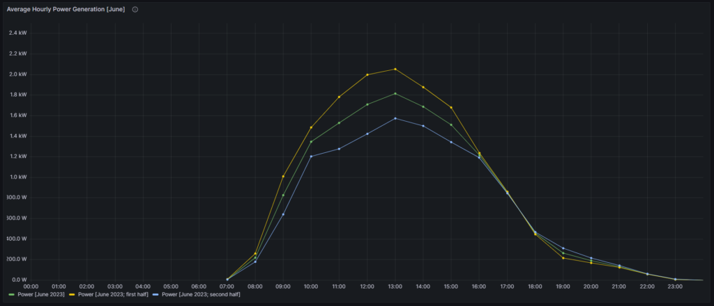
The green curve displays the average data over the whole month of June whereas the yellow curve represents the first half, and the blue curve represents the second half. We can see that this year (2023), the second half of June was much worse than the first half of June, in terms of power generation. Only in the time window [16:00-18:00], all three curves show the same values.
Power Distribution between 12:00 and 13:00 [June 2023]
Let us go back to the assumption we used for the second visualization on this article where we assumed a normal distribution of power values for a reasonably small timeframe (one hour over one month). Is this actually a true or maybe a wrong assumption? In order to get a better feeling, we use the built-in Grafana visualization Histogram and look how the power value samples (4 per hour) distribute in the month of June, in the first half of June (where we had a sunny sky), and in the second half of June (where we had a partially cloudy sky).
For the following three histograms, we use the panel options:
- Histogram → Bucket size: Set to 50
- Histogram → Bucket offset : Set to 0
- Standard options → Unit: Select Watt (W)
- Standard options → Min: Set to 0
- Standard options → Max: Set to 2500
- Standard options → Color scheme: Select Single color
The first histogram shows the distribution of power samples (120 in total) over the whole month of June:
SELECT zeitstempel, ROUND(leistung/1000) AS 'Power 12:00-13:00 [June 2023]' FROM anlage
WHERE (zeitstempel>'2023-06-01') AND (zeitstempel<'2023-07-01')
  AND (HOUR(zeitstempel)=12);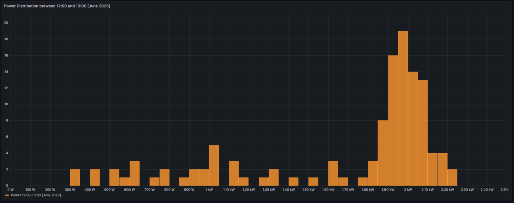
The second histogram shows the distribution of power samples (60 in total) over the first half of June:
SELECT zeitstempel, ROUND(leistung/1000) AS 'Power 12:00-13:00 [June 2023; first half]' FROM anlage
WHERE (zeitstempel>'2023-06-01') AND (zeitstempel<'2023-06-16')
  AND (HOUR(zeitstempel)=12);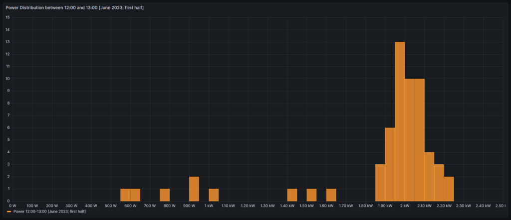
The third histogram shows the distribution of power samples (60 in total) over the second half of June:
SELECT zeitstempel, ROUND(leistung/1000) AS 'Power 12:00-13:00 [June 2023; second half]' FROM anlage
WHERE (zeitstempel>'2023-06-16') AND (zeitstempel<'2023-07-01')
  AND (HOUR(zeitstempel)=12);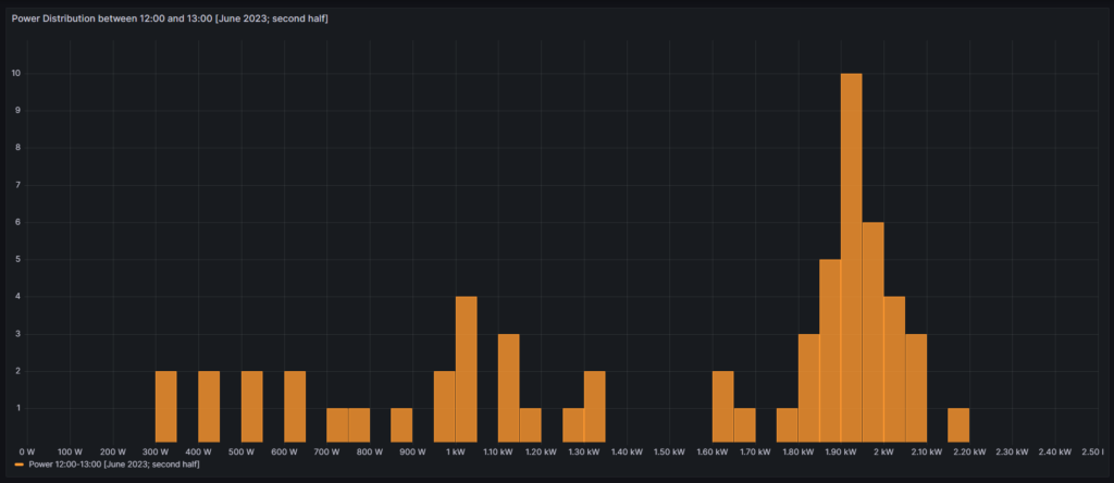
From all curves, we can see that the distribution that we see is by no means a normal distribution. It certainly has a region where we have a bell-shaped density of power values, but during periods with cloudy skies, we can also have many values in the range below the bell-shaped values of the solar generator. Therefore, the assumption of a normal distribution does not hold true in reality.
Conclusion
Visualizations
Grafana allows us to create advanced visualizations from MySQL data with little effort. The point with some less used visualizations in Grafana however, is that there is little documentation available, or to say it in a different way: Sometimes the documentation is sufficient if you already know how it works, but insufficient if you do not yet know how it works. I hope that at least with this article, I could contribute to enlarge knowledge.
Solar Power Generation
The data used in this example shows a solar power generation unit in Germany, facing the East. From the visualized data, we can draw several conclusions:
- Peak power of the installed solar power system is shortly before lunch time and decreases already significantly after 14:00.
- While power generation looks good until even October, from November on, the yield is poor.
- While the generated electricity in the winter months might still help to decrease the electricity bill, it becomes clear that if you were to use a heat pump for the heating of your home, you cannot count on solar power generation to support you in a meaningful way until you have some 50 kW+ peak solar capacity on a large roof.
- As the solar power generation peaks shortly before noon, it might make sense to combine units that face to the East and units that face to the West. This observation is in-line with recent proposals that claim that units facing South are not much better than a combination of units facing East and West (e.g., [3]).
Outlook
The visualizations given here are only an easy beginning. We might want to use more serious statistical analysis to answer questions like:
- Can we infer from a bad start in the morning (little power) that the rest of the day will stay like this?
- How probable is it that we have 3+ cloudy days (with little electricity) in a row, and that translates to: If it rained today, should I wait for 1…3 more days before I turn on the washing machine?
- Does it make economic sense to invest in a battery storage in order to capture excess electricity in summer days? How large should this battery be?
Files
The following dataset was used for the graphs:
Sources
- [1] = Smarthome: AVM-Steckdosen per Skript auslesen – Gabriel Rüeck (caipirinha.spdns.org)
- [2] = Download Grafana | Grafana Labs
- [3] = Ost-West-Ausrichtung von Photovoltaikanlagen (solarenergie.de)
Disclaimer
- Program codes and examples are for demonstration purposes only.
- Program codes are not recommended be used in production environments without further enhancements in terms of speed, failure-tolerance or cyber-security.
- While program codes have been tested, they might still contain errors.